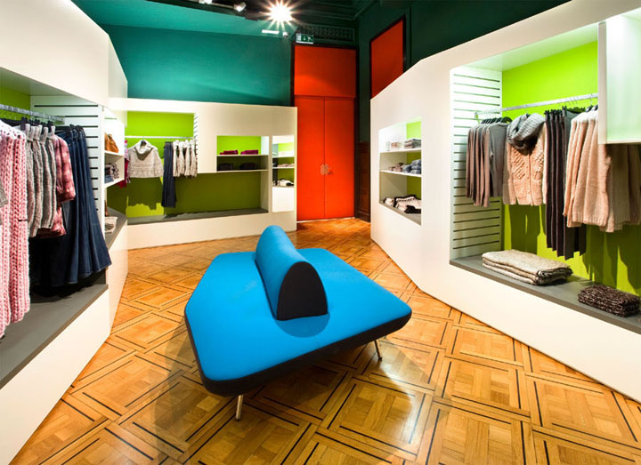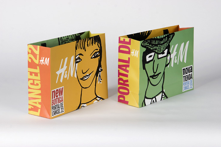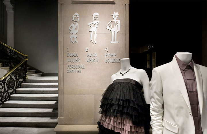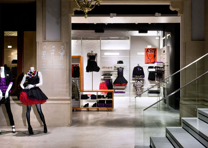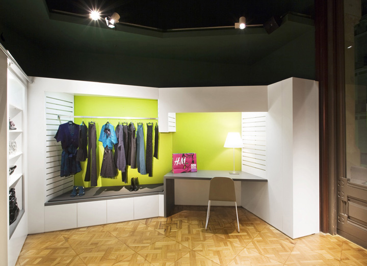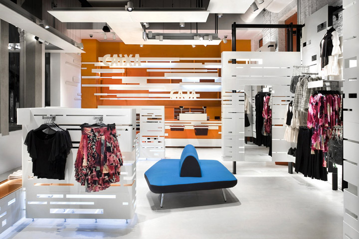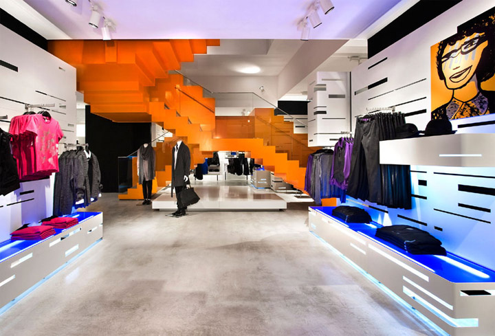

Edtudio Mariscal did a complete work for H&M in Barcelona: Architecture, lighting, furniture, graphics… even the shopping bags. A design project aimed at creating excitement among the customers that go into the shop. Excitement at buying clothes and also to be shopping in a pleasant, comfortable, unique place. To make sure that the area is the setting for a pleasant, fun-filled experience. Second objective: that the clothes should find their own place, that the distribution of the shop should order the exhibition of the clothes and the routes. Design at the service of the shop’s activity, never the other way round.

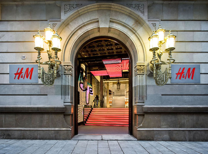
The new H&M shop is found in the most commercial street of Barcelona, Portal de l’Àngel, in the building which was, until recently, the head office of the company Catalana de Gas. The original building, which is listed, is a vestige of the bourgeois architecture from the end of the 19th century, and is the work of Domènech Estapà, an architect who was opposed to the Modernista movement and more inclined towards a neo-classical style.

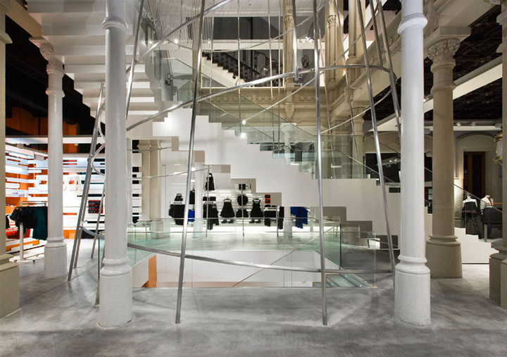
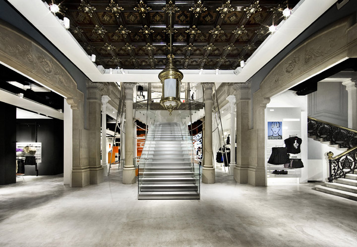
The fact that it is listed and the architectural style of the building were two premises that partly marked our project. The listing was, on the one hand, a real headache in complying with the heritage regulations. But, on the other hand, it was an opportunity to work on a space with noucentista proportions; from a time when square meters were not measured in terms of profitability, hence the huge staircase and the empty space that reaches up into the dome. A genuine old-fashioned luxury.

The change of use of the building was another conditioning factor for the project. We converted an area destined to be the offices of an important company into a modern clothes shop aimed, mainly, at young people, lovers of the latest trends. This meant approaching the project by trying to conciliate the “old” with the “new”. A remorse, bourgeois, baroque dialogue with a pop, modern, contemporary style.

We were very respectful with the different architectural features. We made a great effort to reform the building, highlighting the aspects which, over time and the different uses of the building in its latest stage, had been removed or altered. Things like the dome, the three public rooms, the staircase well and the imperial staircase.

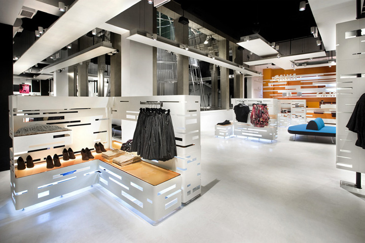
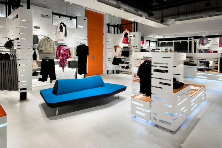
We conceived an ephemeral interior architecture, composed of features that can be added and removed. A second exempt skin was superimposed on the old architecture, creating a new image, without blurring the original. This, which could have been an obstacle throughout the project, became an incentive as it finally helped us to achieve a multipurpose space which is flexible, modular and versatile. The objective, at all times, was to order the product to show H&M collections in the best possible way, which is why the second skin is neutral, in black and white.

The building is so large —1,720 square meters— that we tried to flee from monotony so that the new layout would have rhythm. Not just a rhythm in the formal aspect, but also in the intensity with which each area is experienced. To achieve this, we prepared surprises, changes of atmosphere, each with its own personality, different from the previous one. In this way, the route is more dynamic, as each corner creates expectation. Our aim was to add a “plus” of excitement and emotion for H&M customers.

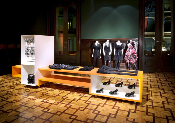
We used pieces of puzzles to achieve an open design, which creates disparate situations that resolve, invade or colonise each corner of the space. To create furniture that responds to this modular need, we used metal that is superimposed and contrasts with the original wood and stone.

This shop was also conceived as a laboratory. It is a flag ship, an insignia shop. A logistical laboratory in which we studied how to make a storeroom that would enable the rails to be continuously restocked. We also concentrated on on how best to display the clothes. We investigated new ways of showing them and making the most of them. Shelves, rails and hangers, modules, Meccano ceiling fittings were designed bearing in mind the various sizes of the garments and the H&M accessories.

In the entrance, we started an explosion of light, colour and movement, through the LED screens. This entrance works as a shop window, shop sign and access. The communication between the interior and the exterior, which normally happens through the shop window, in this case consists of a virtual shop window. The pedestrian street is a flood of people that the entrance to H&M absorbs like a vacuum cleaner. To respect the façade, a minimal logo was placed.

The three public rooms on the first floor of the building, which used to be the offices of the directors of Catalana de Gas, have been restored and are integrated into the shopping space, as they have been given a new use. In these three rooms, the contrast between old and new is more evident, as the wooden display cabinets, the chimneys and the original wooden dais have been preserved and share the space with the new metal furnishings.

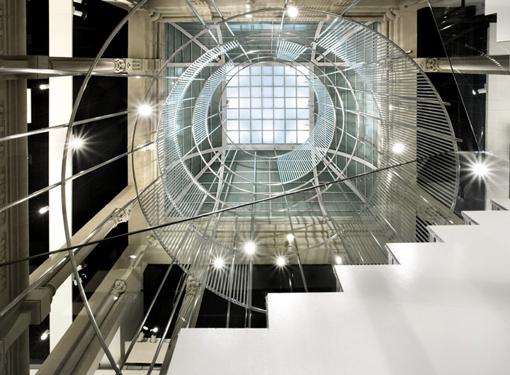
The staircase and the dome are two very important features of the alteration. We have emphasised the stairwell, the emptiness created by the staircase. The new staircase that has been built is not as important as the stairwell through which the light from the dome that tops the building travels. This central atrium communicates the floors and allows the natural light to pervade the interior. The cone is a metaphor, a symbol of rising up into the heights, a spiral towards the sky to capture the light.

In the new basement, sculptural features are integrated providing colour and identity to the space. A series of cactuses, in organic shapes, upholstered in materials in bright colours spatter the area and give it character.

In addition to the interior design and the design of the furniture, Estudio Mariscal was responsible for the lighting and its image and communication.

It is important to recognise, in a project such as this one, the creative freedom that H&M gave us at all times and the cordial, fluent relationship we have had with the client during all the stages of the project.

Client: H&M
Architecture, interiors and graphic design: Estudio Mariscal
Location: c/ Portal de l’Àngel 22, Barcelona, Spain
Area: 1.720 m2
Year: 2008
Contractor: Dula Bau
Furniture and commercial equipment: Dula Ibérica
Structural engineering: nb35

Technical architecture and services: MC Arquitectura e Ingeniería
Leds (provider): BARCO
Leds (installation): SONO
Lighting: iGuzzini
Renovation: Artecc
Aluminium stairs: Alcan
Continous pavement: Pavindus
Furniture:
Personal Shopper area: Guitarra chair, by J. Mariscal for Uno Design
Noble room 3 Zodiac sofa, by J. Mariscal for Uno Design
Shop area, stools and seats Guitarra
Fitting rooms, stools by Estudio Mariscal for H&M
Sculpture: Taller de escultura Pere Casanovas

http://www.archdaily.com/10512/hm-store-in-barcelona-estudio-mariscal/
