

Over the past few years, the concept of the chemist’s has changed in accordance with the changes in the laws that regulate the activity. Apart from the health service provided by the chemist, new concepts such as “added value”, “concurrence” and “visualization” have become part of the services offered.

The alteration of this chemist, an area of 180 m2 distributed on two levels, was carried out in just two months, with the added difficulty of having to coordinate the building works around the chemist, open to the public during the first month. This complex issue thus established the conditions of the project and the procedure with regards to the building alterations, making it necessary to incorporate as many prefabricated elements as possible.

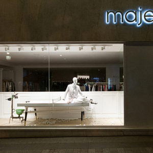
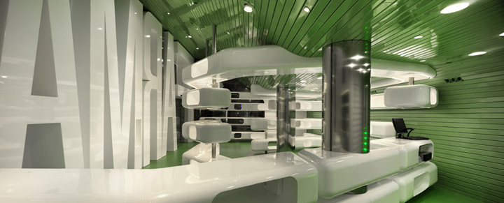
The shop window consists of a tridimensional text of the word “FARMACIA” (Chemist’s) that occupies the two floors of the frontage. The aim of this is not just to indicate the usage and the identity of the business, but to also provide the establishment with protection from the sun, an important factor for this property facing north-west. The sign when lit up at night lights up the street in a soft glow.

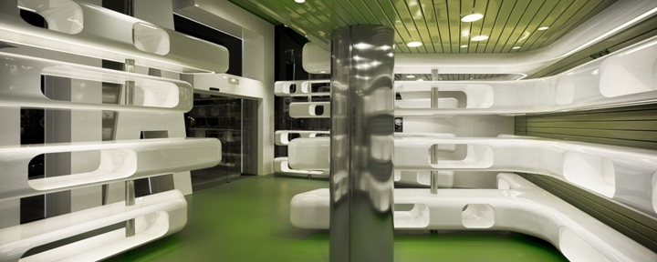
Floor to ceiling metal panels are positioned behind the sign on the inside, visually unifying the area with the floor covered in an epoxy resin of the same colour, and acting as a backdrop to the display cabinets and shelving. These tubular units are white in colour and are self lit, giving the appearance of floating in the room, and creating different areas such as: a rotating sales counter, a seat, and a pulpit. The cavities and recesses within the units allow space for displaying the products. A totally new setting for a new business concept.
To meet the strict deadlines, all the pieces of furniture were made up previously in the workshop. The metal sheeting is also another industrial solution when rapid installation is required. Altogether, this represented 95% of the volume of the works, allowing us to complete on time and keep to the budget. This we can prove.

The metal sheeting also hides a small office, and the air conditioning equipment. On the other side, behind the counter, a sliding glass door takes us through to the laboratory, and the cloakroom, with the robotized drug storeroom on the next level. We incorporated additional lighting by way of small fittings where necessary, as well as LED continuous lighting to light certain features. Only energy saving fittings were installed.

The design incorporated just two colours: the typical chemist’s green for the floor and the ceiling, and white for the furniture and the frontage.

The premises are located in a modest neighborhood and some colleagues consider that a more central street would be a better place for an alternation of this nature, but we are happy with this location. The neighborhood already feels identified with this new icon and it functions as a stimulus for other shops. Architecture for everyone!




Designed by Clavel Arquitectos
http://www.clavel-arquitectos.com/


Add to collection
