
Add to collection

Christies Boutique is the first store of the Italian exclusive brand Christies Lingerie open in Poland. Its location is not at all random – placed in a renovated historic building in the heart of Krakow. This place is to stress the character of this brand and the design of the store itself. From the very beginning, its concept entailed a desire to create a friendly, comfortable and above all unique place.

INSPIRATIONS
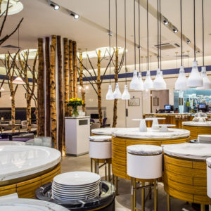
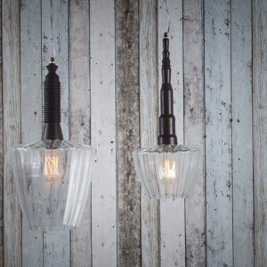
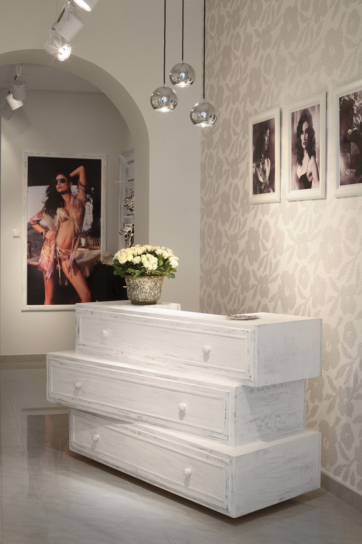
The subtle colors, delicate eclecticism, seemingly old wood, drawer theme, surprising modern details are the main inspirations of the interior design. The place is infused with broken whites, creams with accents of cool browns that appear in the fitting rooms. Interesting additions to the look are the silver lamps which make excellent decorative accent and at the same time with their subtle light emphasize the important elements in the store – a round display table and a characteristic counter. The main material used for furniture design was old-looking rustic wood painted in white.

This material was used to make chests of drawers, a round table and decorative elements – characteristic frames for panels, mirrors and LCD, and the stairway railing. The design of display racks also matches the interior – wood painted in rustic white. The most characteristic feature, however, is a unique counter, which is made of three drawer elements stacked on one another in a seemingly careless manner. A similar motif appears in a decorative piece of furniture, used for product display. The inside of the store also accommodated an antique element of the old Singer sewing machine which after renovation has proved to be an excellent coffee table in the fitting room area.

VISUAL MERCHANDISING RULES
minimalism
simple forms
sets of consistent colors
product availability
customer-friendly display
natural-looking mannequins and display torsos

STORE WINDOW
Due to the street side widow the display is open to enable passers-by a look inside, and thus encourage them to enter the store. The store window presents a mannequin in a half-reclining pose, which makes the store’s first room clearly visible. The element visible in the first plan is the LCD, which attracts the attention by presenting the backstage of the photo shoot, collection of current photos and press materials.

INTERIOR
The store space, which is approximately 60m2 (200 ft2), has been structurally divided into three parts, each of which is dedicated to a slightly different presentation. Three steps with the wooden railing lead to the first room. At the entrance on the right side there is a the photo gallery from the latest photo session. This is an introduction to the store trip – encourages a customer and helps them to know what to expect next. The first room is more stylish and exclusive. At this point, all specific selected color lines which we currently draw attention to or all new arrivals which have just appeared in the store are presented. Rubbed white panels, low chests of drawers, a flowers vase, round wooden table with drawers that can be used for product display bring home-like feeling and at the same time create a coherent form of this part of the store. An attractive addition to the whole design is LCD in a white wooden frame which displays company’s advertising material – backstage of the photo shoot, current collection photos other press materials.

The second part of the store is much narrower and includes a display panel, a mirror and a counter. The counter is a very characteristic element of the entire store – an unusual, attractive, and innovative, built of three large drawers asymmetrically stacked on one another, built on soft looking raisers, despite its dimensions gives the impression of a fairly light and non-distracting piece of furniture. There is a photo gallery on the wall behind the counter. The greater part of the collection is displayed on the panel which has a more selling than stylish role.

Consistent elements that connect the two rooms are similar compositions with unevenly stacked drawer blocks, the use of interesting wallpaper with mosaic motifs, powder flowers and metal triple lamps suspended over the table and over the counter.

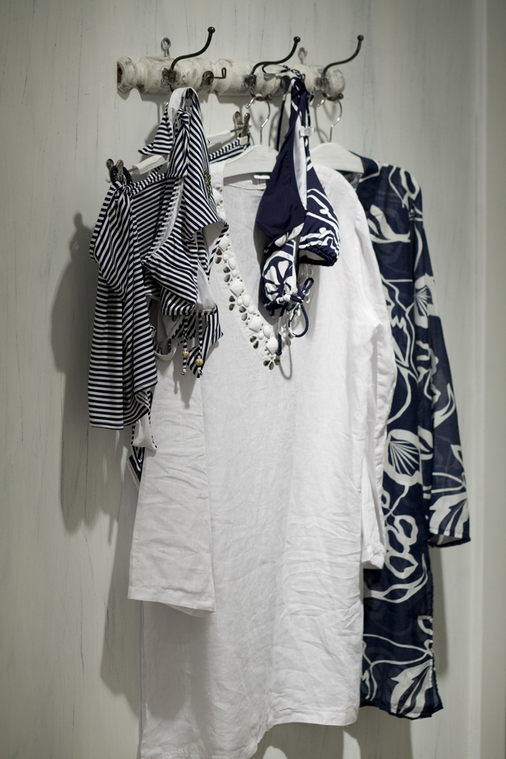
The second part leads to the last room, design of which focuses the fitting room area. Before we get into the room though, we pass additional display panel and a wall with an old, renovated hanger which has color-consistent style sets hanged in a artistically careless manner.

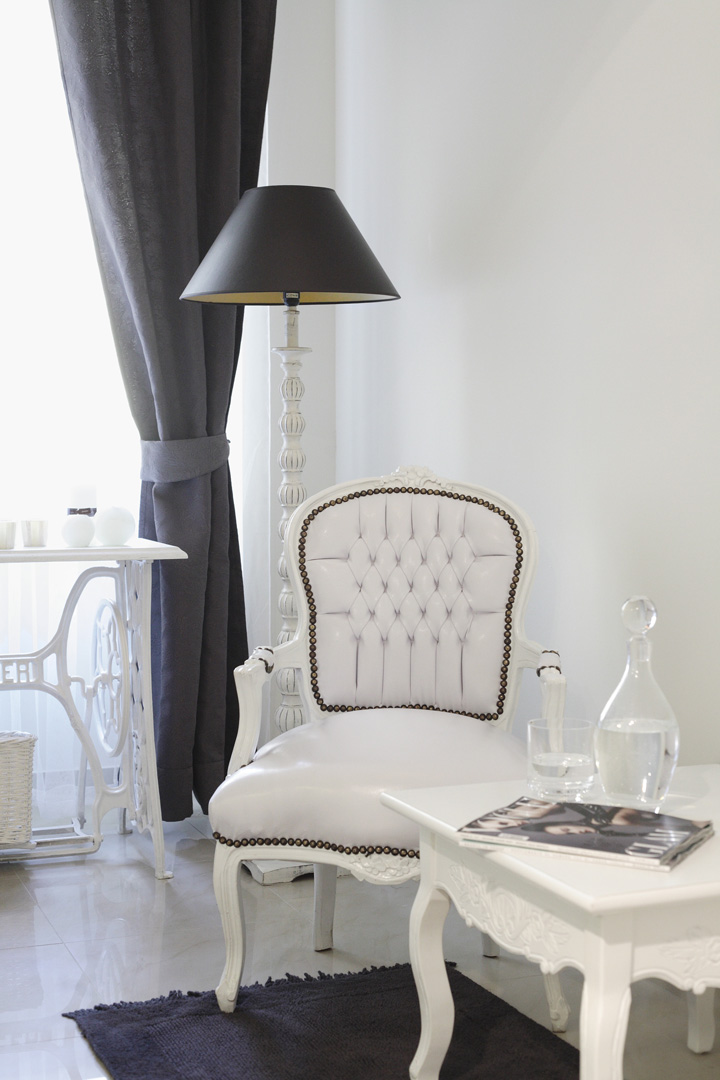
Due to the nature of the product the fitting room zone is a place that is intimate, “safe”, separated from the store, of a home-like character. Here, a customer can relax, drink coffee, look at the catalogs and fashion magazines, talk about collections and more. An antique part of the old Singer sewing machine with a new countertop element is used as a coffee table. Intimate atmosphere in the room is enhanced by candle light. Whites with accents of cool browns prevail in the design – curtains, carpet, a lamp and a chandelier. Fitting rooms themselves are cozy, spacious, comfortable, and subtly illuminated. The store design displays rail lighting system.

CHRISTIES BOUTIQUE
Ul. Zwierzyniecka 22, Kraków, Poland
INVESTOR: Moda e Intima
DESIGN: MHSHOWROOM / MORPHO STUDIO
INTERIOR AND VISUAL MERCHANDISING SPECIALIST: Monika Harlacz/Mhshowroom
INTERIOR DESIGNER: Justyna Friedberg/Morpho Studio
PHOTOGRAPHY: Magdalena Pacana/Paweł Kaminski


Add to collection