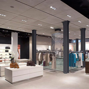
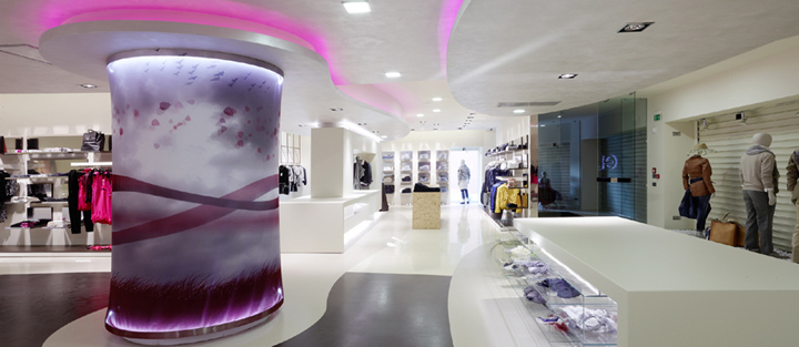

When it comes to creating an Italian fashion store based on a company’s overall communication strategy, things can get tricky. However, Alberto Apostoli Studio came up with a design that is both appealing and brand oriented. Here is the official description of the Eliseo store from the architects: “The concept underlying this project is based on a combination of creativity and rationality and evolves through a refined use of form, light and colour.

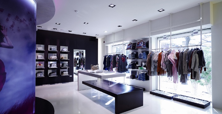
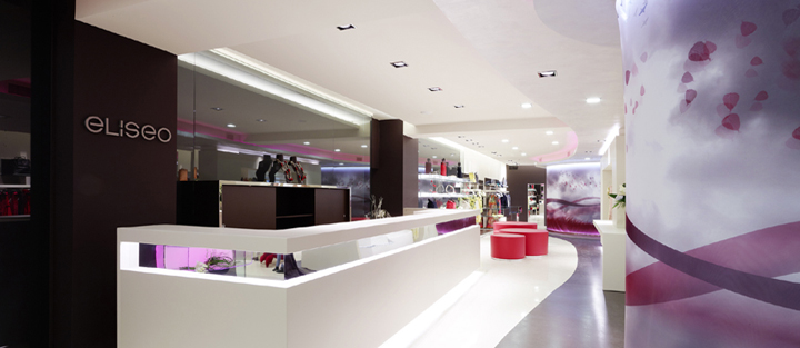
Rationality is implicit in the use of squared shapes executed in glass and metal; creativity is mainly to be seen in three elliptic elements rising from the floor to model the false ceilings, thus contributing to separate the retail space into three distinct areas: menswear, ladies’ wear and young fashion.

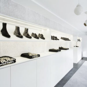
Important elements of emotional communication with the clientele are, for example, the back‐lit glass display cabinets, the RGB lighting of the false ceilings and the “honeycomb” display units in glass and metal. The LEDs, whose vertical and horizontal light is used by Apostoli as a proper surface covering, run all along the main aisles of the store and its furnishings, transforming the latter into sources of indirect light.

All furniture pieces have been custom‐made by the architect’s own design and are defined by an unusual combination of glass and pearly white lacquered wood. A particularly impacting element is provided by the large brown wall which appears to be “boxed” inside a glass display cabinet and whose interior supplies the backdrop to the china cabinets and furniture elements composing the till area. The large display table positioned close to the entrance is particularly striking and elegant with its all‐glass structure that is partially illuminated from within.

A clever use of colour has been made: coffee and beige for the resin flooring, dove grey for the furniture and sections of the flooring and, finally, red – a flash of colour that defines some graphic details, as well as a most unusual chair that has been specially created for this project.”


http://freshome.com/2011/10/03/brand-oriented-italian-fashion-store-by-alberto-apostoli-studio/
http://www.albertoapostoli.com/


