

When Marques de Riscal, one of the most traditional wineries in Spain, needed to redesign their on-site shop they approached Carlos Aires of MARKETING-JAZZ with the project. When the management of the shop first met with Aires they had two main concerns: they wanted to sell branded merchandise in addition to the fine wines they already produced and sold, and with the re-design of the space, they wanted to be as “green” and economical as possible. This meant using existing furniture and doing as little construction work as possible.
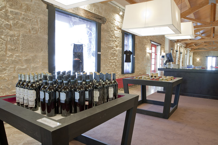
The owners firmly believed that Marques de Riscal was not just a winery, but a lifestyle brand. This had to be reflected in the merchandise mix of the shop. To display the branded items such as t-shirts and other articles of clothing, Aires and his team closed in windows on the left-hand of the shop to create “closets.” The resulting alcoves would serve to display the branded items singly with appropriate backdrops that included photographs of the landmark winery.

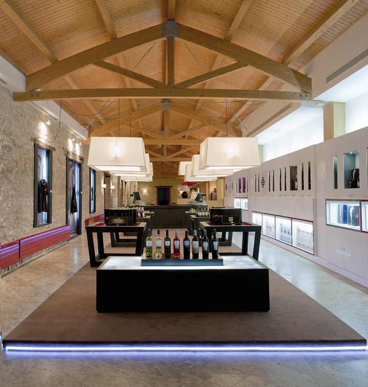
To improve the wine buying experience and en- courage impulse buying, display tables were placed to allow casual and easy circulation around them and the cash/wrap was moved to the back of the space to lessen the “sales” pressure from the staff and allow customers to browse at their leisure. Without hindering the casual shopping experience, the owners also needed to promote the idea of their wines as one of the finer things —
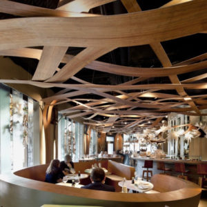
Top: One of the ornate display cases. Right: The overall atmosphere of the store retails the atmosphere of a traditional winery with stone walls, exposed rafters and vaulted wood ceiling. Below: The layout of the store invites customers to wonder about the display tables without intimidation. Opposite Top: in- set display cases on the right-hand wall hold the best wines and promote self service. Opposite Bottom: Display cases or “closets” on the left-hand wall — once windows — hold branded merchandise such as shirts and other items of clothing.

One of life’s little luxuries. To achieve this the central display area was raised a few inches off the ground and lighting tubes were placed around the perimeter of the raised platform. This gives the impression of the wine being in an exultant position, almost on an alter. In keeping with the economic directive, these walkways and display tables were placed to allow the use of existing lighting.
On the right-hand wall original shelving was lined with custom panels and utilized to showcase the winery’s very best wines as well as promote self-service. On this wall in-set display boxes are mixed with tradition wine-hold niches that form a diamond shape. The various displays, in combination with the stone walls, exposed wooden beams and vaulted ceiling of the original space, give customers the impression of being in a very special place and brands the wine and other merchandise as items necessary to a appealing lifestyle — within every- one’s reach.

Design: MARKETING-JAZZ, Madrid
Creative Director, Visual Presentation and Furniture Design: Carlos Aires
Photographer: Luis Sanchez de Pedro Aires
MARKETING-JAZZ creative store design
Huelva 16, Bloque 2, Estudio 54
28100 Alcobendas, Madrid Spain
T: + 34 91 484 02 30
www.marketing-jazz.com
info@marketing-jazz.com

