

The client’s brief:
Maurizio Donadi’s / Levi’s’ brief was reasonably simple. The theme was called “Re-Store®” and the idea was to design and build a store that would be made from left-over, recycled, re-used or reclaimed materials. Completely. However, it couldn’t look like “junk” or be “designed”. It needed to perform well commercially and needed to be colorful and friendly and fully functional as a high street retail store.

There were certain requirements of what the store needed to sell and show and what levels of performance it needed to achieve. I think it was important for Maurizio and Levi’s that the store reflect the city in which it was in- Amsterdam. In the way that Amsterdam has a history of resourceful living and conversion of bikes, homes, boats, junk, second hand goods… Ultimately it was decided that we would apply for LEED Gold certification because of the highly recycled nature of the project and even the climate systems.

How we translated the brief into the concept:
Maurizio Donadi and I worked very visually on the project sharing very abstract visual references that could evoke certain feelings and large scale conceptual ideas rather than trying to copy anything. Frankly, the store was breaking new ground for the brand and for a store in general, so there wasn’t much to look at for shop inspiration. We mostly looked to art and things Maurizio Donadi and I had seen on the street in different cities.
We realized early that we could work quite effectively this way, in that I could translate abstract visuals into concrete ideas and sketches. After going back and forth with preliminary designs, we settled on a complex series of houses and structures made out of all recycled and incongruous materials both from the demolished space itself but also from elsewhere. Problem was, it felt good on paper and through the sketches, but when we made some prototypes, it just didn’t look and feel right and we also felt it couldn’t be realized within the budget we had.
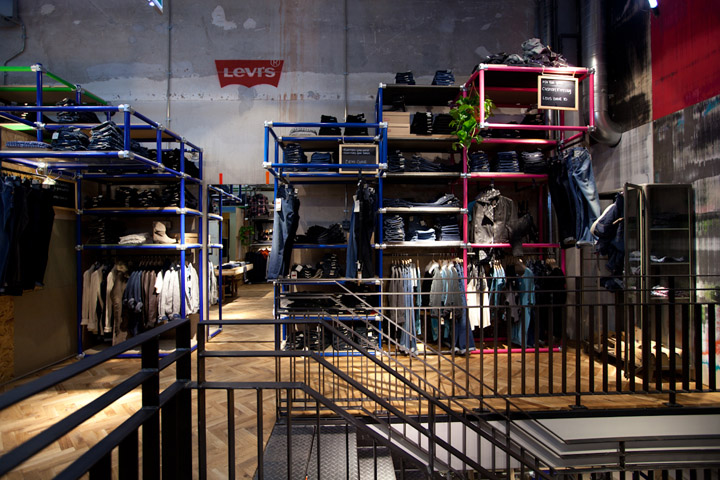
We got lucky when the project got delayed and we had the opportunity to re-evaluate it. We were honest and admitted it didn’t feel right. It was on message, but lacked a certain lightness and sparkle that we felt it needed. So it was rethought and redesigned completely and ultimately made much lighter through the open and colorful shelving systems.

The concept:
“Re-Store”: Re-use, re-brand, re-juvenate

Our inspiration:
Art, installation art, street structures and scaffolding, temporary structures, design out of necessity, and exploring new ways to retail denim.
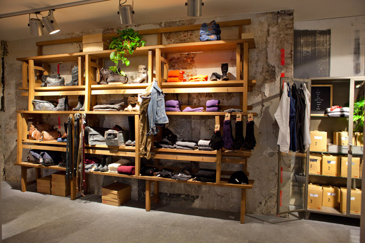
The following materials were used or re-used in the project
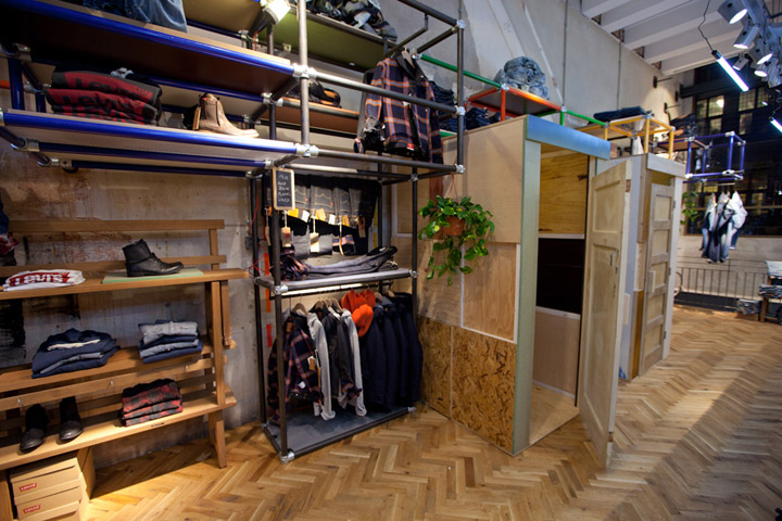
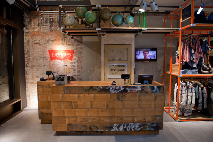
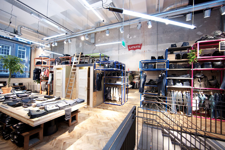
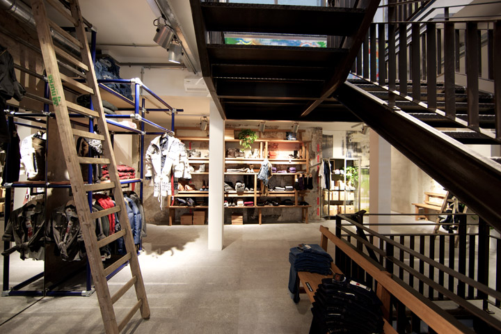
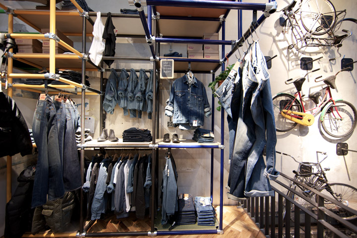
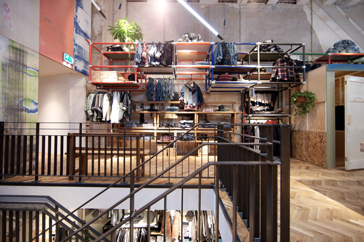
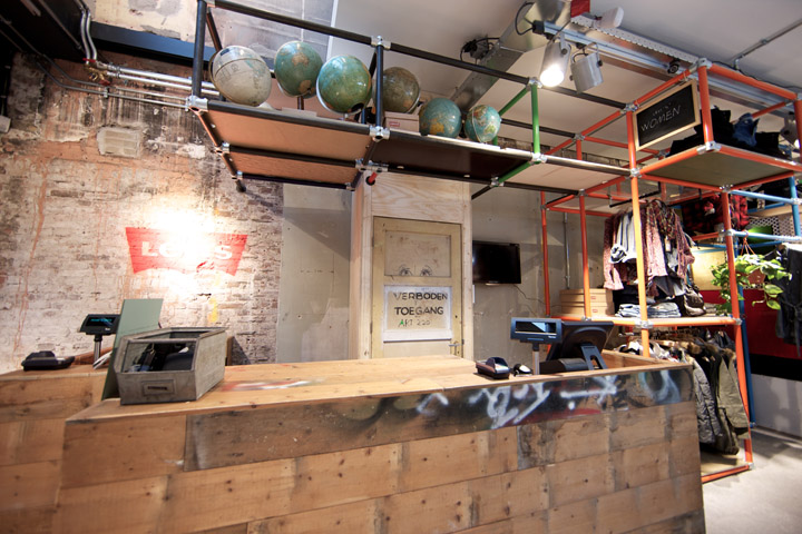
+ The pipes used to make all the framework came from second hand sources or demolished installations. Nothing was ordered or fabricated for this project.
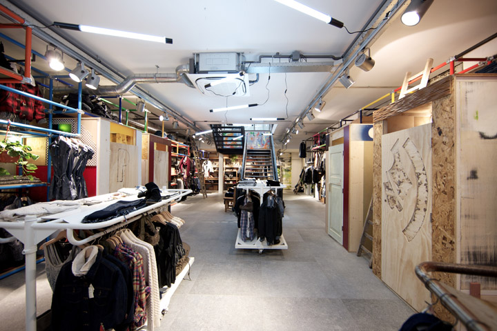
+ The lighting used in the store was re-used from the Levi’s® Bread and Butter trade fair earlier in the year.
+ The wood on the second floor was also re-used from the same trade fair.
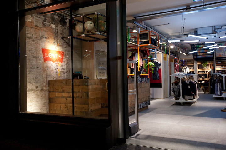
+ The cash desk was made from the floorboards demolished from the second floor of the building
+ We are the first ones to use the 90 x 90 tiles on the ground floor, produced by REFIN in Italy and with an environmentally responsible certificate
+ Several walls were finished in recycled wall panels normally for rental and used 100’s of times before mounting in the store.
+ All the shelving was made from discarded or extra plate material.
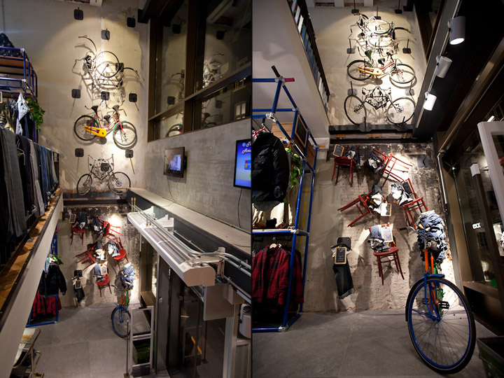
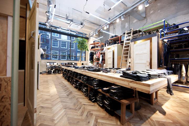
+ All the changing room houses were made from recycled and excess wood and materials used in this project or others
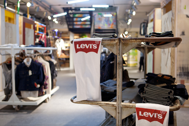
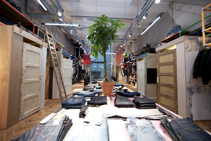
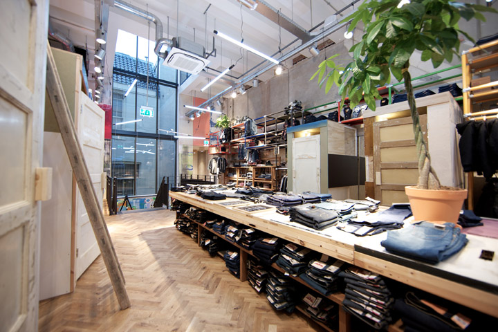
+ The “denim table” is made from old doors and mounted on old church benches
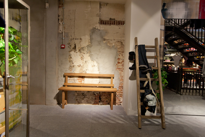
+ All freestanding shelves and benches are made from church benches taken from a church in the East of The Netherlands
+ Display cabinets and carts are all second hand
+ All hanging lights in the rack and changing cabins are second hand and use energy-saving lamps.
+ There are no signs on or in the building- therefore no use of acrylic or other such materials. Levi’s® Logos are merely spray painted on the wall in 2 spots.
+ The bike sculptures are created out of old bikes welded together.
+ We’ve used plants and trees everywhere.
+ We’ve left 80% of the walls as they were.
What we are most proud of.
How natural the store feels. How colorful, friendly, accessible and humorous it is. How different it is from anything else at the moment.
Photography: Zowie Jannink
Design:
Como Park Studio
info@comoparkstudio.com






Add to collection
