
Add to collection


Following what Mark says in an interview: ‘If you are operating from the comfort zone, you are in the wrong business’. This is how we have dealt with this project. Ecko is not a catwalk brand; it is not something that can be measured or classed within a trend.

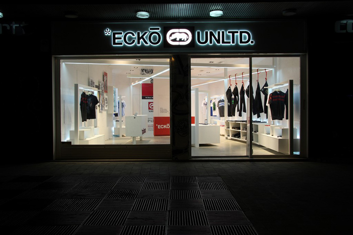
Ecko represents the most rebel heart from NYC; it is the response to the adoption of bourgeois ways by fashion, the commitment with people on the streets that have made of NY the iconic city that represents to the rest of the world. This is why Ecko stores cannot be a standard commercial place. They have of course to comply with certain parameters that cannot be avoided but, at the same time, they can skip many rules that other brands cannot.

For us, Ecko deserved a store image that got the feeling of the most authentic NY from the 80’s and 90’s, those years in which NY was a high-spirited city in which the most exciting social, artistic and cultural events had place. Our idea is to mix the best things from the past with the present New Yorker icons that will last in the future. We want to show in a clear way how a city and a culture may have influenced our lives and how Ecko is a brand that has not only been influenced by NY, but which has also been part of it, has contributed to it and still contributes actively to keep it alive.

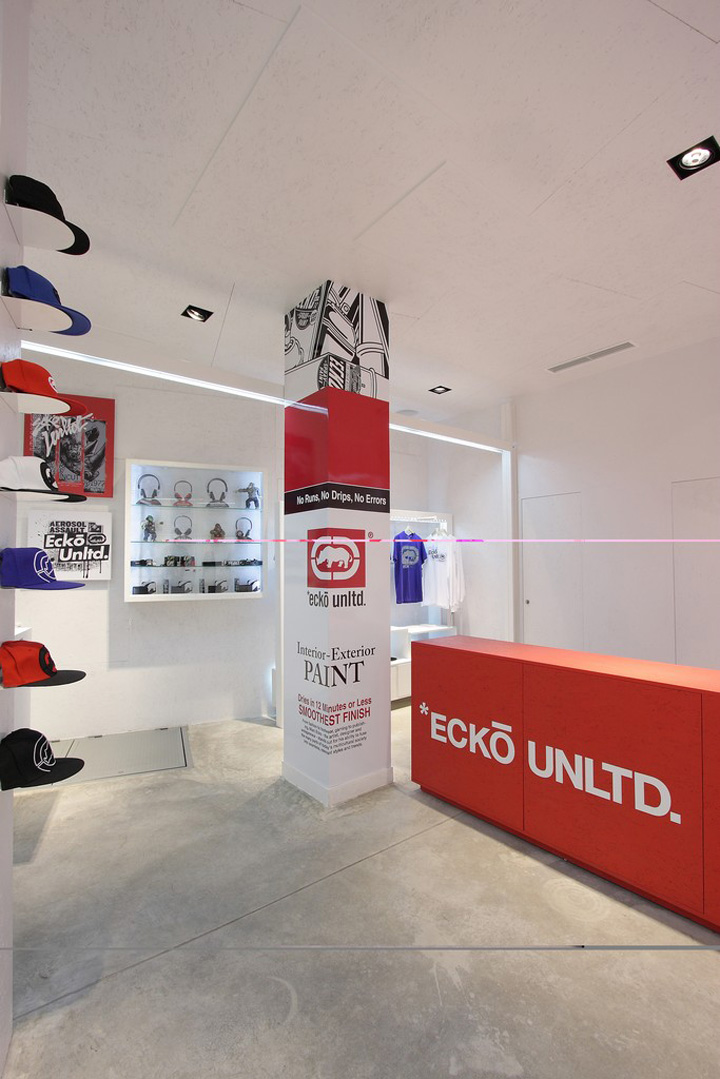
NY is a city that has changed a lot during the last 20 years but, at the same time, has kept its chaotic aspect that a city of this kind cannot help. We have also wanted to pay a tribute to the urban art and the graffiti that is in the brand since its beginnings, with a red heart that transmits passion, strength, power, confidence and respect for those who have seen it grow. This is a little tribute that we think is necessary and that will confer the store a feeling of authenticity and commitment.

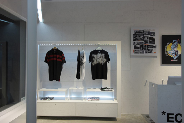
Just like a good piece of art, a good project is solved with few elements that express for themselves. In our case, this is a dogma, so we always try to turn out the space into the perfect connection between the product, the brand concept and the customer. Our store will be a space where the customer will perceive in a simple way what Ecko represents and he will feel part of it and also that he is important for the brand.

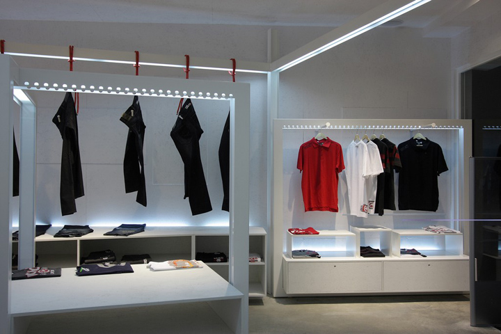
The sources of inspiration have been urban icons, simple elements like a scaffolding, which is a structure that has covered and will always cover the streets of Manhattan. Other elements are the construction fences, made in OSB boards and displayed in random order and painted in white to confer the place a warm texture, putting out of context a material that will provide a new value.

In order to break with such an orthogonal space, we have decided to create a structure that, apart from being used as a base for the lightening, it casts a perspective to the back but turned with respect to the premises, so in this way we emphasize the chaotic spatial effect we are looking for and that represents the current NYC so well.

In short, we think that this store is the mixture of the three most representative elements of the New Yorker life and culture, remade to make people feel the purest Ecko essence and that when they are in the store they forget for a while that they are in a city that it is not the Big Apple.
Designed by Stone Design


http://www.arthitectural.com/stone-designs-ecko-unltd/


Add to collection