

Located on the prestigious Princes Street and facing the historic castle, Primark Edinburgh occupies approximately 7,000 sqm of retail space, over five floors. The new façade makes a dramatic impression on the street, with reference and sympathy for the surrounding heritage, whilst using finishes and architecture that reflect the narrative of the brand. This store realises Primark’s
desire to create a landmark store, in the capital of Scotland. The store design reflects the fashionability the brand has established and moves the scheme forward in a competitive market.

At street level, openings through to the floors above and below give customers a glimpse of other levels, helping them to understand the offer and navigate the store. The architecture of the interior is a response to a challenging footprint, which works to support the customer journey. A neutral palette of finishes sits as a backdrop to an evolved suite of sub-brands, and allows maximum expression for departments, collections and campaigns. Circulating vertically through the building, dynamic angles and ceiling treatments vary, developing the principals already established in other Primark flagship stores, while offering a new and contemporary twist.

The escalator atrium is a key feature of the brand experience. The atrium wall uses digital screens to interact with passing visitors and reinforce the value and fashionability of the Primark offer. At the top of the atrium, large LED lighting rings in the brand colours are suspended from the ceiling, complementing the soft curves of the wall graphic. Colour, light and form are combined here to create a space that is uniquely Primark, as the customer moves between floors. Towards the Rose Street end of the building a unique staircase appears to float in space, with glass flights spanning the atrium, easing a challenging customer journey.

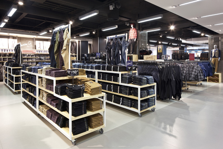
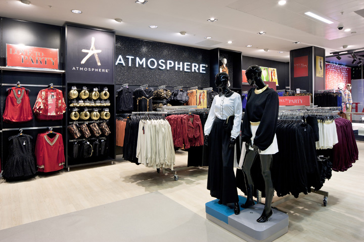
The ceiling and lighting treatments reference the walkways below, assisting the customer journey whilst creating dynamic vistas throughout. The general lighting is made up of bespoke fittings designed to create a fresh aesthetic for this evolved scheme. The architectural package is complemented with a new suite of fixtures designed to give maximum merchandising flexibility. The perimeter package is made up of modular equipment that allows expanses of wall to be reconfigured with minimum disruption.

It is designed to support more VM than ever before and offers endless display combinations. Similarly the midfloor fixturing is reinvented to create furniture with a common handwriting. It offers greater density, smaller footprints and increased flexibility, whilst supporting visual merchandising, ticketing and seasonal or brand graphics. Much of the equipment interfaces between the perimeter and midfloor. Dalziel and Pow and the Primark store development team are committed to the ongoing development of the Primark brand throughout 2012.

Contact:
David Wright
Group Marketing Director
d.wright@dalziel-pow.com
+44(0)20 7837 7117
www.dalziel-pow.com


