
Introduction of the Client
Our Client, The Mart Ltd. building engineering trade company plays a signification role as market leader in the field of sanitary- and building engineering trade in Hungary. The company was established by the Austrian ÖAG Group in 1990, since 2008 operates as a /independent/ Hungarian enterprise.
From the competition to the concept
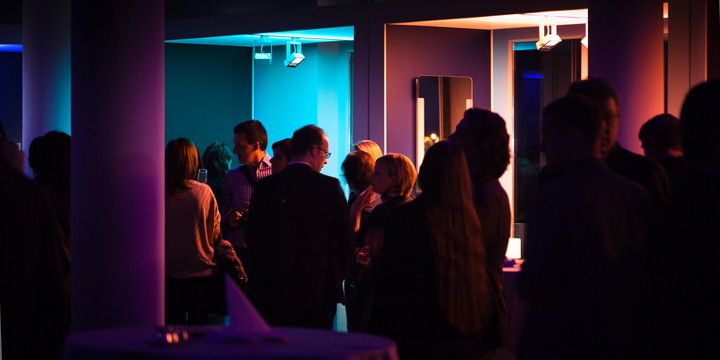
The Mart Ltd. has announced a competition for interior design to create a new “generation” showroom, a showroom which has never seen before on the Hungarian market. The 680 sqm, rented area is located at the ground floor of the Proform office building. The interior design competition has included a new concept of strategy operating with different functions in a parallel way which turns the usual way of sale to a new platform and offers a communal forum for the client of the architecture- and interior design profession; for contractors and for consumers.
Description of the interior design concept
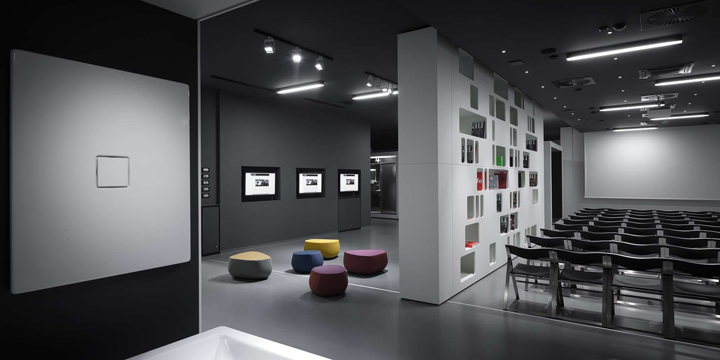
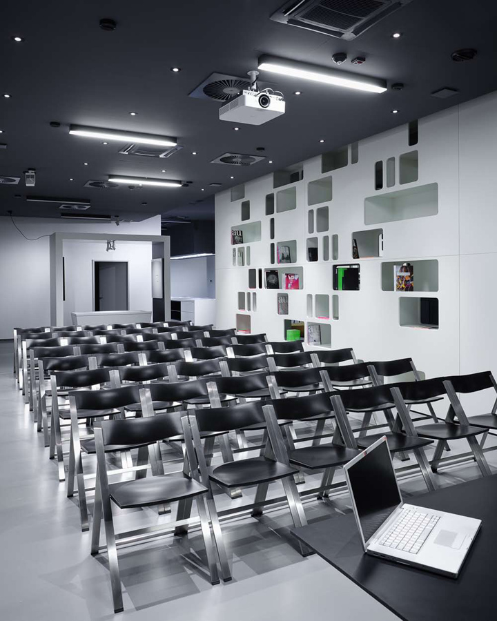
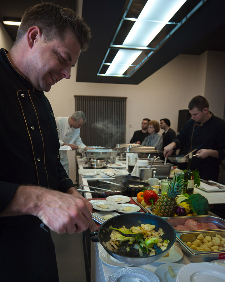
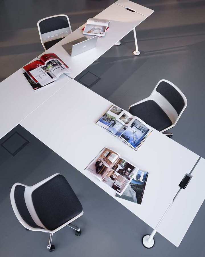
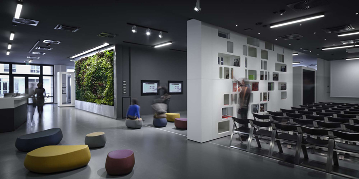
The leading idea of designing was to create a decent, elegant space which is able to be flexible and to represent an enduring value. The functional structure of the showroom includes various services: exhibition hall, conference hall, point of education, cooking school, sales counter, lounge, restroom.
The usage of material and form
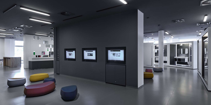
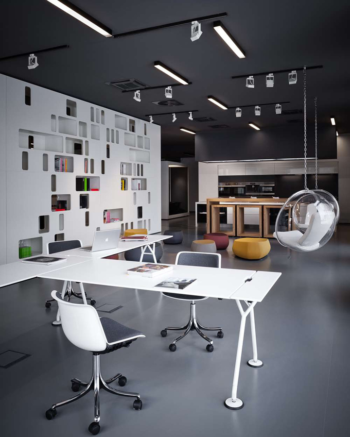
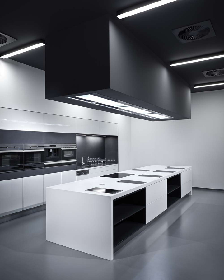
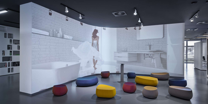
It was important for us during the designing period to keep the multifunctional space visible and flowing and try to visualize it as one coherent space. The monochrome colours, the coherent usage of materials and the minimized, functional, custom furniture elements / dark grey, monolith ceiling; lighting armatures in black, grey- green rubber floor, white and anthracite painted MDF furniture/ intensify the homogeneity of the interior.
Installation box
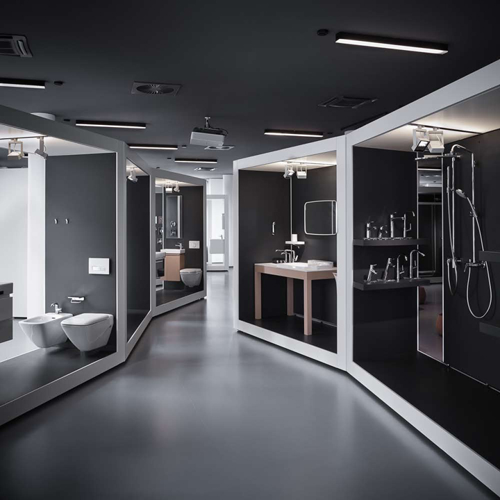
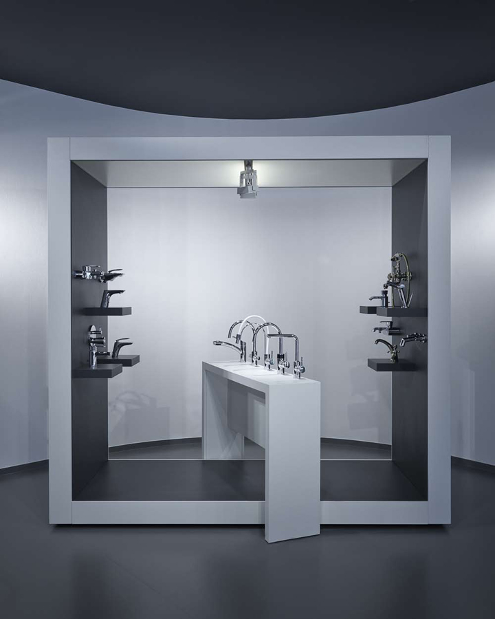
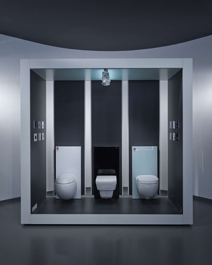
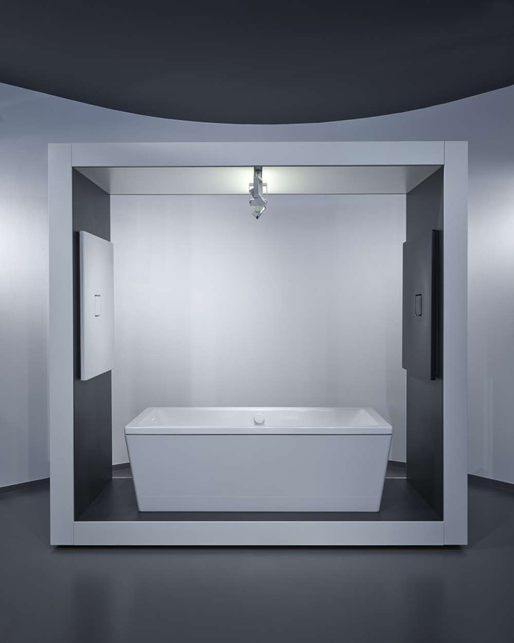
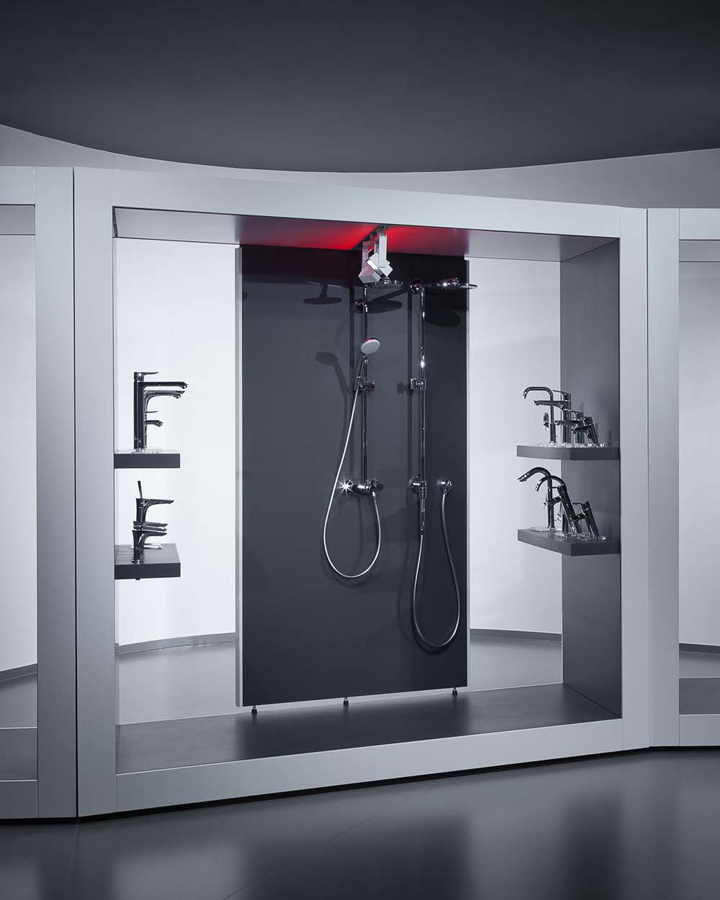
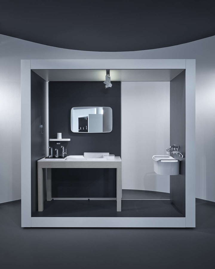
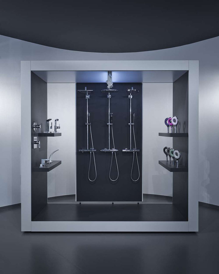
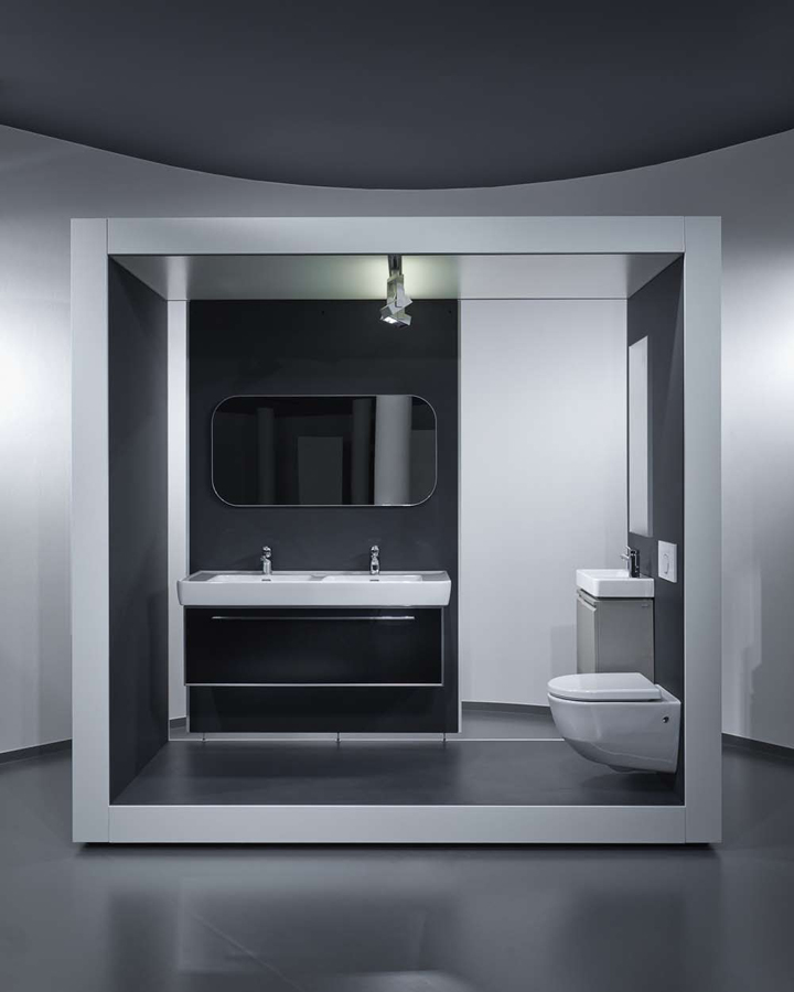
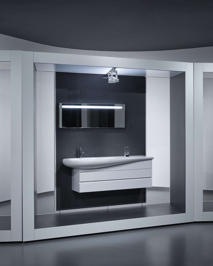
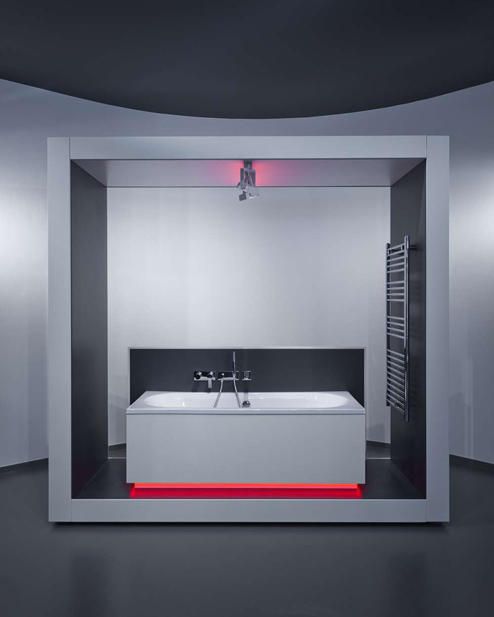
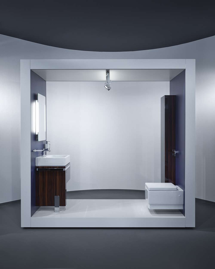
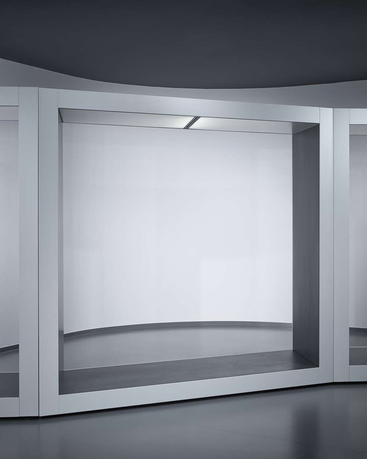
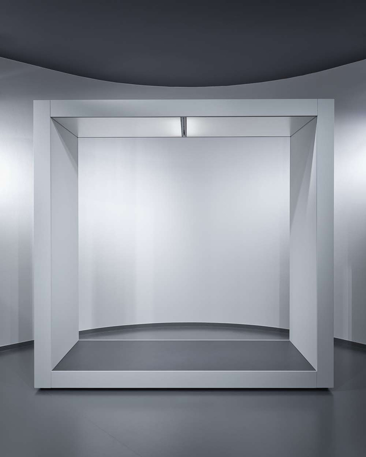
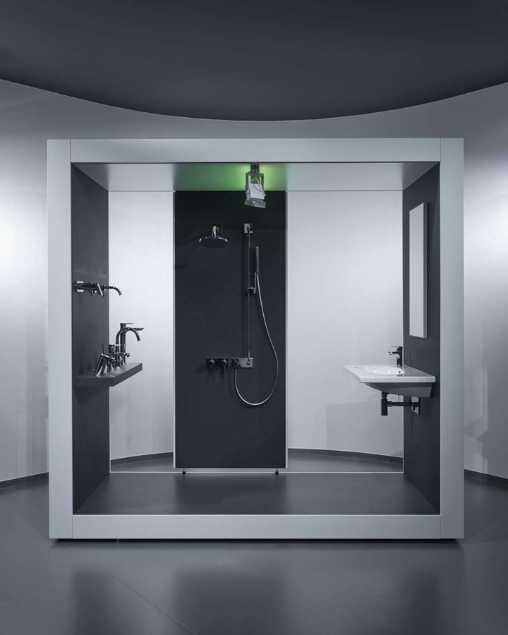
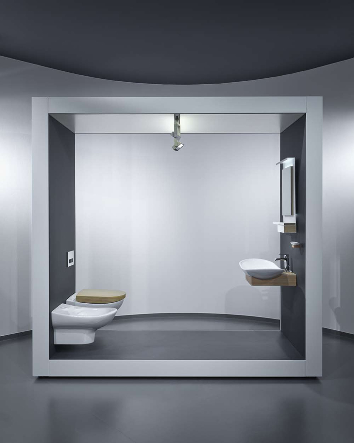
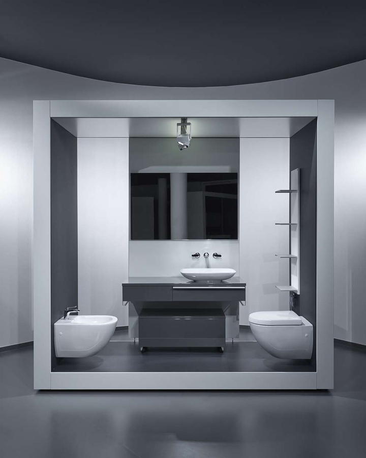
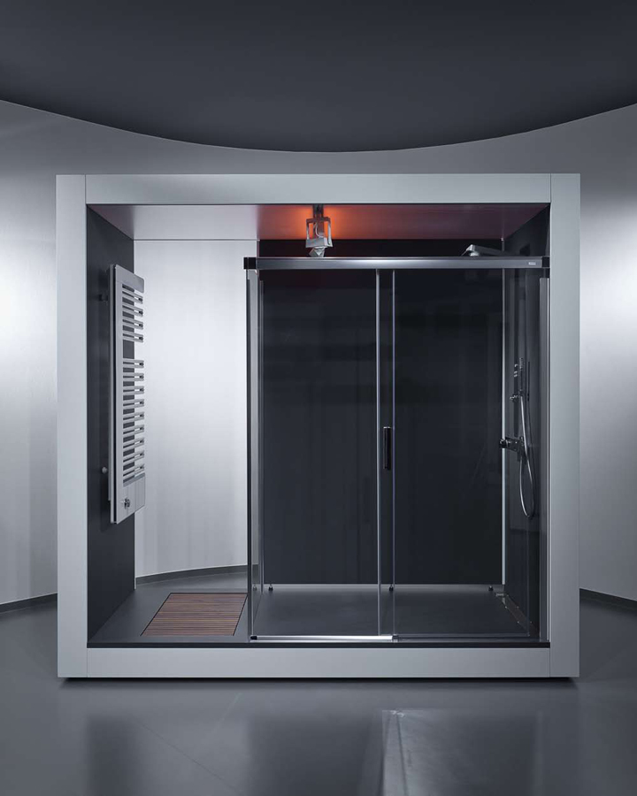
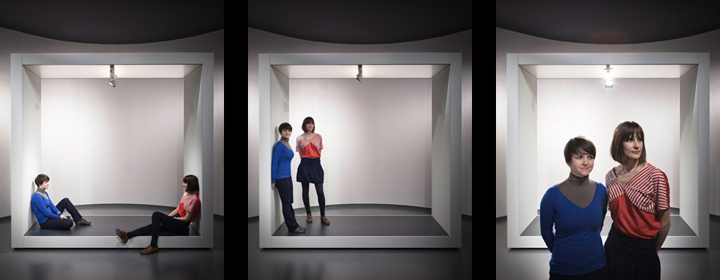
The custom designed mobile installation boxes are responsible for the flexibility of the space. This approach to the exhibition shows the sanitary wares in a new context. The selection of the sanitary wares mirrors the unique identity of the sanitary companies instead of the conventional method. The castor installation boxes with levelling feet make it simple to rearrange the interior. It is possible to make exciting forms, structures with lining up the various constructions /rectangular, rhombus, inverse of rhombus/, it resolves the strict pillar raster of the space.
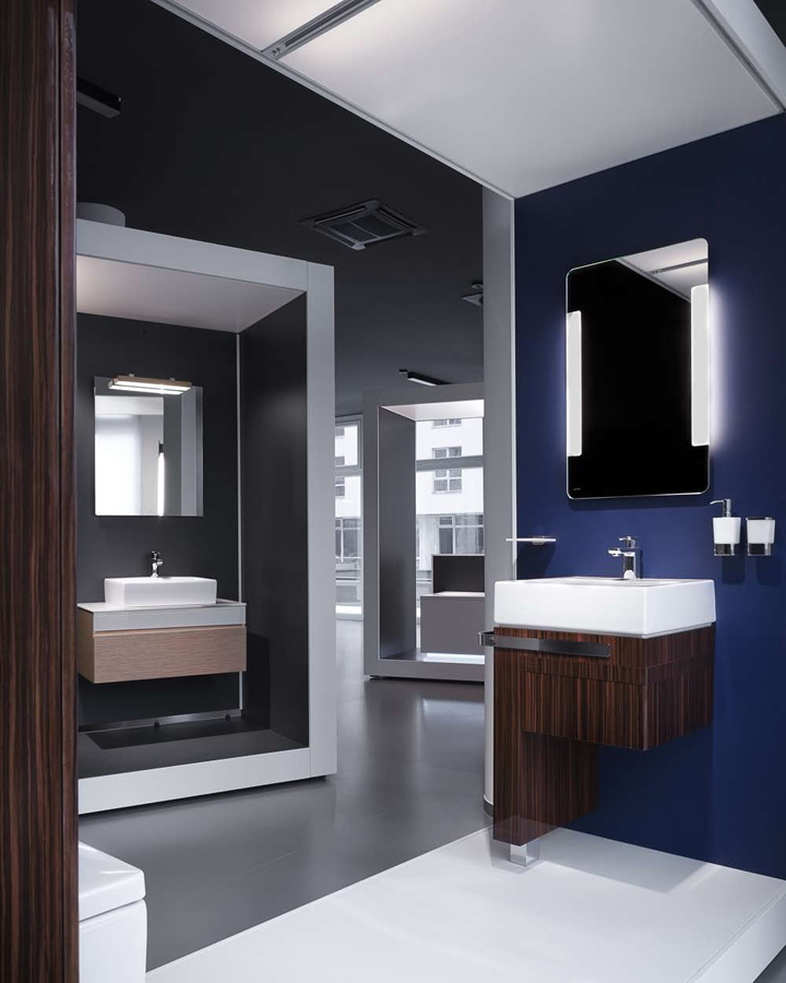
The form and simplicity of the frame of the installations unites the diversity of sanitary companies and though keeps the space clear. The boxes get electricity from the ceiling. The raster electric points on the monolith ceiling /spot, rail adapter helps/supports the flexible position of the boxes. Each box has its own, internal lighting /spotlight, diffuse light, some boxes with coloured LED light/. The internal anthracite- grey painted MDF surface of the box gives a homogeneous and contrast background for the exhibited sanitary wares.
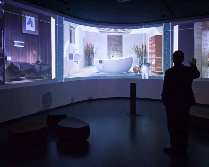
The external white painted MDF skin turn keeps conversation with the other custom designed white furnitures. The internal walls of the boxes are mounted, repairable, interchangeable. (can be serviced, repaired, changed). The innovative usage of visual communication devices enhances the unique appearance of the exhibition. Touch screen LCD displays, personalised softwares /interactive image viewer wall/ help to present a big range of products.

Natural green wall
In the middle of the space as part of the sales counter takes place the live green wall applied with irrigating system. It has an iconic view, gives colour and natural feel to the space.

Colours in the space
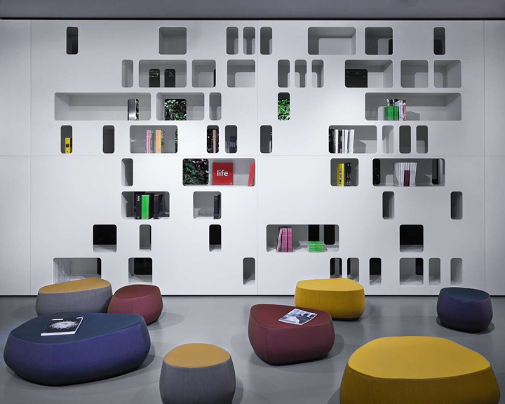
The colourful Moroso pouffs dissolve the monochrome colours and enhances the colourful iconic point of the space.
Custom designed furnitures/ restroom
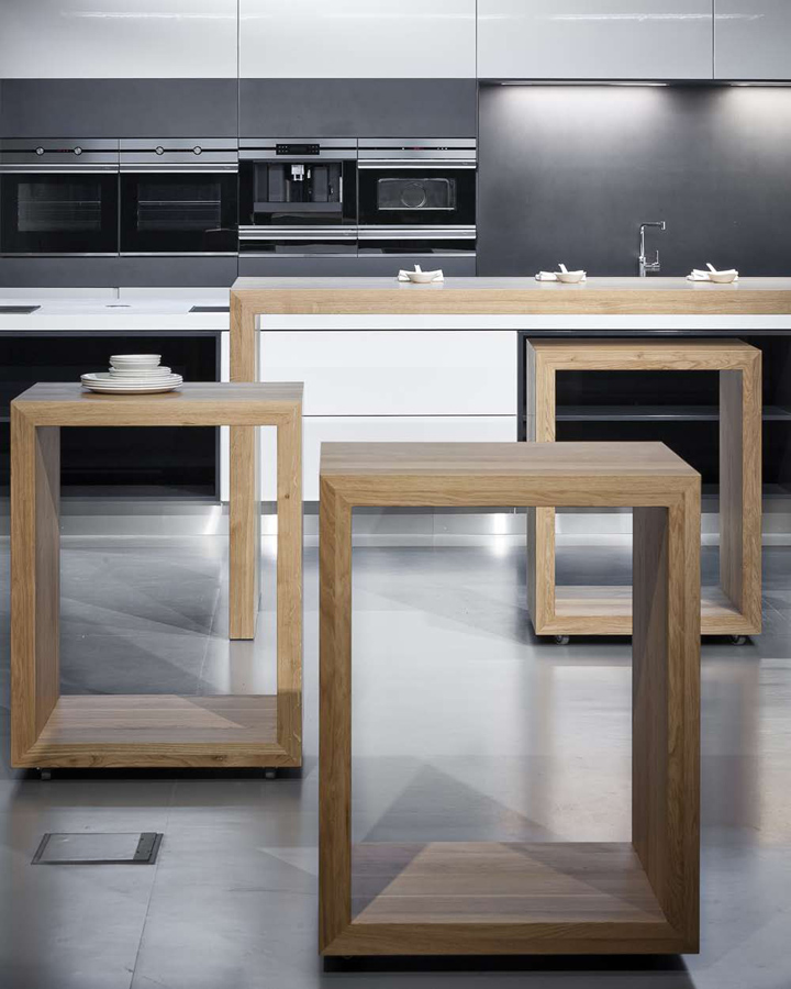
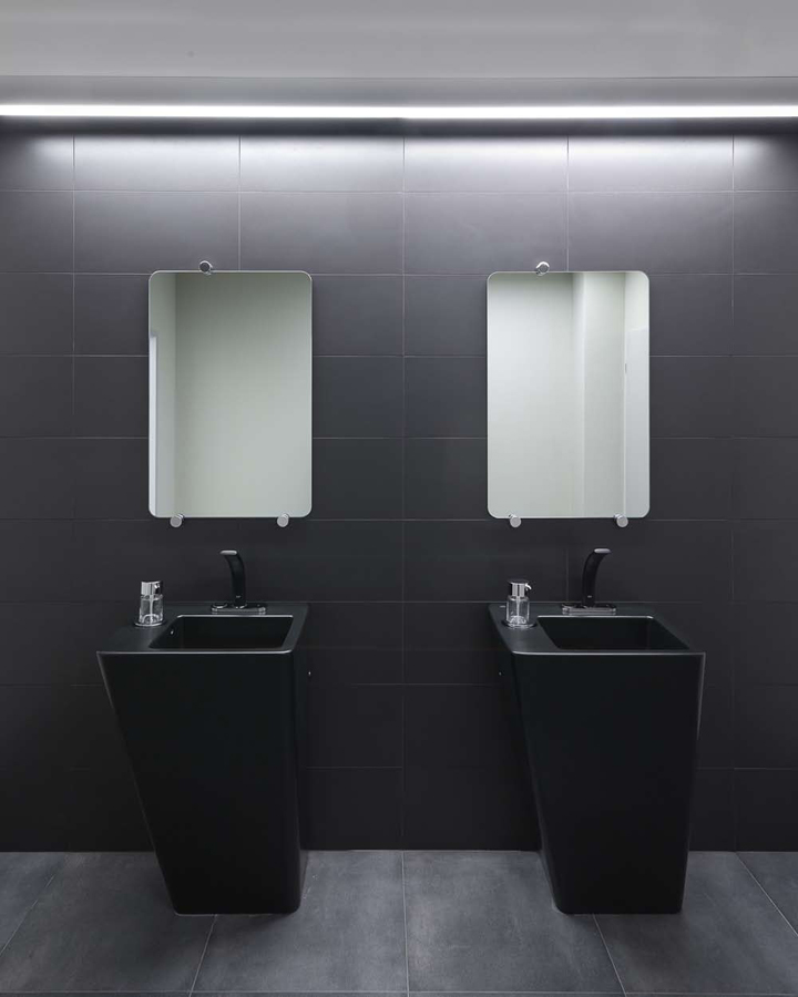
Each functional space is defined by custom designed furnitures. The perforated divider shelves at the conference hall and at the point of education can be used as a library of subject catalogues. The cooking school shows up as an island in the space therefore it helps to release the professional tension. The isle is flat white corian coated, that is in harmony with the dark mass of the vent hood above it. The restroom is a special part of the exhibition area.
Interior design: FLÓ Architects (Ágota Demeter, Linda Csővári)
Strategy concept: Péter Széplaki
Green wall design and realization: Mohány és Páfra (Kriszta Dancsuly, Márton Kiss)
Lighting design: Ferenc Haász
Personalised softwares: Binaura (Bence Samu)
Graphic design: Kriszta Klebercz
Photography: Beamphoto
Interior design coach: Kazimír Medveczky







Add to collection
