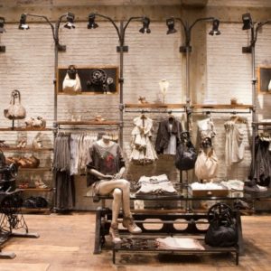


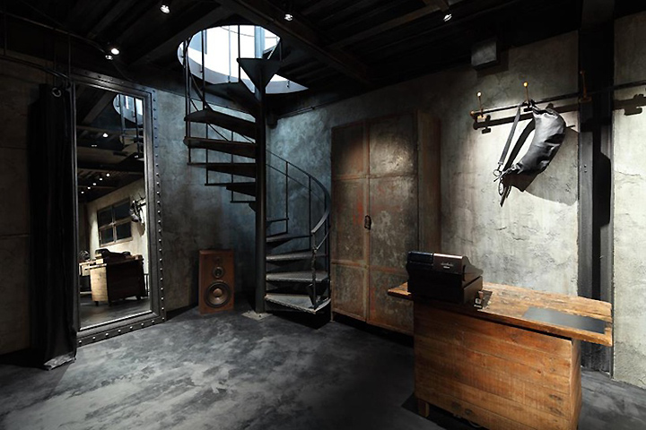
Tokyo-based designer Ito Masaru has completed of ‘Backlash’ a retail store which sells high-end leather goods and clothing. The entrance is a military-looking antique door with a small plate inscribed ‘Backlash’, that opens to a space with a taste acquired through a series of processes over a long period of time. The underlying spirit is just like the one in the brand’s well-processed leather clothes. The floor and walls are finished with plaster. The floor is made of mortar mixed with charcoal to create an uneven texture while the walls are antique-finished to express a sense of accumulated time like an old barn.

As to the structure of the building, black oxide steel is used, which was processed to be partly rusty, reflecting the brand’s philosophy just like the floors and walls. The fixtures include a workbench with a thick wood board with a distinctive texture after a long use in a factory, rusty expanded metal lockers exposed to the weather, an aged customer counter with a vise, and a plain and tough hanger rail.

Each was carefully selected and installed in an exactly right place just like the way the owner selects and sets leathers, buttons, and zippers when making clothes. A heavy-looking spiral staircase at the back of the 1st floor rhythmically leads to the totally different space on the second floor. It is a symbol of the will for further pursuit of improvement from the regular brand Backlash to the custom-made brand line.
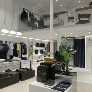
The second floor is the space for line, which is the custom-made line for high-end leather lovers who discovered the beauty of the material from Backlash and are looking for higher levels. It is a new concept brand born out of Backlash. This is why the space is like an all-white clean room reminiscent of a laboratory or operating room. White resin flooring is used for the floor, only 100×100 white tiles for the walls, and hairline stainless steel for the ceiling and fixtures.

As for lighting, only indirect white one is adopted with no down lights in order to produce the extremely minimal space. A stainless steel rack was installed for displaying samples and a counter to take orders. And in the back of the floor, two industrial sewing machines were placed as symbolic elements with plants of the owner’s choice next to them. The organic color and form of the plants are in sharp contrast with the inorganic space, emphasizing the latter. Organic and inorganic, clean and dirty, black and white, and time and space, these opposing notions symbolize each other, merge, and finally simmer down to transform themselves.

http://www.designboom.com/weblog/cat/30/view/20977/ito-masaru-backlash.html


Add to collection

