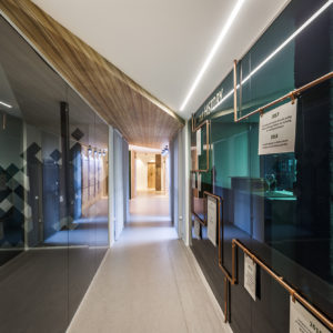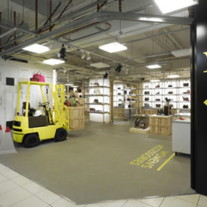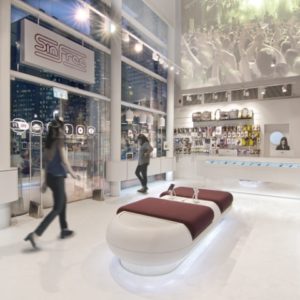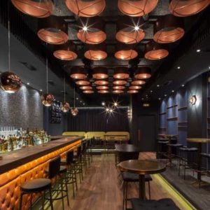


The goal is to enhance the product by providing an environment that provide a strong aesthetic appeal. It is intended to convey an idea of the quality of the product by associating it with an architectural quality of space, as a frame that enhances the picture. We have chosen to depart from the traditional image of the shops and their evocative informality, to search for a more sophisticated and elegant language, unusual for this kind of shops, similar to the elegant shops of the center: a “boutique of bread”. Particular attention was given to this language, combined with modern design, it would make the space too cold or just not comfortable making customers feel at ease.

We have chosen materials that can then convey this sense of elegance, but combining them in a way that is harmonious and in tune with the products for sale. The white calacatta marble floor rises to cover the fronts of the counter, creating a white continuity that enhances the richness of multi-colored baked goods on display. To protect only a single simple crystal casket.
Work equipment, baskets of bread in plexiglass, the ovens are framed in polished stainless steel to enhance the technological beauty.

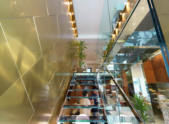
Above, a wood paneling is raised to the ceiling. It is made of polished mahogany with a design that highlights the opposite wood lines. Inspired by the austere monumentality of a old “boiserie”, expressed in a modern way. On the other side was arranged a mezzanine to increase the availability of seats. It is made entirely of polished steel and glass, as well as the stairway, which mitigates the look, making it very light.

The wall on which it is again a further reinterpretation of the classic wood paneling, even more extremist in the sign and materials. It is entirely paneled in satin brass with different thicknesses. The direct illumination makes it alive and shiny and its golden color fits well in the context. On the mezzanine, white leather furniture turn this corner in a lounge where you can have lunch. At this point the question arises, we are sure that it is “only” a bakery?
Designed by Andrea Langhi


