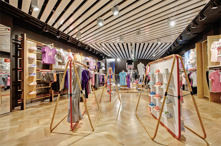

To create a sense of motion, a strong angular grid pattern is present in the floors and ceilings. Parquet flooring evokes a tractional gymnasium floor.
Storeage, the Amsterdam-based retail design agency, has created a new retail concept for Li Ning’s flagship stores in Beijing and Shanghai. Li Ning is one of China’s largest developers and distributors of sports apparel, footwear, equipment and accessories. Storeage was chosen by Li Ning for its connections and experience in the market, and for its expertise in sports retail.
According to Leendert Tange, partner and co-founder of Storeage, the mandate with Li Ning strengthens Storeage’s position in China. Having already worked extensively in this market, Storeage
sees a major opportunity to help Chinese brands grow, leveraging their heritage.

Open structured display units resemble junglegyms.
The two Li Ning stores together comprise more than 6,000 square meters. The 2,000 square meter Beijing store opened in March, and Shanghai, at 4,000 square meters, opened in July. Storeage started its design process with a thorough analysis of Chinese 18-35s. Findings revealed that 93% view mystique is an important factor in making a brand “cool”, and 85% identify with a brand that represents motion. Based on this, Storeage created a brand experience that celebrates motion and creates a mystique around the idea of movement itself.
“Our design concept for Li Ning’s flagship stores will help the brand stay up-to-date and in touch with its target market,” said Leendert. “It is a true celebration of the jump, the leap and the slide that makes each sporting moment great. At the same time, the concept is in sync with Chinese culture, using materials like bamboo, and a color palette of reds and golds.”
To capture this mindset, Storeage introduced a strong angular grid pattern that is present throughout both stores — in the ceilings, lighting and floor patterns. This pattern creates an impression of no-stop movement with no beginning or end.

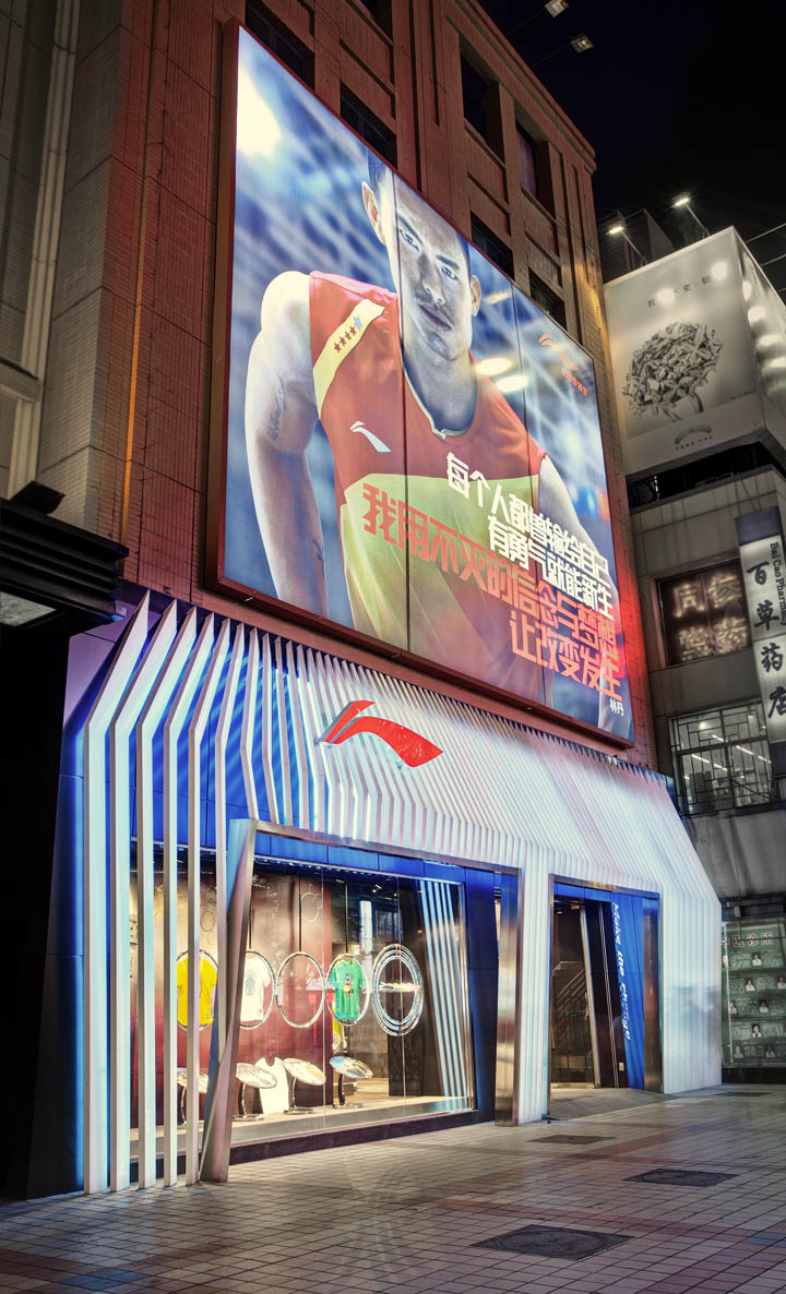
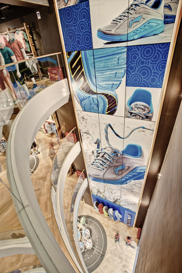
At the Beijing flagship, the theme of motion is at its most visible in the store’s façade. When passing by the store, the sweeping lines of the façade’s lamels create a continuous sense of movement. At the entrance, Storeage created a massive four-storey void space that evokes vertical movement, like the leap of a basketball player. The space features a massive banner with changeable campaign imagery that spans the height of all four floors, and has balconies on each floor that allow consumers to experience the space’s sheer magnitude. The Beijing store’s staircase features wavy bamboo slats and a red line that winds from bottom to top, and the ceiling is decorated with curved aluminum lines. Both features create a sense of motion and activity.

At the back of the Beijing store, a massive four-story void space evokes vertical movement.
Parquet wood flooring evokes a traditional gymnasium floor while playing to the angular theme. Concrete inlays with strong white graphics reference sporting fields, basketball courts and running tracks, highlighting the diversity of Li Ning’s products. Display tables are inspired by traditional gymnasium equipment such as rings and ladders. Hanging display units resemble uneven bars, open structured display units resemble jungle gyms. All feature red and gold accents. The VIP area, that will be used for product launches and special events, features tiered, bleacher style seating and display areas.

At the five-story Shanghai flagship, Storeage created the same strong sense of movement around the escalator area located at the center of the store. A metal framework with angular details surrounds the escalators on each floor – creating a sense of circular and vertical movement – and is used to display footwear relevant to each sports category. The sheer size of the store allowed Storeage to create large central display areas that anchor each department and contain a mixture of apparel, hardware and footwear. It also enhanced the agency’s opportunity to celebrate each of Li Ning’s sports categories. The store’s running pavilion, for example, allows customers to road test running shoes on a treadmill against a changing video backdrop of forests, cities and other running scenes. The table tennis area features a table tennis table to display merchandise while a double layer of white bats create a spectacular backdrop for the merchandising other hardware and performance apparel. The bottom floor features a bleacher-style VIP area. Flooring, display elements and materials used are all similar to the Beijing store.

The store’s staircase features wavy bamboo slats and a red line that winds from bottom to top.
Storeage’s approach of customer research, branding and design has proven to be successful in the Chinese market and has led to new contracts with Chinese fashion and footwear clients. The agency is in the process of opening a Shanghai office to better serve clients and to be in close proximity to China’s fashion and creative industries. And in teaming up with HTNY, the Beijing-based construction company that managed and built the Li Ning stores, Storeage is well equipped to handle large scale projects in China. HTNY provides Storeage not only with excellence in building and installation, but also with the necessary information on local construction and architectural regulation within China.

At the Beijing store, the sweeping lines of the facade’s lamels create a continuous sense of movement.
