

Global creative firm, Bates 141, recently underwent a fresh remodel of their Jakarta space with the help of M Moser Associates. As a sister company to Ogilvy & Mather, the office is both located in the same tower and shares one section of their office.

“The general characteristic of the office fell into place quite early in the process,” recalls Ramesh Subramaniam, who led the project team from M Moser. “The working style at Bates 141 is agile, creative, and intensely collaborative, which are all qualities that tend to be supported in an open, flexible environment in which people can easily see and hear each other, and move to where the action is.”

Because the office is always buzzing with both clients and potential clients, it was important to “instantly convey Bates 141 brand qualities, as well as offering the flexibility to cope with everything from small, private meetings with clients to larger social affairs like launches and celebrations. ”Though the team kept finding industrial style popping up in design discussions, they didn’t want it to be raw and rough, and landed on what they’ve called contemporary industrial.

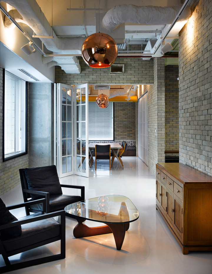
“To the left of the reception desk, a large café/lounge room – shared with Ogilvy & Mather – is visible through a glass wall inset with a trio of glass pivot doors. Behind the desk is a brick wall partly concealing a lounge area, eclectically furnished with a pair of contemporary armchairs, a curvy glass-topped coffee table reminiscent of the jet-set early 1960s, and a decidedly residential looking cupboard.

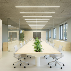
Adjacent to the reception/lounge are a pair of glass-enclosed meeting rooms accessed through collapsible French doors. Like the reception, both are exercises in unexpected but harmonious contrasts, with wood veneered tables and vaguely retro seating balanced against brick walls, exposed ceilings, copper light fixtures, and a white epoxy floor surface.

Another wall – part-glass, part-brick – divides reception from the office’s open-plan work area. Thematically, however, the shift is only a subtle one: the bare white floor continues, as do the bare ceiling and sections of brick wall. Providing the space with its true focal point are its long, bench-type workstations, each consisting of a plank-like top surfaced with random patterns of six different wood veneers. With their supporting pedestals made of clear acrylic, they appear to levitate off the floor. Located at one end of each six-seater workstation is a vertical glass wall – a natural surface onto which staff members can scribble their ideas during impromptu collaboration sessions.”

http://www.officesnapshots.com/2012/10/17/creative-collaborative-bates-141-office-design/
