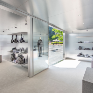
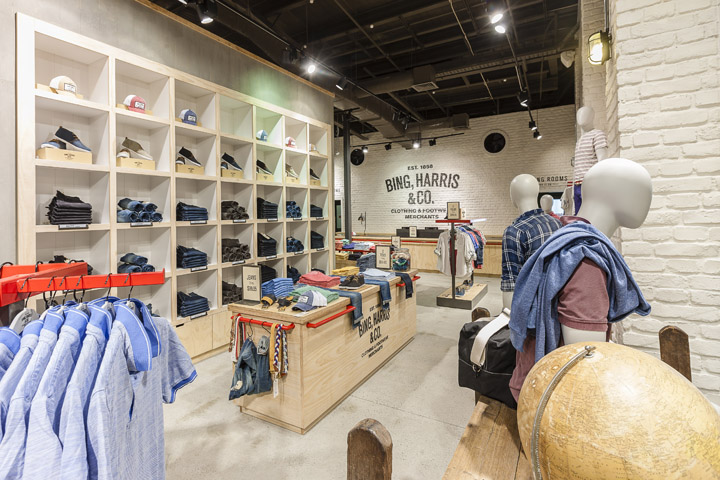

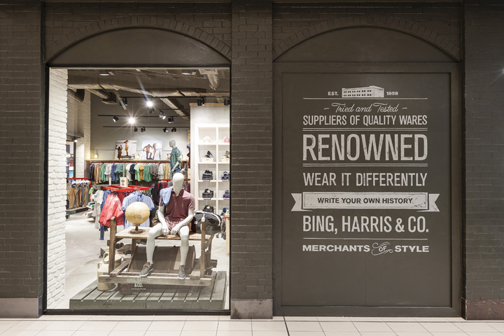
The Store/Store Pad Design Inspiration For The Brand Emerges From Its Past As A ‘Dry Goods Warehouse’. As Such The Materials That Were Used Are Natural, Raw, Authentic And Masculine Such As Brick, Steel/Iron And Wood. These Materials Were Listed As The Key Building Blocks For The Firms Original Structure. These Elements Have Been Taken And Modernised For Today’s Style Savvy Customer.

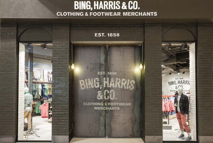
The Brick Has A Modern Wash Of Matt White Paint And The Brand Logo Has Been Hand Painted With A Distressed Finish On This. Old Brand Advertisements Likewise Have Been Hand Painted Onto Key Walls.
The Steel Door And Skirtings Have Been Left Raw But The Piping Used For The Racking System Has Been Painted Bright Red To Modernise And Allow Some Contrast Colour.
The Wood Is A Mixture Of Plywood (Such As Found In Shipping Crates) And Highly Glossed Packing Pallets For Mannequin And Table Displays. Both Have Logos Spray Painted Onto Them Such As Is Often Found With Crated Goods. The Past Is The Basis For The Design But The Future Is Reflected In The Treatment Of These Older Elements.
Designed by Pennant & Triumphs


Add to collection
