Add to collection


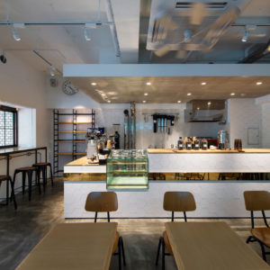
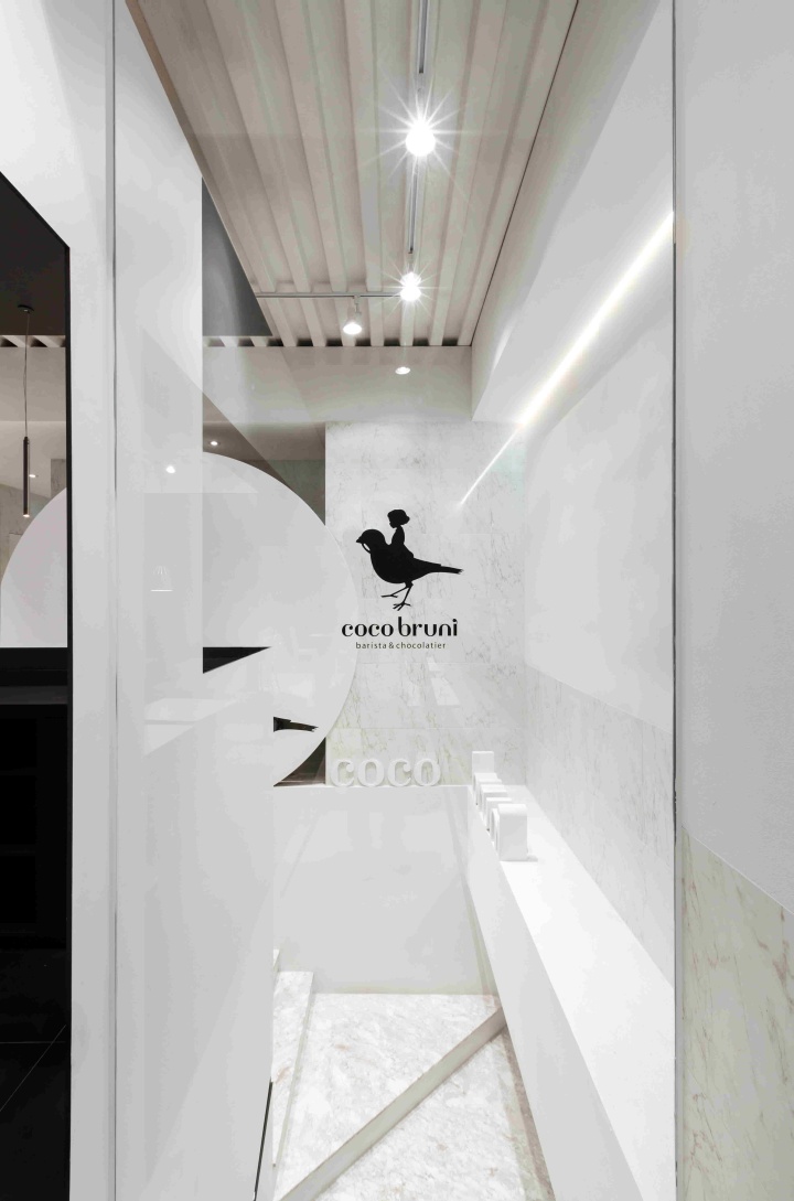
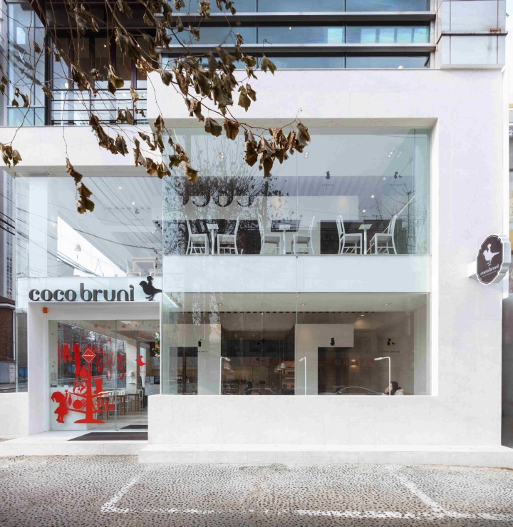
By making cafe necessary through an analysis of the trade area is not a point that shows the image of the brand while you shop here Cocobruni things to show off the interior of various each store has become a brand identity, access I started. I think in order to increase the frequency of use of male customers than female office workers and business meetings frequency, in Sonrunjomu here, and I need a neutral image here Cocobruni i.

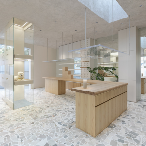
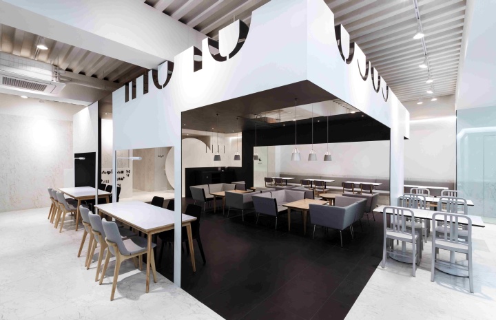
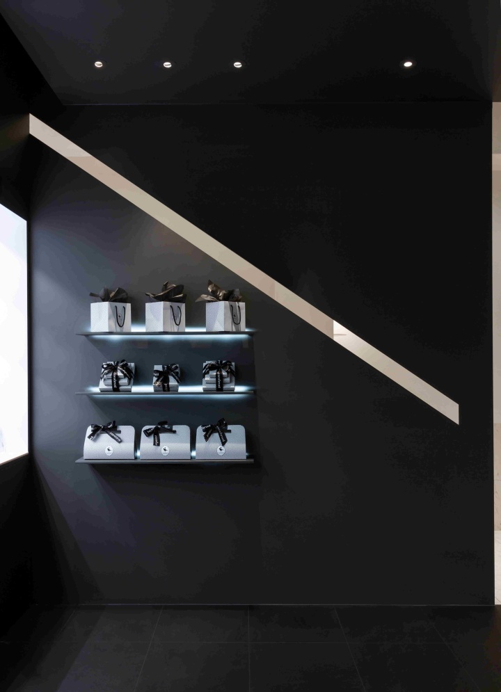
As I approach show a reversal of the reversal of the color and spatial representation of black & white monotone. Structure that can seat all of the in-store based on the psychology of human behavior in space brings comfortable for brand identity can be represented arbitrarily as the logo to eliminate the image of molding images and Cage existing in outer space, but I feel that is seen as white with emphasis most features, in the room, the expression that it is being compared to black space so that the effect of illusion placed between the walls of 10mm in the center of emergency.

To leverage the design elements of the wall, or become a flow line in the representation of the opening and closing a sense of stability necessary for the people, while the other space and black to enjoy the two-sidedness of the space in the white space across the table I am able to plan. I feel the ambivalence that is created so that customers can see just look at the cross-section of the space, but not all, through the experience of the space.

Seating begins to be satisfied from the side. Plan in the space I will often side to make space in the space has been considered to be a sufficient element of side to people the sight of people sitting towards the center more and more to give a sense of psychological stability and is, there is no inconvenience to induce people to space center to sit.

Material space tried to show a change in the texture of the white-collar elsewhere in C using the marble tiles to the height of the table. All walls, but a simple form, is represented as not only oak texture. Graphics of the brand continuously experientially that can give the fun you can attach a magnet to move using the griddle partition center, located consumers to move in a variety of ways the graphics of the brand me applied to elements that can be change.

In the illuminance, the white space in the space black, he was designed in mind that the space that café processing the illuminance dark attributes consumer choice has been expressed variously bright. Not a very beautiful space, the nature of the conversation has been trying to make the space available in the comfort of the user in the unconscious.
Architecture & Designer: Kim Jung-gon, Oh Hwanwoo
Design Office: Betwin Space Design/ (Tel. 02 6402 9665 / www.betwin.kr)
Design Team: Lee Jae-yeol, Kim min-back, Kim hyun-ju
Photographer: Lee Pyo-joon


Add to collection