
The design studio Déri, from Offenbach in Germany, designed the new global stand for Toyota. Déri created am immersive environment that guides the visitors on an exciting journey through state-of-the-art technology: from the large, impressive staging to the small playful design details on to a tangible experience of the product itself. Their holistic approach involved the concept, design, and communication.
The Stand
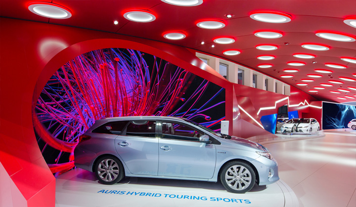
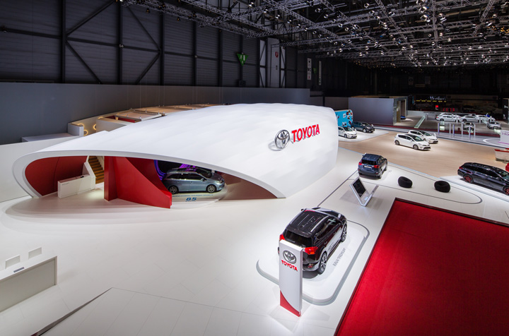
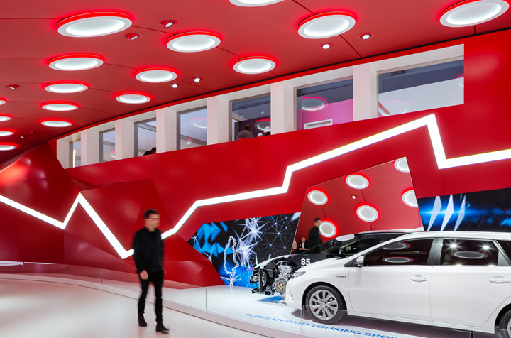
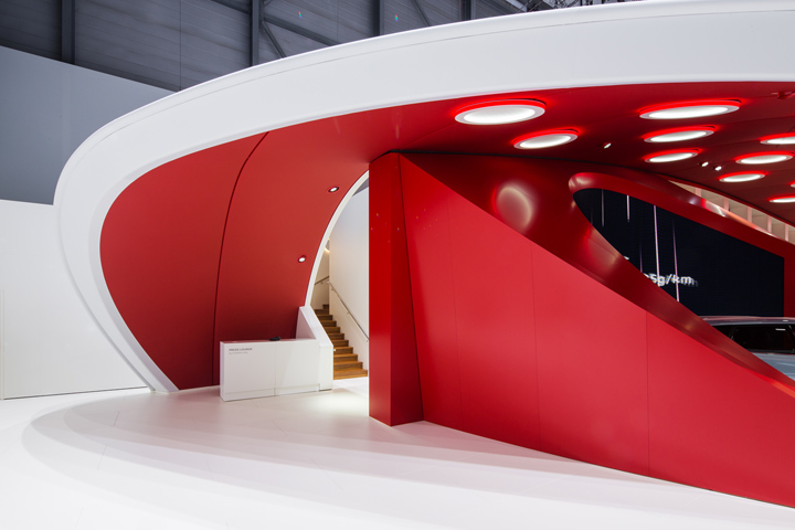
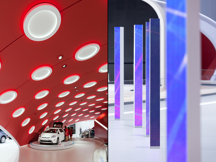
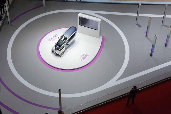
Already from the distance, “The Wave” unfolds its magical attraction. A flowing white form, discreetly crowned by the brand logo, embraces an impressive LED facade. The architecture looks minimalistic and calm from the outside, but you can feel a tremendous force radiating from it. Under its spell, you curiously glide into the interior. Once inside, you find yourself in a surprising environment bursting with energy and filled with large media walls showing energetic, abstract animations. The architecture and the media merge together in such a seamless way that everything feels coherent and harmonious in its entity. The construction of “The Wave” posed a further challenge. This complex engineering task was realised by the Düsseldorf-based company b+s exhibitions.
The Concept
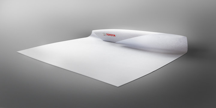
Dynamic and simple, energetic and pure – the shape of the stand reminds of a wave in motion. The design is an illustration of the Japanese principle of Seijaku, the “active calm” or serenity in the midst of activity. By creating “The Wave”, Déri Design delivered the idea that prevailed in the international competition for this prestigious project. The key to success was a combination of the profound understanding of the brand and Japanese culture as well as a simple, surprising, and bold solution.
“The Wave design was not created only as a symbol or metaphor, it is itself a full unforced creative intent. Its beauty lies in its natural and uncontrived appearance that portrays the asymmetrical balance we find in nature and at the heart of Japanese aesthetics.” says Alia Ramadan, the design director on this project. “After a lot of research on Japanese design tradition and experimenting with different shapes, we rolled a piece of A4 paper to visualize the idea. From that moment on, we knew that this was the concept we wanted to go for and make it happen.”
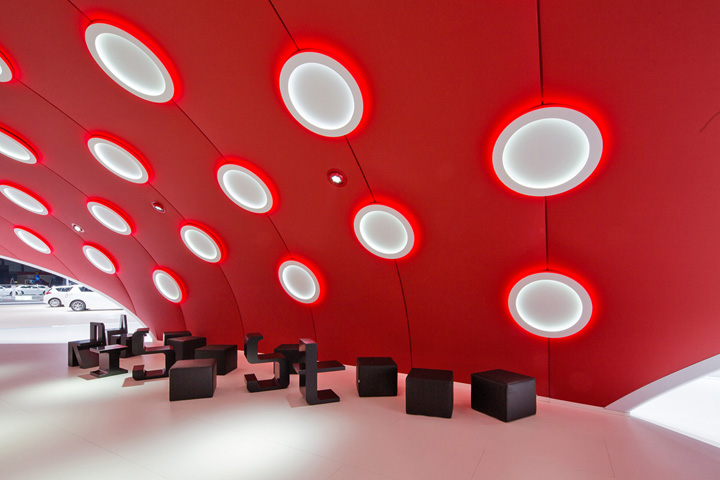
The communication is also based on the principle of “active calm.” Everything is in constant motion, connected, active, interactive. Each second, the viewer is surrounded by millions of impressions. And yet the area is filled with a certain calmness resulting from the profound harmony of all elements. Abstract forms become organic, soft shapes collide with hard edges, multicolored explosions melt into monochromatic paintings, and all is perfectly orchestrated in this surrealistic digital microcosm.

Concept, design and communication (animations, films, interactive) by Déri Design
Design and Architecture director: Alia Ramadan
Architect team: N. Dzavikova, R. Pérez, P. Acewicz
Realization, construction, engineering and logistics by b+s Exhibitions.
Photography by H.G. Esch




Add to collection
