
In the Quechua language of Peru Pakta means “union”; in this case the union of two cultures and their respective cuisines. The interior design created by El Equipo Creativo emerges from this same idea, considering that Japanese cuisine is the basis of the nikkei gastronomy but wrapped in Peruvian tastes, colours, traditions and ingredients. With this in mind, the basic elements of the restaurant such as the bars, the kitchen and the furniture are designed with a clear reference to the architecture of the traditional Japanese taverns.

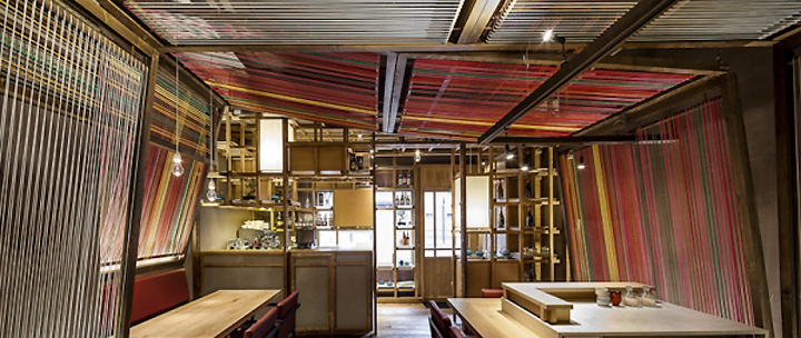
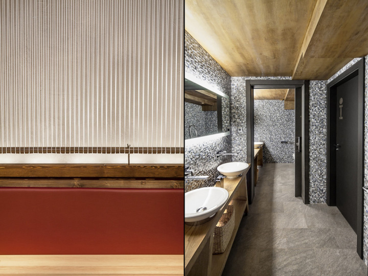
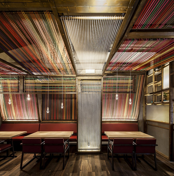
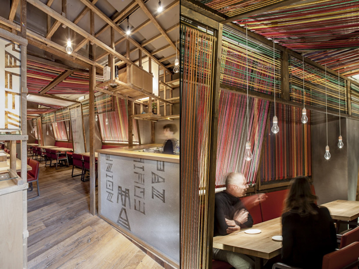
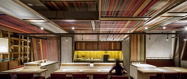
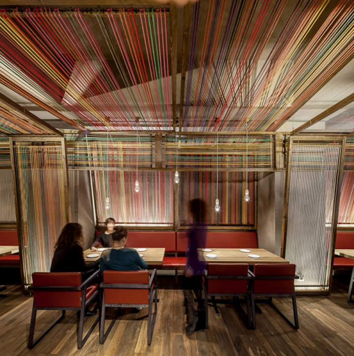
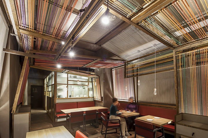
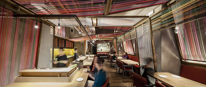
An explosion of colours evocative of Peru envelopes the space. This chromatic “second skin” is achieved by use of a direct reference to the Peruvian loom, offering a surprising combination of colours which contrast with the austere Japanese design, and underlining the deep-rootedness of this artefact in Peruvian arts and crafts.

However, the re-interpretation of the Peruvian loom goes further, sequencing its own elaboration process on the walls of Pakta, transforming this flat surface to offer a tridimensional character to the space, adding vitality and movement and blurring the limits which mark the locale. The traditional Peruvian weaving looms are wooden mechanisms where colored threads intertwine in various directions, forming a suggestive tridimensional space which generates an attractive atmosphere transformed and reinterpreted in Pakta.

The final result unites the re-interpretation of these two cultures–Peruvian and Japanese– by means of some of their most emblematic traditional elements, creating a visually potent but balanced solution, at once spontaneous and rational, hilarious and silent, surprising but strangely familiar, as is the nikkei cuisine itself

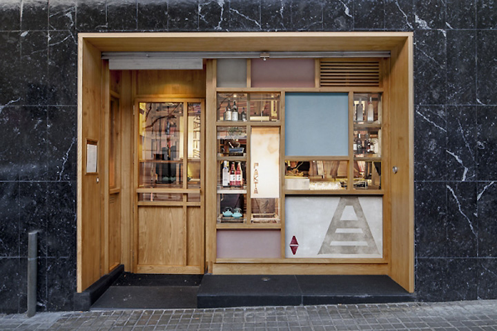
As the small locale is long and narrow with a tiny facade, from the beginning of the project it is clear that maximum advantage must be taken of the space. The work areas are divided into three zones: In the entrance, the sake and pisco bar also acts as a filter between the interior and exterior of the locale. It is a three dimensional framework which serves as a shelf, visual filter and product display stand. Facing outside, the bar becomes the facade and welcomes guests with a composition of faded colours, Japanese lamps, graphics elements and a small selection of products on display. In order to enter the restaurant, the guest passes through the wooden framework, as an introduction to the dining space.

Presiding the dining area is the sushi bar. Structurally speaking, it is completely antagonistic to the sake and pisco bar as it is composed of three heavy, luminous stone pieces, upon which the sushimen work slowly but surely serving directly to the clients who sit around them. The idea of dividing the bar into three separate and elevated “stones” helps to contain the reduced scale of the locale and create a sense of strange levity among the heavy pieces.

Closing the space at the end of the dining area is the kitchen, conceived as a luminous box which allows the cooks inside to be observed through a layer of glass panels with different degrees of transparency.
