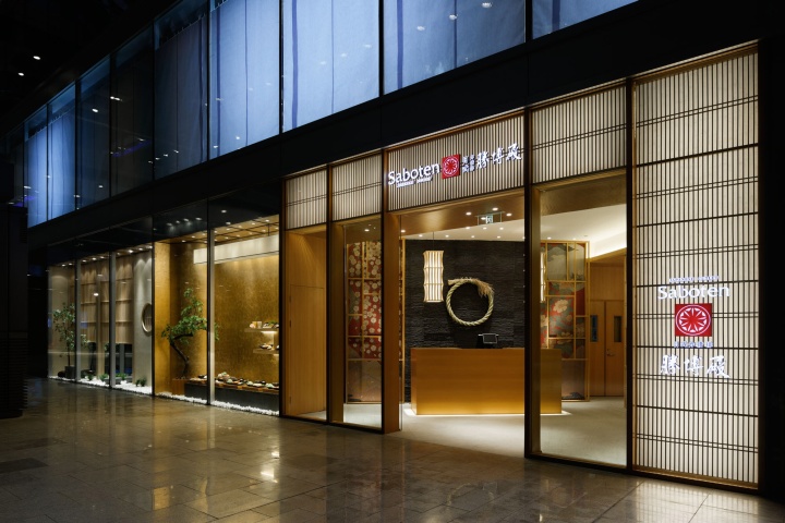


Front side of façade. Asymmetric arch control the direction of eyes and lead to the place where to be focused on.
Deformation of our tradition and good localization are essential in order to make Japanese culture easier to be accepted by foreign countries. This is a Japanese cutlet restaurant chain called ”Saboten”, the first flagship restaurant in China. Here, viewing the future visions of restaurant chain, we made designs that will become useful manuals when expanding to China and also overseas.

Overview of façade. Constructed with various elements. Horizontally long facade will not give a monotonous impression.
First of all, one of our challenges was to grasp the right understanding of “Japanese images” that the foreigners prefer. We focused mainly on” traditional Japan”. At present, compared with this modern style brand, we put in effort on how to incorporate this” traditional Japan”. One of our approaches was to add traditional aspects to the materials. Furthermore we made deformation and by adjusting this to modern style, we created a new identity. And this, in fact, made the foreigners easier to understand our outcome.

Spot garden of façade. It brings far more depth to the space than reality.
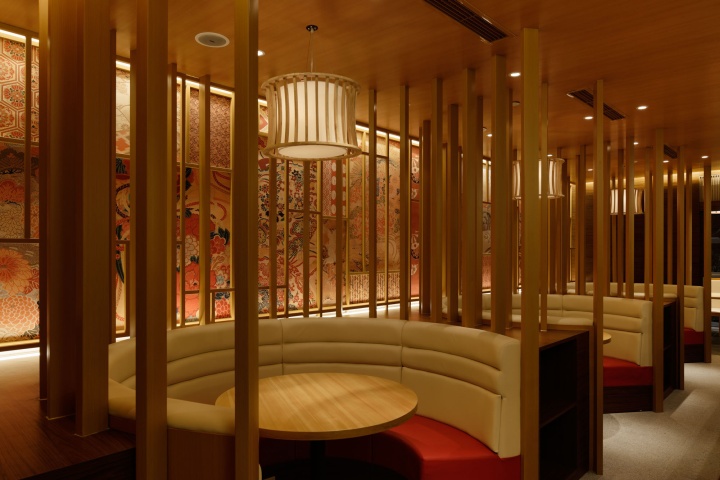
And here is another approach we challenged. We tried to understand the local culture and to partly localize the designs and layouts. You will see this from the height and position of the partitions. We also adopted round tables. This is one way of localization. Nevertheless, it is just one of our Japanese minds of hospitality known as ”Omotenashi”. We came up with this conclusion when we considered about improving customers satisfaction in a flexible way. But this does not mean that we created this Japanese restaurant so that it will look like Chinese restaurants.

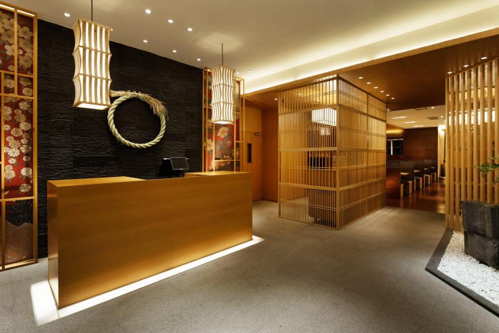
Looking from the entrance, the reception counter are placed not at the front but vertically, in order to create comfortable atmosphere when you enter.
In this way, Japanese restaurant Saboten that we “delivered” to China received good reputation to a wide range of customers. And also to the Japanese, this restaurant gained attention with a fresh impression look. It has become an excellent example of integrating traditional Japan and contemporary Japan.
Designed by DOYLE COLLECTION
Photo credits: Satoru Umetsu/ Nacasa&Partners Inc.

Full view of reception hall. Good balance motif that evokes feeling of “Japan”.

Both sides of the reception counter are decorated with original fabric expressing Japan’s four seasons. (This fabric is originally used for kimono’s sash). Shimenawa (sacred rice-straw ropes) placed in the middle, is a traditional Japanese relief that are made to pray for autumn harvest.

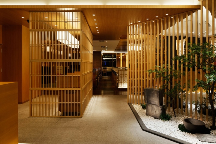
Ttsuboniwa known as spot garden is located in the approach of the restaurant. This enables customers’ feelings to shift toward the Japanese (Wa) atmosphere.

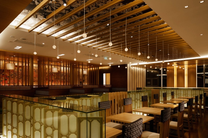
You will have a good overall view of various seats from the entrance hall to the customers’ seats. So it is easy to select your favorite.

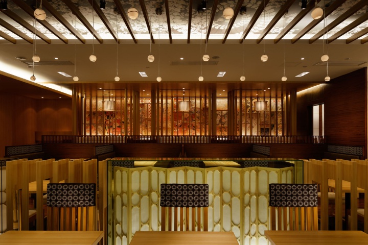
In the center area of the customers’ seats, there is a ceiling display with the Japanese Wa motif which makes an impact on the whole seating. And over 30 evenly displayed pendant luminaries generate dignified atmosphere.

Each seating has different designs. All of these accumulations create the biggest identity to the whole restaurant design.

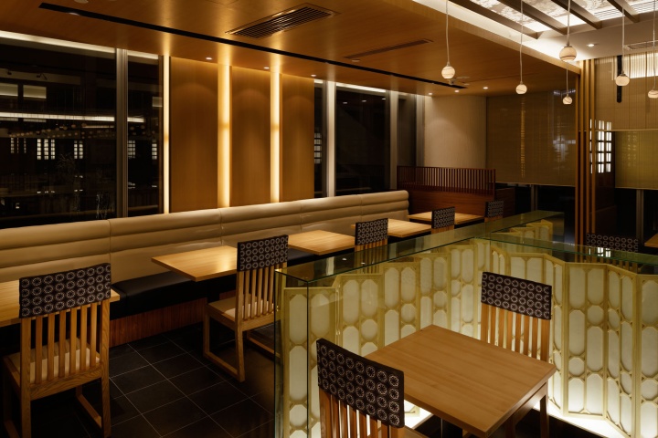
The center areas of the customers’ seats are surrounded by partitions, displayed with folding screens in glass showcases. This area is the only place in the restaurant that is illuminated from the bottom. This amplifies surrounded images.

The floor of the innermost seats are placed one step higher so that customers will receive special feelings.

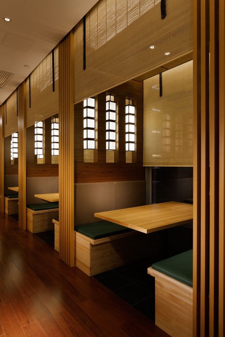
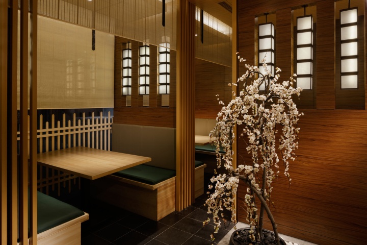
The booths are surrounded by reed screen (Japanese material called Sudare) to enhance private feelings.

There are openings between the booths’ wall so that you do not have to feel oppression. Pendant luminaries will avoid eyes of the neighboring seats which will also give private feelings.

Though the restaurant is big, this is the only place where there is a wall. This wall is covered with many kinds of kimono cloth which bring traditional aspect to the whole restaurant.

Detail of the wall surface attached with Kimono cloth. The wall surface can be seen through the strips that surround the round bench. These whole atmospheres emphasize the Japanese style more.

There is no Kimono cloth design that is the same. To maximize the characteristics of the cloth, we used effects of the lightings.

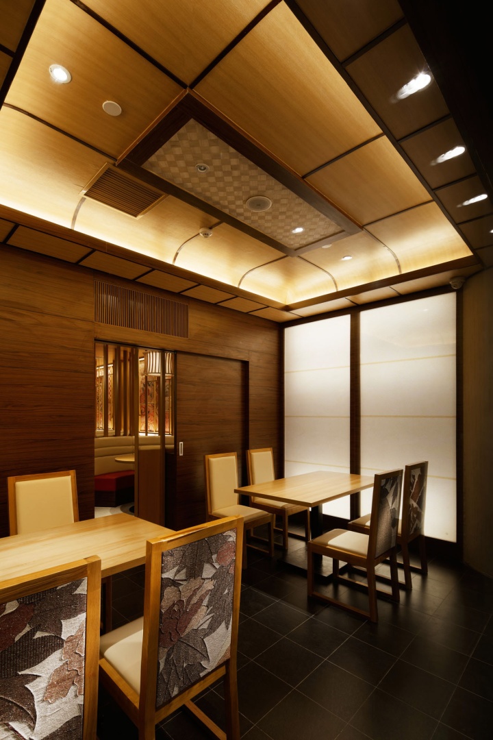
Private room. Japanese traditional architectural method is used to make the ceiling. Kimono cloths are used at the back of the chairs. Set of four chairs make one design.
