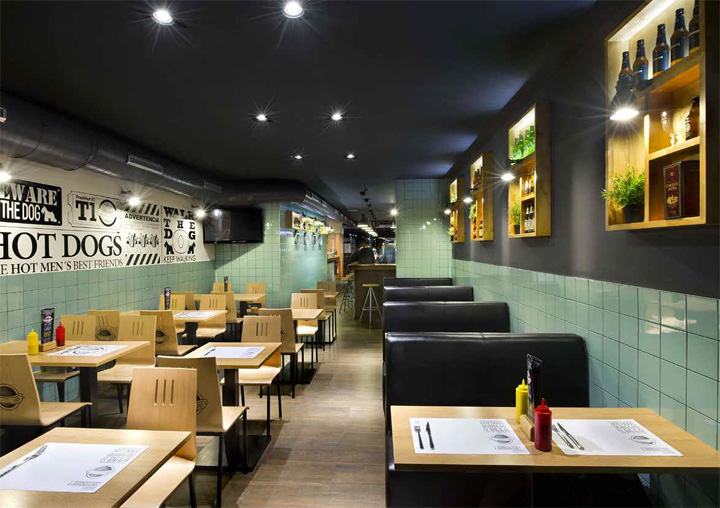

The word “Frankfurt”, being the name of a sausage and a city at the same time, invites to combine the pleasures of eating and traveling into one experience. For this reason, and given the task of creating a simple, memorable name for this “dinner”, Daniel Perez and Felipe Araujo from Denys & von Arend, pushed for “Frankfurt Station” not only as the restaurant name but as a conceptual guideline in the design process.
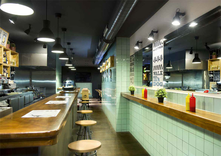
From this “station”, but without moving, we embark on a culinary journey through time and geography: Choosing between recipes, we will not only satisfy our appetite but travel back in time, in order to visit an old road cafe with its typically 50´s tiled walls and its gleaming metallic surfaces.
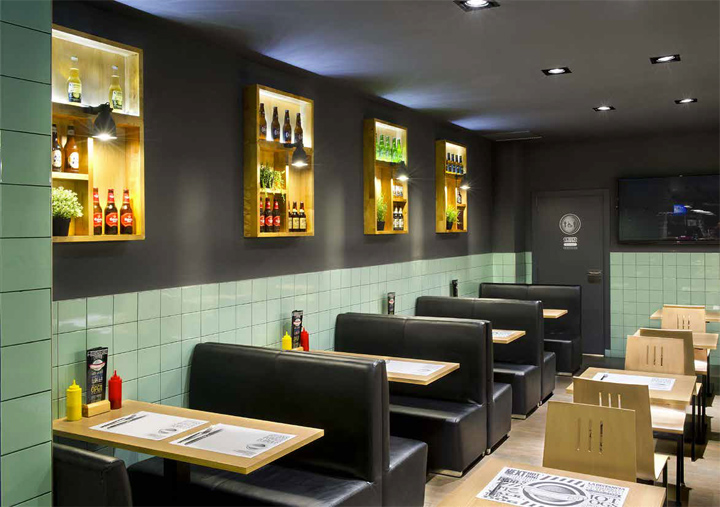
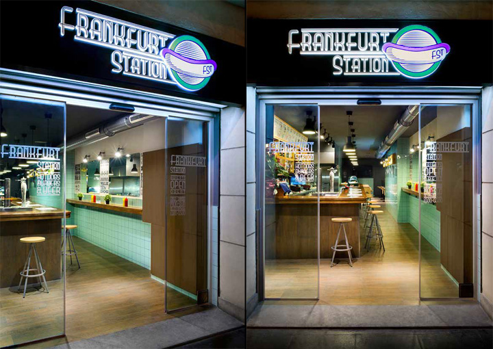
The space layout, determined by the elongated geometry of the premises, suggested itself, a platform and a wagon. Therefore, just a few feet passed the entry hall, the sidebar was treated as a large desk/counter where each “destination” is displayed, prepared and served. Meanwhile in the rear dining area, the guests are to be accommodated according to the classic seating arrangement of a train: On double opposite seats facing each other across from a table by a window consisting of a backlit shelving unit dotted with pieces of greenery. Through this “static window”, rather than admiring the landscape, “travelers” are invited to peek at the world of beers.
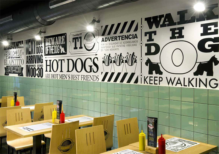
If hopping on this train is the equivalent to taking “the shortest way from appetite to satisfaction” this interior scheme, represents the most cost-effective manner of doing so. In order to make an effective translation of the “Quality Low Cost” concept to the interior design field, affordable, heavy duty, and low maintenance finsihings were the choice for the premises. Varying its color and cutting pattern proved to be enough to convey the warmth these type of coatings often lack in their most common applications.
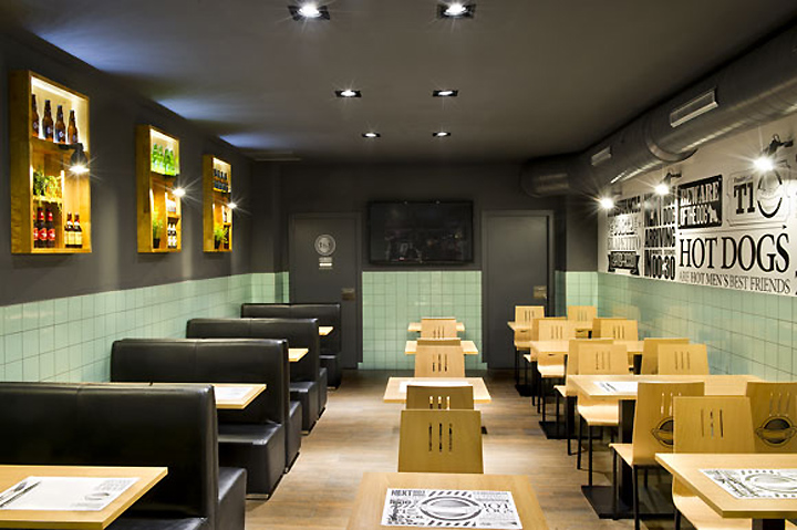
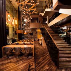
Thus we see how the traditional 10x10cm tile, slightly tack to a shade of “vintagy” pool green, grouted in anthracite gray becomes instantly updated, winning decorative quality, prominence and uniqueness. In turn, but in this case in the toilets, the alternating color pattern sets itself apart from more traditional schemes, randomly dying the walls, from roof to the ground, in a vibrant yellow splash which makes these restrooms much more than just amenities. Meanwhile, the wooden parquet flooring, which fell into disuse in public facilities for almost over a century, is again employed in this “station” in its high traffic version: a magnificent imitation of wood, available in the market nowadays, but made on porcelain substrate.
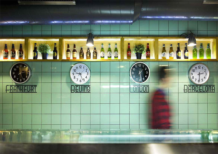
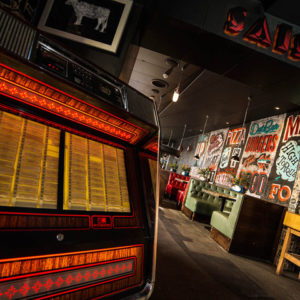
The alternation of visual texture patterns: geometric and organic, tile and wood, stands out against the clean sobriety of a deep gray background. This neutral envelope of darkened ceilings and walls, is dotted with industrial-looking lamps, installed and layed out in a domestic manner for an unexpected twist.
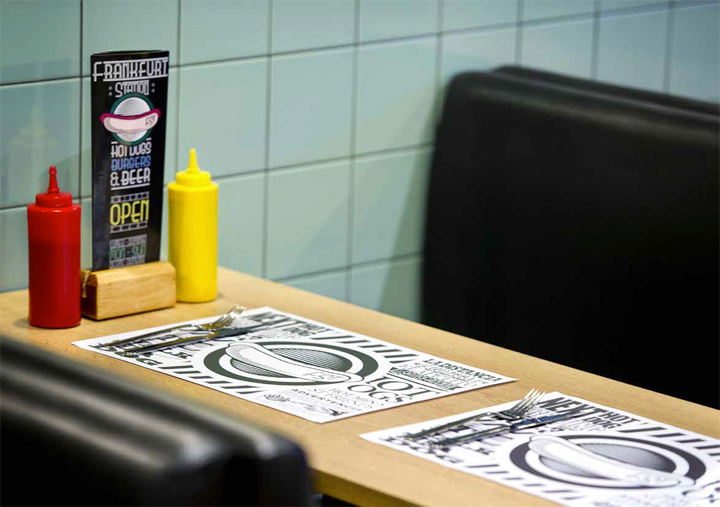
Moreover, visually speaking, it would be difficult to separate the common image of a train station from its typical profusion of written messages: complicated way finding systems, multiple and repetitive safety warnings along with the chaotic overabundance of advertising text and images. Therefore, for the recreation of this type of environment was necessary to translate all this “visual noise” to a smooth graphic texture describing traveling & eating related messages.
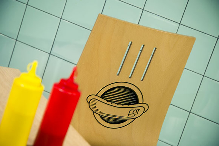
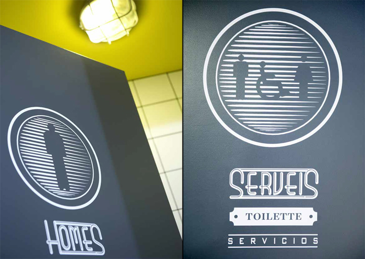
A balanced combination of type and pictograms that would add aesthetic appeal to the vertical planes enclosing the experience. As a result, the corporate image unmistakably resembles that of one of the world´s most popular and oldest subway systems: London´s “tube”. Therefore not only the restaurant´s front sign, but all menu boards, wayfinding signs, and even the opening hours lettering end up combining the traditional but effective duo of icon + text that makes comprehension universal.
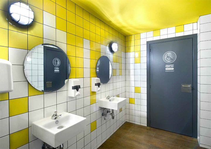
This playful taste for mixing and merging concepts is rapidly becoming the signature style of the studio on the hands of two of their bolder team designers. In their own words: “ we seek to represent the current and constant dialogue between public and private spaces, between the inside and the outside or between areas meant to serve different purposes ( eg. restoration and transportation)… and going beyond practical considerations, alternation is also being pursued at formal and aesthetic level, trying to find a way to convey the ever present dialetic between light and shadow, between brightness and opaqueness, between colorfulness and monochromy and between image and text.
All opposites may be reconciled, and to prove this true, Denys & von Arend posed this environment were low-priced delicacies are offered within an atmosphere of timeless delocaized aesthetic efficiency.
Designed by Egue y Seta in collaboration with Denys & von Arend.


Add to collection
