
Woodstock Pizzicheria by Studio Y, Melbourne – Australia
posted by retail design blog on 2017-05-10
Stonnington
Add to collection

Our client sought an interior that not only smelt but looked, sounded and felt like Old Rome. As it was located in Chadstone Shopping Centre, our task was to then create a space that transcended the retail setting and transposed you to an alleyway in Italy’s capital. After rigorous research of traditional architecture, we sought to create an interior that not only echoed tradition but that was also contemporary.
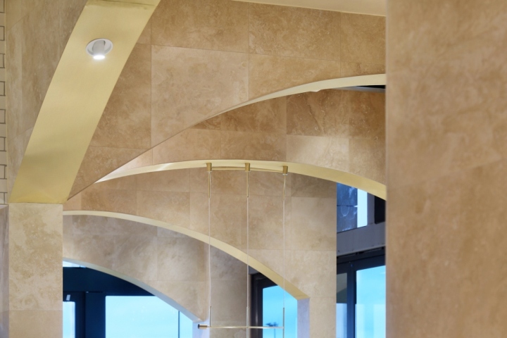
Balancing the client’s vision as well as the shopping centre’s aesthetic guidelines was the first challenge. We had to create something that was on the spectrum of the classical but also high end and contemporary so it fitted the Chadstone mould. Secondly, designing the archways was a big challenge. We were given a curved floor plan with strict design guidelines from Chadstone and the rationale for the archways had to be intelligent and robust.
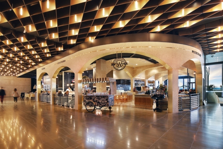
This was our big “Colosseum” piece essentially, the backbone of the interior that really created the architectural base for the finishes and textured overlay. They had to be structurally engineered and columns placed in specific areas whilst at the same time we needed to be mindful of keeping the space visually ‘light’ and not weighed down by heavy architecture.
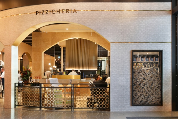
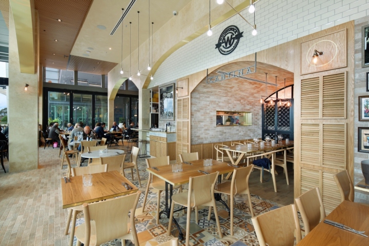
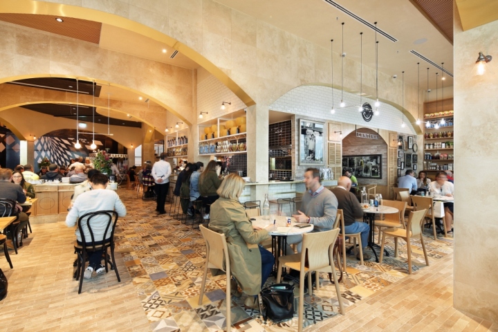
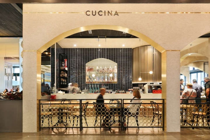
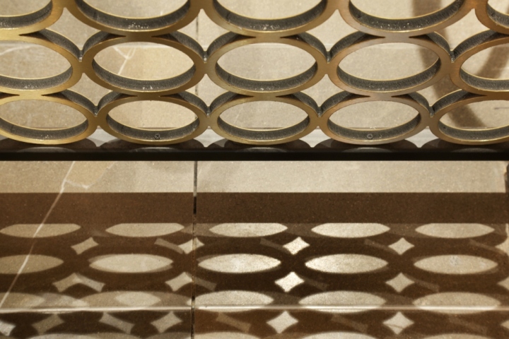
We are very happy with the result; the clear language of the archways as you look along the length of the restaurant is very powerful yet balanced. It is essentially what evokes that ‘Old Rome’ element. The classic arched forms are cladded in white Carrera mosaics and then framed with brass sheeting to give the structural heaviness of the facade a fresh and visual lightness.
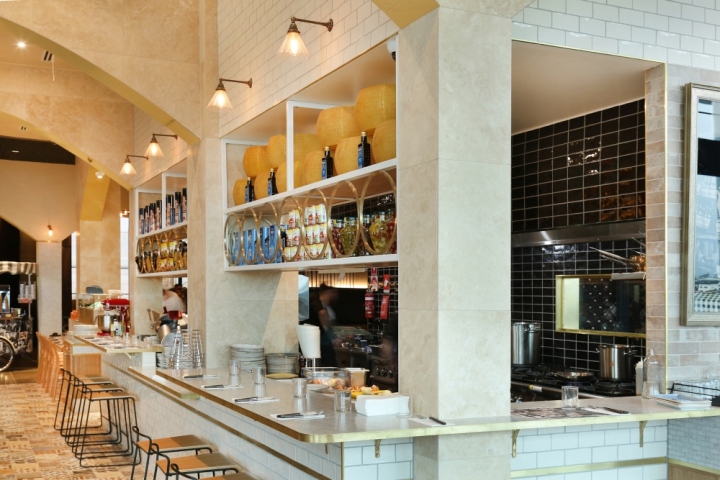
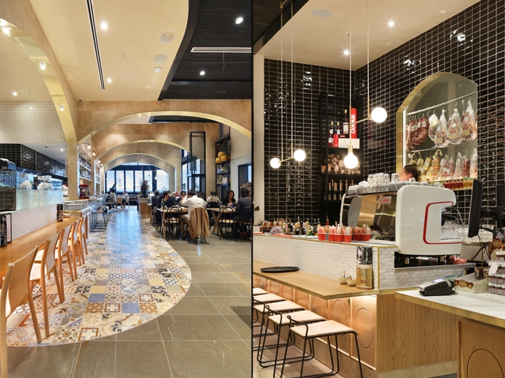
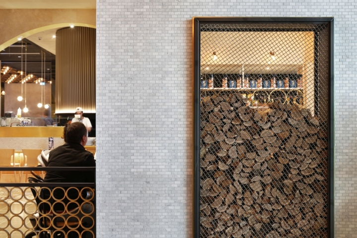
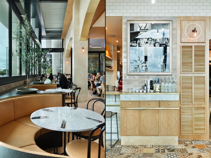
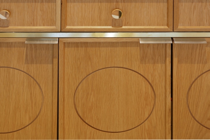
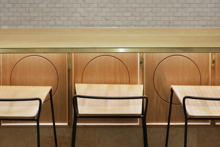
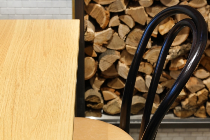
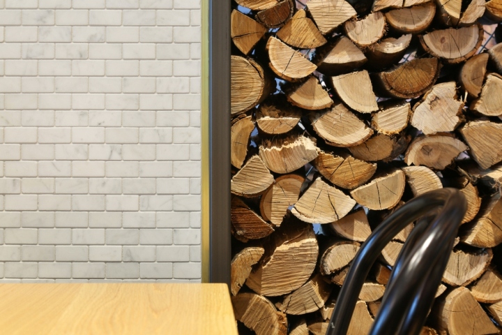
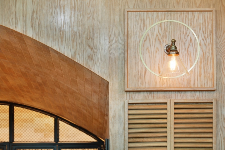
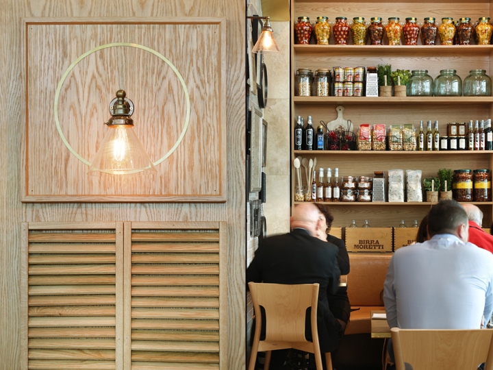
We brought this effect inward with the use of white handmade subway tiles matched with brass detailing. The accessorizing with dried chilies, garlic, jars of pasta and condiments helps bring certain individual warmth to the interior. This aims to diffuse the sometimes impersonal experience of shopping centre dining. Essentially the design is broken up into areas.
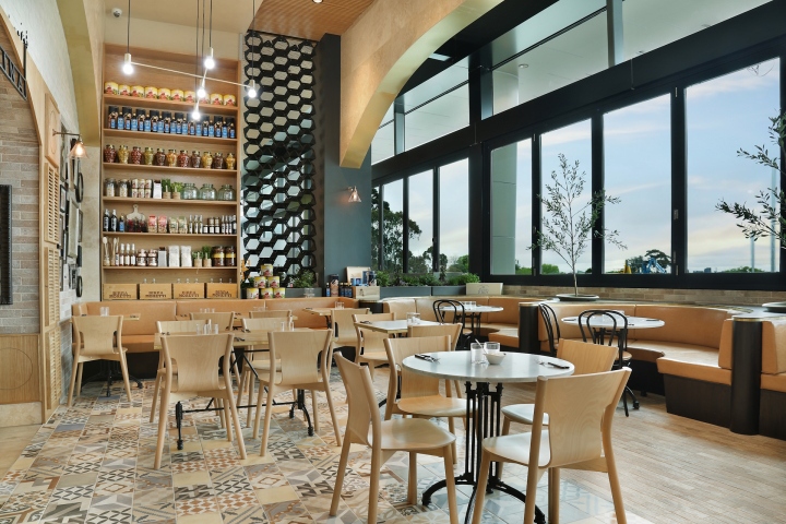
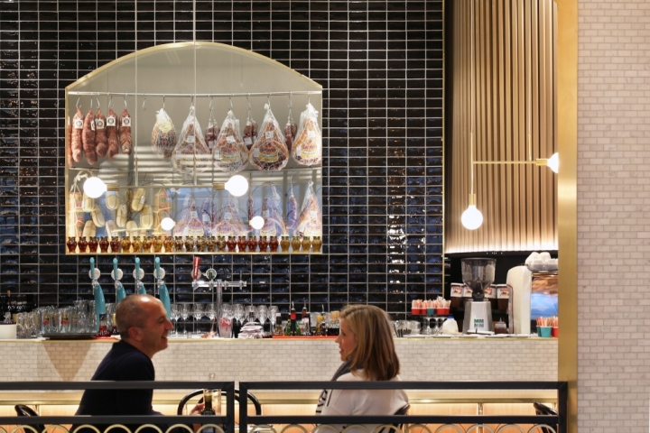
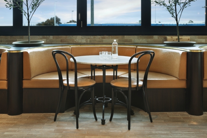
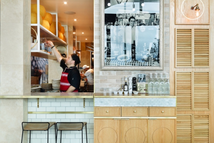
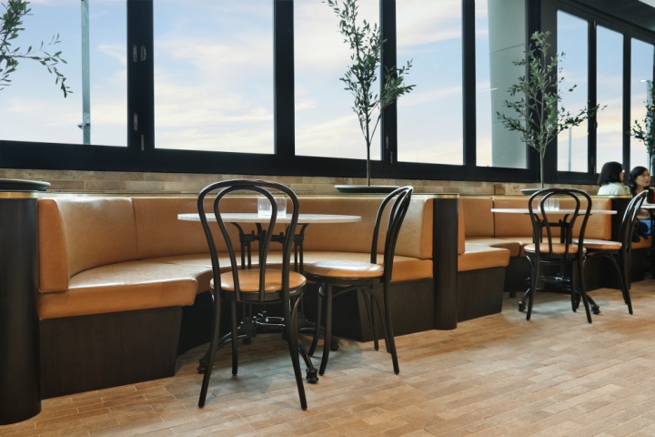
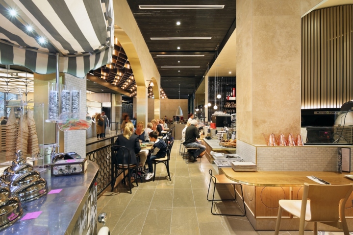
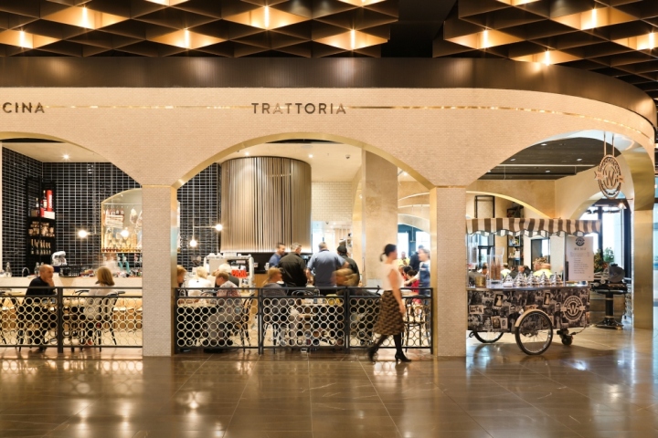
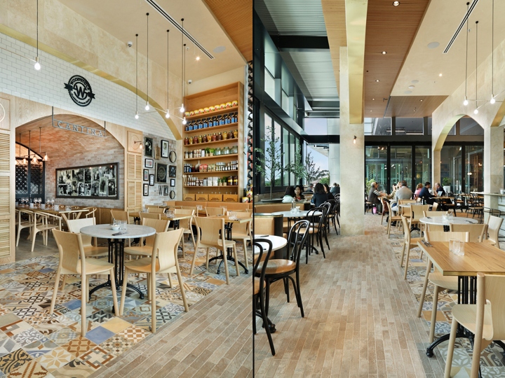
The “Cucina” is facing the shopping centre and the entry so it is very bold, striking and contrasted by black handmade tiles. There’s also a large arched window which displays the cured meat and cheeses visible from the thoroughfare. As you move into the space there’s the main dining area – the ‘Pizzicheria’ and ‘Piazza’. We aimed to make the Piazza feel like its outdoors by changing the flooring to brick tiles and adding lemon trees built into the banquette.
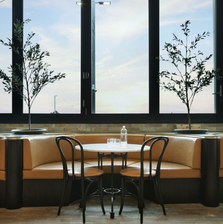
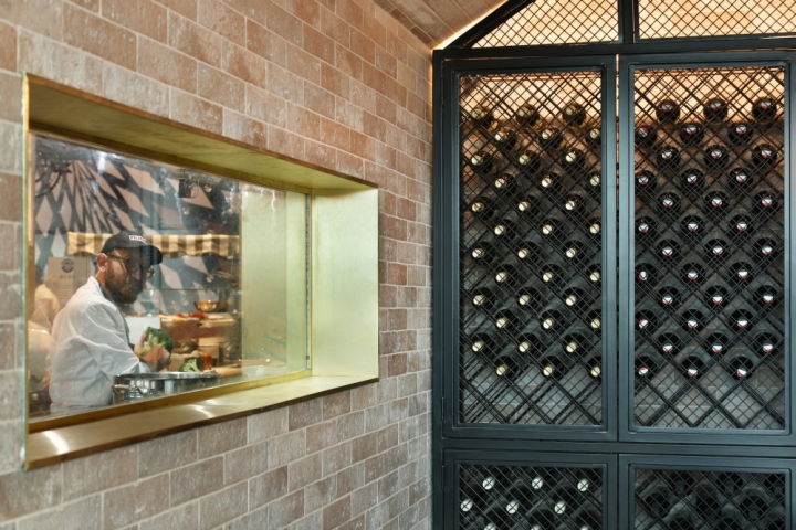
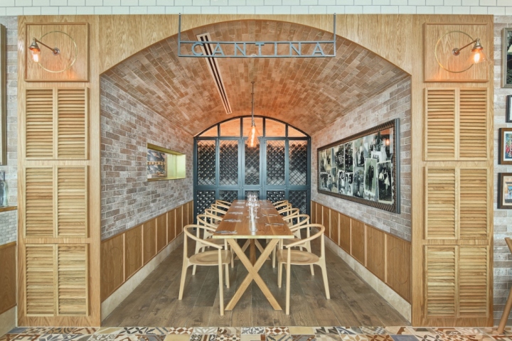
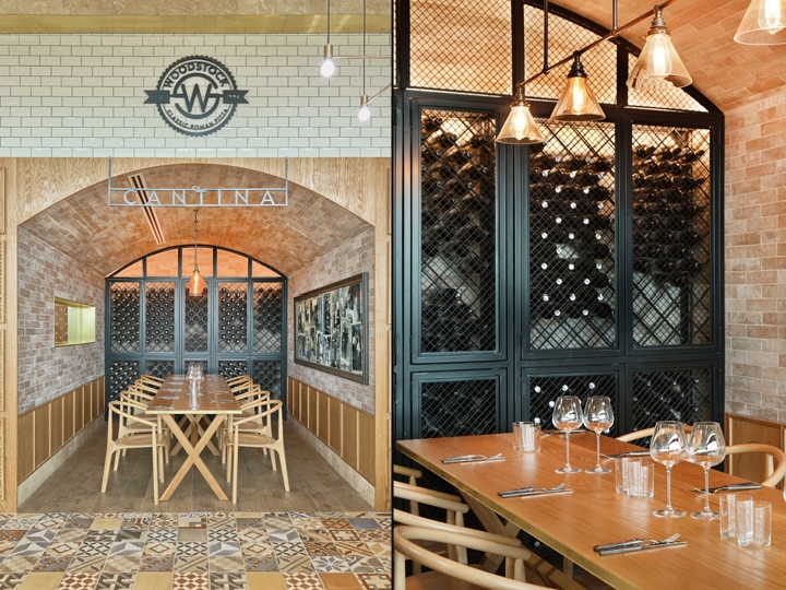
We’ve faced the banquette seats so the patrons are looking inward back through the restaurant. This aids the sociality of the space and makes the entire dining experience inclusive which is a lot like the feeling of being in a piazza. Lastly there is the ‘Cantina’. A small private dining area with a vaulted ceiling which has been completely covered with brick tiles to look like a traditional Italian dining space.
Design: Studio Y
Photography: Michael Gazzola


Add to collection