
Shanghai Pharma Kyuan office by Yedesign Associates, Beijing
posted by retail design blog on 2013-09-03
Add to collection


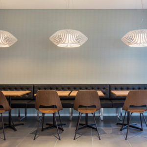
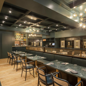
Designed by Beijing Yedesign Associates, Shanghai Pharma Kyuan Beijing office is composed of three layers of Loft spaces, each layer of the Loft space has its own characteristic, but the common denominator is comfortable, elegant and full of vitality.

1. Connect the upper and lower space – stairs
For 8 – meter tall Loft space of each layer, the owner commissioned sandwich design of each layer to be borne by the interior designer, it can be designed together with the layout so that it gives full play to the designer.

We make the void part of each layer as the public activity space, the stairs as a bridge connecting layers. We give each of the stairs different functions and characteristics, such as water staircase, garden staircase, sculpture staircase, viewing stairs. And these stairs in different forms provide not only functions but also places for employees to communicate and meet.

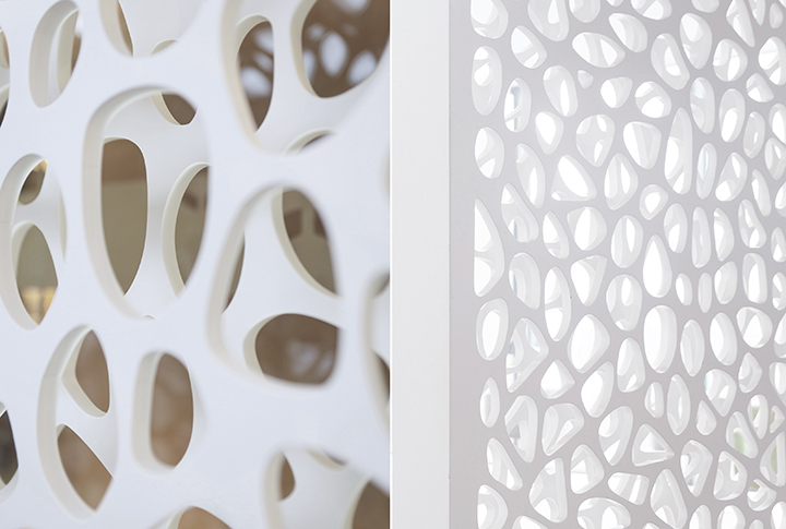
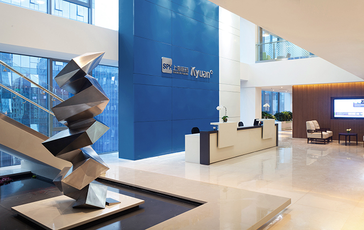
2. Layout and beautify a space – screen
Our design is always hope to inherit the national culture. This design is no exception to use Chinese style screen. But the form of screen is modern, which agrees with customer’s culture itself. The pharmaceutical industry reminds us of “human blood vessels”, so the design of screen is like the body vascular network. The double screen design is just the perfect combination of vascular “vein” and “artery”. By the way, with the upper and lower tube depository, it appears more ethereal and elegant.

3. Give the elegant space vitality – color
We use three different colors to distinguish each layer of three Loft floors. We apply grass-green to the 7th layer to better show the vitality and passion of young employees and interns. The 8 layer is the company’s reception area, we use the client company’s logo color “blue” to better reflect the company’s typical characteristic. The 9 layer is the company’s leadership offices, we adopt “orange” to embody its steady but not boring features.


Add to collection