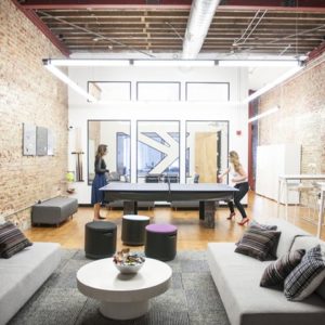


Like many young entrepreneurial ventures Ticketfly, an online music and sports ticketing service, had reached a point at which a more sophisticated work environment, something slicker than sleep-on-the-couch start-up chic, was necessary to serve its staff and impress its clients. In the very appearances-oriented entertainment industry a stylish office is as important as favorable buzz. Ticketfly wanted a stylish office, but didn’t want to mess with a working formula that had generated four thousand percent growth in three years.

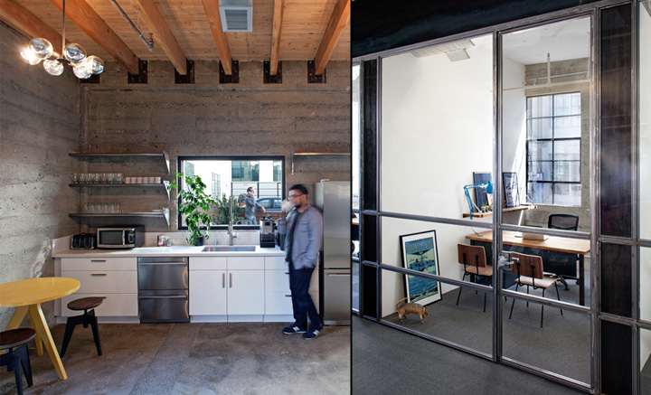
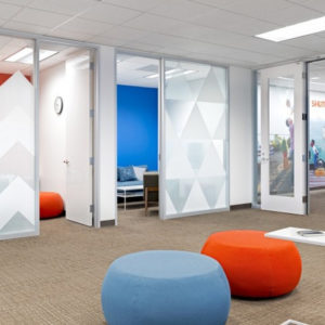
Our first move was to establish a minimalist finish palette and employ accent colors sparingly throughout the space. Thus the carpets, many in shades of gray, echo the gray of the unpainted concrete walls. Cast iron table legs and workstation supports reprise the charcoal of the building’s façade. Natural warmth is provided by strips of reclaimed engineered wood used as panels and partitions throughout the office, but color, such as it is, comes mainly from the art on the walls and from the personal effects people bring to their desks.

Music is a motif that runs through the space’s interior branding. Graphics throughout the office reference concert themes, musicians, musical instruments. And in keeping with the multi-media aspect of many live music performances the central panel in Ticketfly’s lobby is a screen on which a slow slide show unfolds. The versatility of this technology in allowing a company’s graphic presence to shift with changes in the season, changes in emphasis or simply in response to new initiatives and achievements demonstrates how innovative graphic design can contribute to keeping a space fresh and dynamic.
Designed by Studio O+A
Team: Primo Orpilla, Denise Cherry, Kroeun Dav, Justin Ackerman, Will Chu
Services: Site Verification, Programming, Schematic Design, Design Development, Interior Branding, Furniture Coordination, Project Administration
Photographer: Jasper Sanidad


