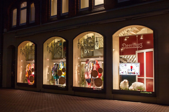

On 12 September 2013, the mail order company, Deerberg, moved further afield, opening their first store in Hannover in the form of a perfectly presented, well-composed store concept with Scandinavian flair that brings the brand identity of Deerberg to life in every detail. The modular concept was developed by the planning and project agency, K.U.L.T.OBJEKT from Dresden, together with the proprietor, Stefan Deerberg. More stores are planned.
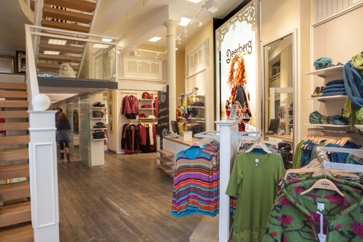
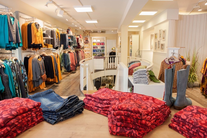
The new store, with its well-lit, pleasant atmosphere of well-being, opened its doors in an old heritage-protected building. The store concept embodies Deerberg Versand’s brand philosophy down to the finest detail – their business principles embrace values such as empathy, trust and commitment, security and a love of nature.
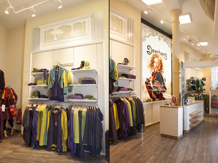
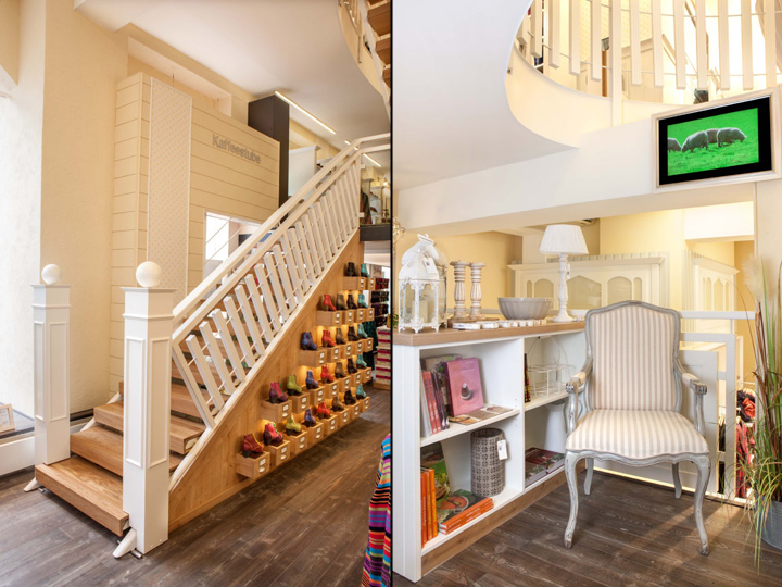
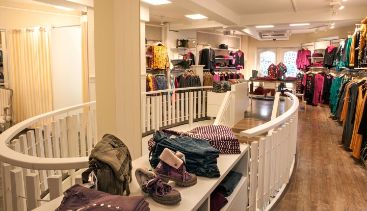
Subtle positioning of stylish elements creates the impression of a Swedish country house. The laths on the banisters give remind one of a white picket fence. Ornaments on mirrors and displays echo typical Swedish log houses and the veranda culture, which draws the people out on long The edges of coloured mirror frames and furniture are deliberately worn down to reveal the material beneath, reinforcing the “lived-in” impression that the store exudes.
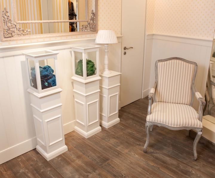
Bright furniture and wall panels alternate with strips of patterned wallpaper. The flooring in washed pine look also lends authenticity to the store concept. The majority of the wares are displayed on back-panel systems and in cupboards with a country house look. The white, grey and yellow tones of the backdrop sets scene for the colourful fashion style.
Important for the opening of further stores is the modular interior concept, which allows flexible use to be made of the individual modules, no matter what conditions are on hand in terms of the building structure.
The concept modules of the Deerberg brand stores:
– The coffee shop is the heart and soul of the store. The employees off baked goods, apples and juices to the customers, proactively (and free of charge). This raises the customer loyalty and
keeps them in the store for longer, and it also ensures more traffic in the store and piques the curiosity of passers-by.
– The fireplace, in which a virtual fire crackles, gives the visitors a feeling of cosiness.

– The current mail-order catalogue lies in easily accessible trays inviting customers to browse.
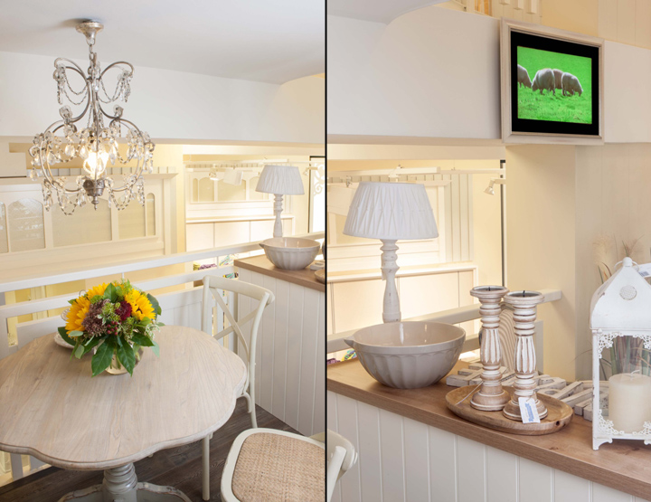
– Divine visual merchandising. The shop is also a concept store. The extravagant decor, with chandeliers, vases, bowls and other living-room accessories, small pieces of furniture, chairs etc., ensures repetition of the ‘look’ throughout the store. Everything is available in the Deerberg selection and is for sale.
– The show wall that consists of draws and gives the nostalgic appearance of an old trading store, is a real eye-catcher and it draws the customers like a magnet. Although it is not as spacious as many standard shoe displays, the turnover is very quick. The range of shoes is one of the focus-points in the selection.
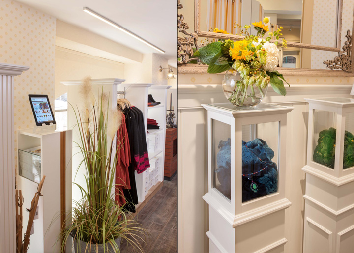
– iPad stations, with the digital selection offered by the mail order company, bring together e-commerce and the offline store. And a convenient side effect: The articles called up on the iPads quickly reveal gaps in the range within the store.
– Floor to ceiling displays each with the current catalogue title ensures recognition for the regular customers and reminds them that there is a wider range available in the very important, traditional catalogue.
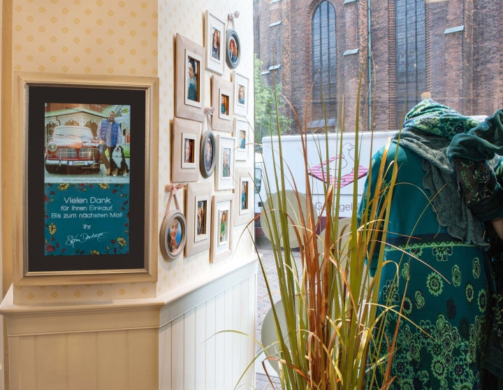
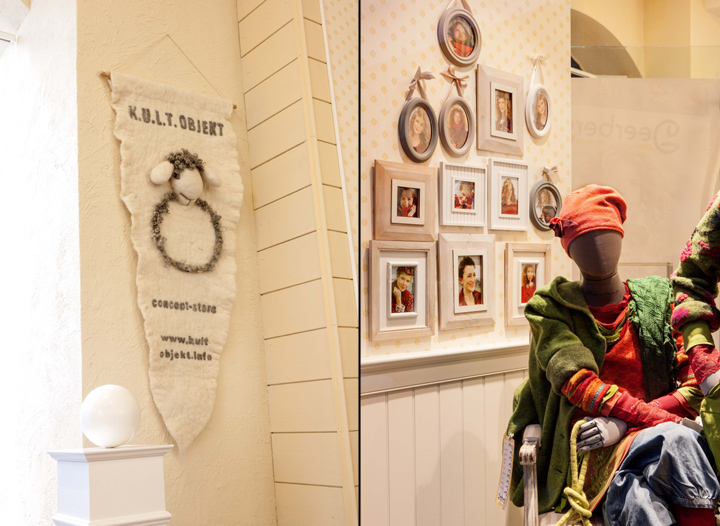
– Walls of framed pictures also show current motifs from the catalogue and support the homely look.
– Chandeliers couldn’t be sued throughout the store as planned, due to the low ceilings. We therefore simulated a chandelier atmosphere. In the shop windows, silhouettes trigger an association with real chandeliers. In the store, warm accent lighting and the flattering light created by back-lit mirrors, was introduced.
– Glass cases with content that is not identifiable at first glance arouses curiosity. The fashion jewellery that is displayed in the cases appears finer through the glass.
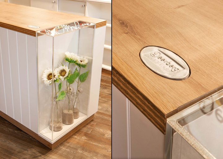
– A touch of extravagance combined with a clever marketing idea: Ceramic platelets with the Deerberg logo, just a few centimetres across, are set into the surfaces in positions that are often touched unintentionally. Because the platelets bear not Deerberg logo not only in writing, but also in Braille, they allow for an experience that is both visual and haptic, which is remembered in a favourable light.
Photography: Judith Reinhard for K.U.L.T.OBJEKT
About K.U.L.T.OBJEKT:
The Dresden-based interdisciplinary planning and project agency develops expressive, individual store concepts for retailers and draws much inspiration from the dramaturgic and scenographic methods of film and theatre, new findings from the world of neuromarketing and their extensive know-how from the retail and brand management branch, with their main focus on the shoe, sports, jewellery and perfume trade. The proprietor, Jens Fischer, stresses his innovative involvement in store planning: “Our goal is to make a ‘local hero’ out of a retailer – one who is unmistakeable, thanks to our design, and one who the area simply cannot do without.” K.U.L.T.OBJEKT develops concepts in close collaboration with the proprietors – empathy and trust between the cooperating partners are absolutely essential, according to Jens Fischer. The implementation of the design on site is performed, as far as possible, with local suppliers, artisans and service providers.


Add to collection
