
Citypress is a leading independently owned PR agency, delivering on and off-line communication campaigns for clients in a wide range of market sectors, with offices in Manchester, Birmingham, London, Edinburgh and Bristol. The company originally employed our services in 2008, when, due to expansion we were asked to relocate their Manchester Head Office to new premises. Five years on and, expanding again, they were in contact with us once more!
Every project has its challenges and this one was no exception… Their new location is situated on the third floor of a prestigious six storey Grade II listed building on Deansgate in the heart of Manchester. Our brief was to produce an inspiring, creative office interior that would motivate and encourage, whilst preserving the building’s features.On entering the third floor, we were met with two separate areas. We were asked by the client to create a ‘functional’ part of the business in one section and a customer facing zone in the other.
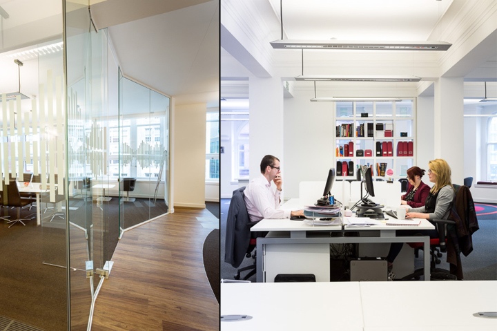
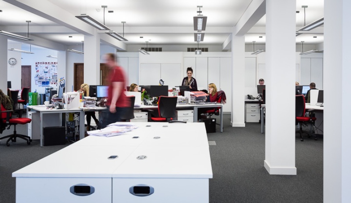
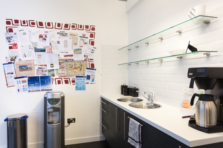
To the office area we designed an open plan space, which was able to comfortably accommodate 50 people. Installing a tea point to the area meant that staff would not have far to walk carrying hot drinks and the curved partition wall surrounding the space gave separation from the neighbouring desks. We were also able to incorporate a library, with floor to ceiling feature bookcases to divide the area from the rest of the office. Brainstorming zones fitted with whiteboard walls and quiet working rooms gave the finishing touch to this space.
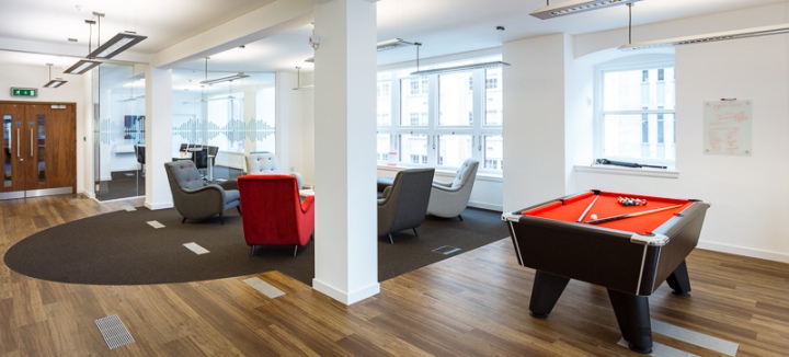
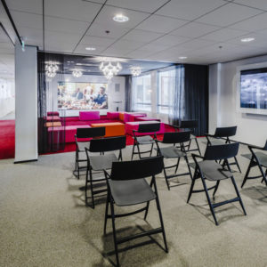
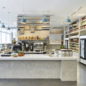
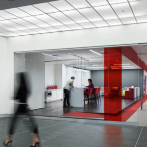
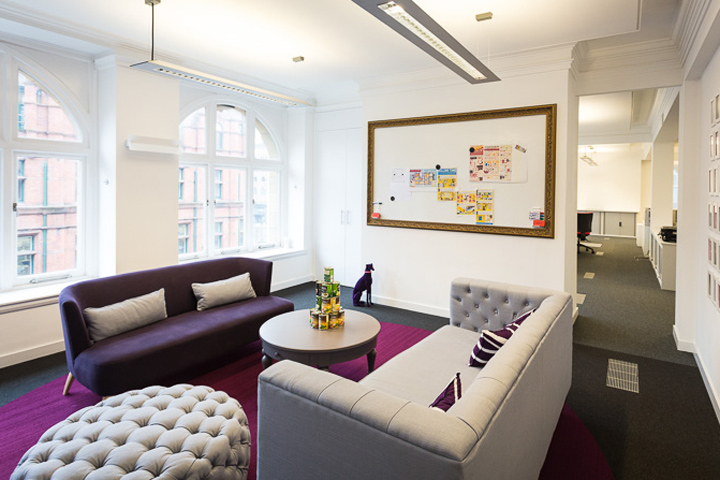
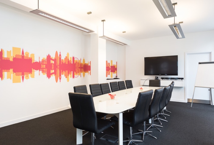
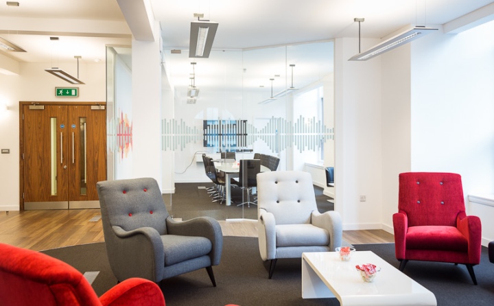
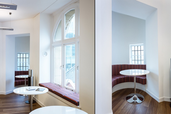
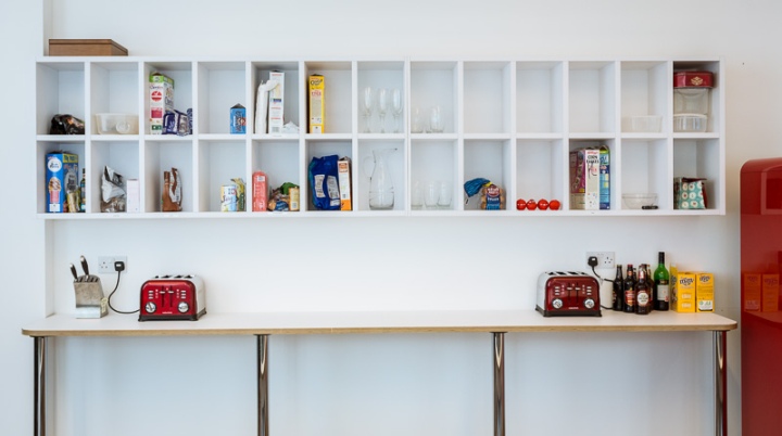
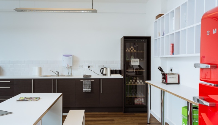
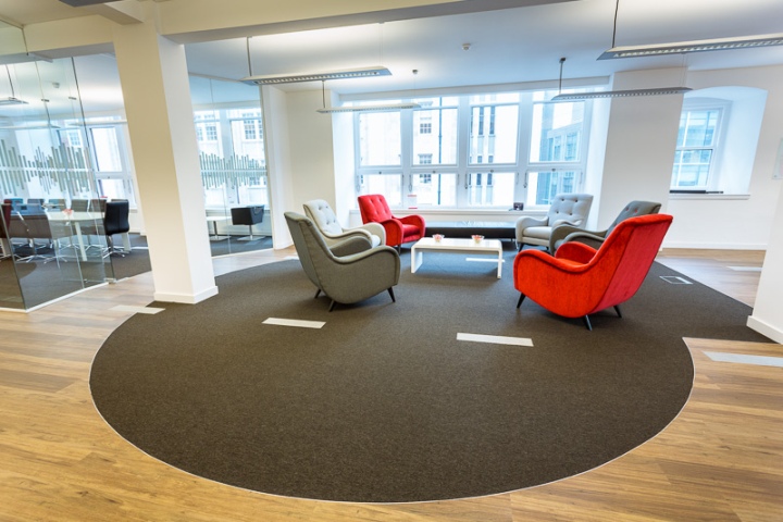
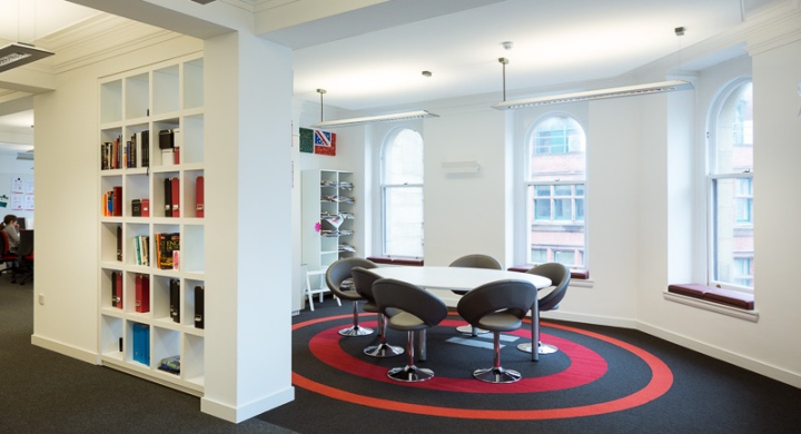
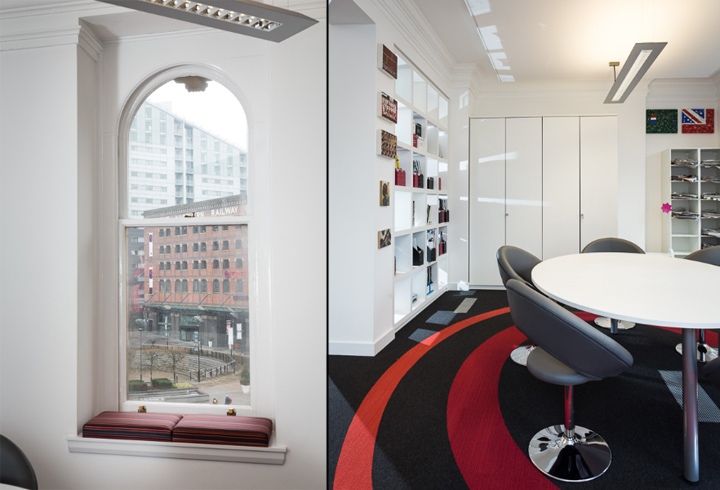
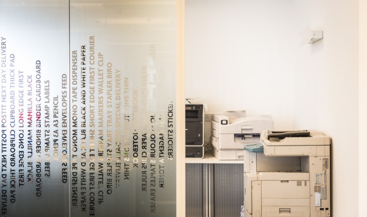
We introduced various sized glass fronted meeting rooms, along with an open kitchen and a social space for staff to the customer facing area. Window seats, finished in contemporary striped fabric were installed to the perimeter of the room. This style of seating adds to the ambience of the space and allows staff to take advantage of the fabulous city skyline. Graphics in the form of manifestation for added privacy and Health & Safety compliance as well as feature flooring present an inviting and comfortable area for visitors and staff alike.
One of the benefits of having a previous relationship with the client, meant that we already had a good understanding of the sizes, shapes and finishes of their existing furniture so were able to reuse some of the pieces in the new premises. By undertaking this exercise at the outset, the budget which was originally earmarked for new furniture, was reallocated to the client facing areas giving the space the all important ‘wow’ factor!
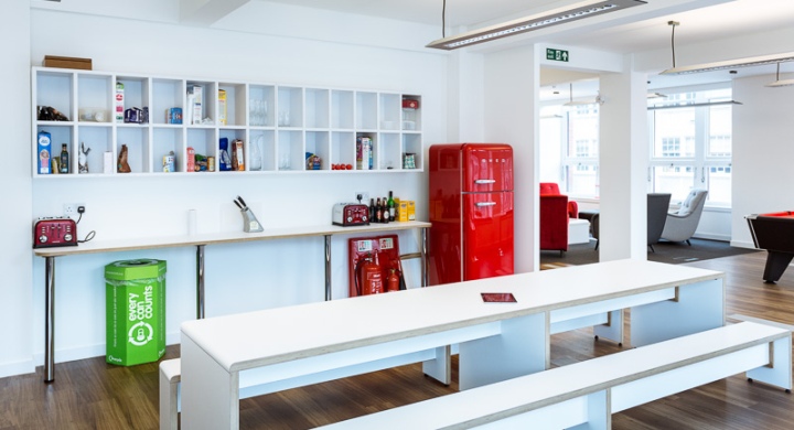
The bold corporate colour scheme, teamed with natural finishes and contemporary furnishings, ensured the final scheme provided an inspirational environment and the perfect platform for the next stage of growth for this prestigious company.
Designed by by Whitespace Consultants Ltd.


Add to collection
