DUDE jeans store by Moras Antonios & Karkatselas Nikos, Larissa – Greece
posted by retail design blog on 2013-12-17
Add to collection
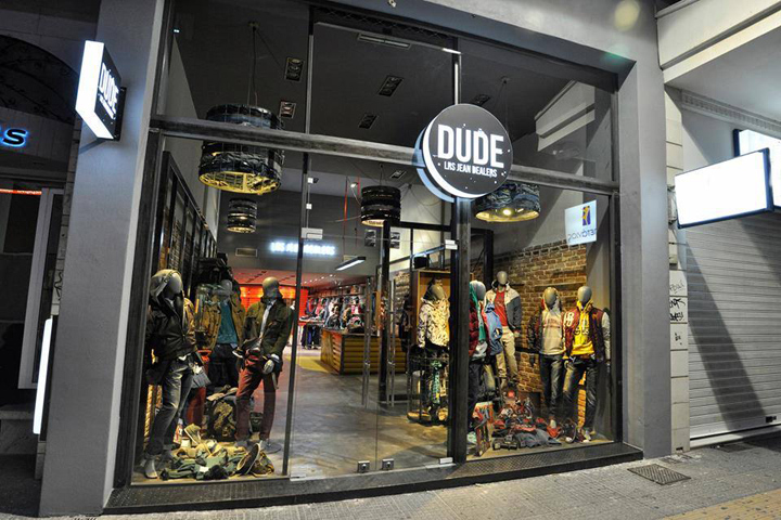

The client asked for a flexible and light scheme that could adapt to different and varied scenarios with regards to the way that the clothes could be presented to the customers. The client also was very specific about the fact that he intended to focus mainly to male customers / shoppers and that the store should have qualities that should appeal to such a target group with ages from 18 to 35.

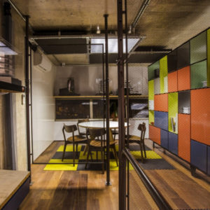
As a response to these conditions we came up with the idea of the mancave as a scheme that addresses primarily to men, that has a friendly, street wise, street-living image and that also stands for independence and shelter. G. Papakonstantinou proposed that the store should be named “Dude” which seemed to work well with the whole concept of the store and the idea of the mancave. In order to compliment the character of the store we dug up vintage objects from the 80s-90s as digital game stations, flippers, boomboxes and paraphernalia that were strategically placed next to the products.
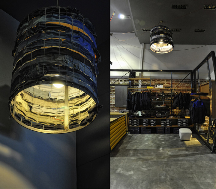
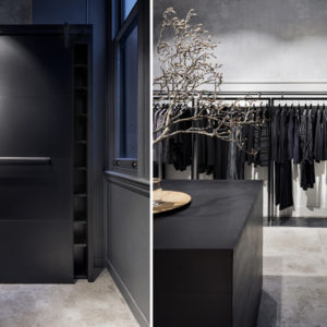
Staying true to the concept the materials used were left kind of unfinished and raw. The steel construction of the shelving system exposed its traces of welding as well as the scratches due to the transportation of the pieces etc as it was not painted or polished by any means. We also used unrefined wood for the cashier desk and the shelves. A steel grid was used strategically as a second skin that could also function as a massive hanger for clothes. On the floor a thick layer of cement was applied with a spatula so that it would look as handmade as possible.

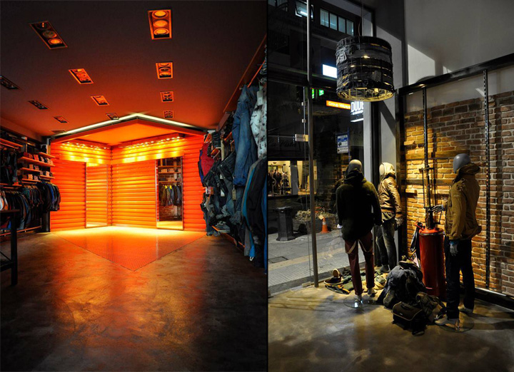
For the cashier and the fitting rooms we proposed two separate constructions made of trapezoid shaped iron sheets, that look like parts detached from a container, that were painted in vivid colors to attract attention. Parts of the floor where the cashier and the fitting rooms were placed were covered with iron sheets in angular forms in the same colors as the constructions. The already existing spotlights (cold light) were reused / re-appropriated and new custom-made and context specific lighting units (warm light) were designed in order to create different ambiences in the store.
Design: Moras Antonios, Karkatselas Nikos (architects engineers)
Graphic design: Constantinos Chaidalis (aka brittle)


Add to collection