

Add to collection
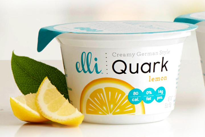

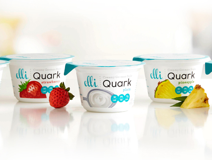
A clear understanding of evolving consumer behavior helped McLean Design introduce an unfamiliar but über healthy European dairy product called quark to a highly skeptical American market. Quark is a creamy, cheese-like fare with yogurt-like features, a staple in Europe but almost entirely alien to U.S. shoppers. The challenge was to present it as captivatingly different but not strange, European but not old-fashioned or elite gourmet.


Add to collection