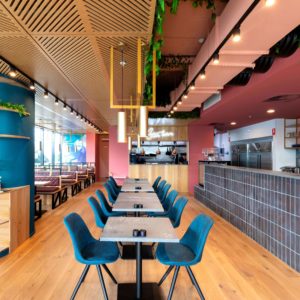

BREAKOUT AREAS! MTV Networks Headquarter by Dan Pearlman, Berlin
posted by retail design blog on 2014-01-29
Add to collection

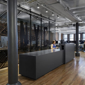
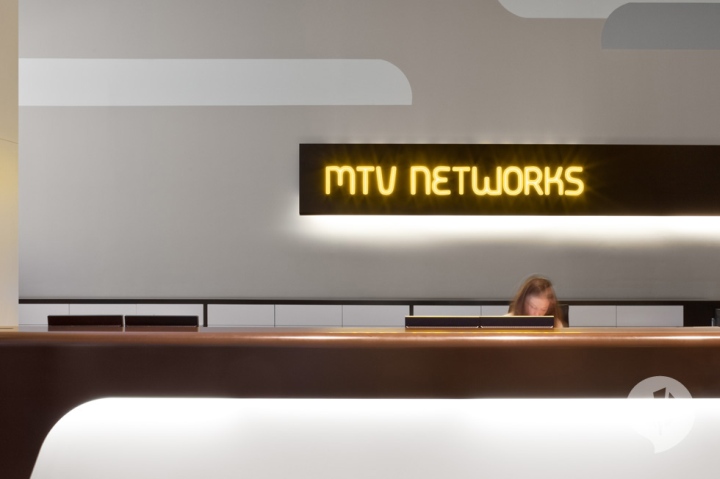
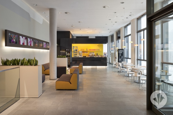
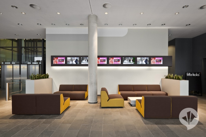
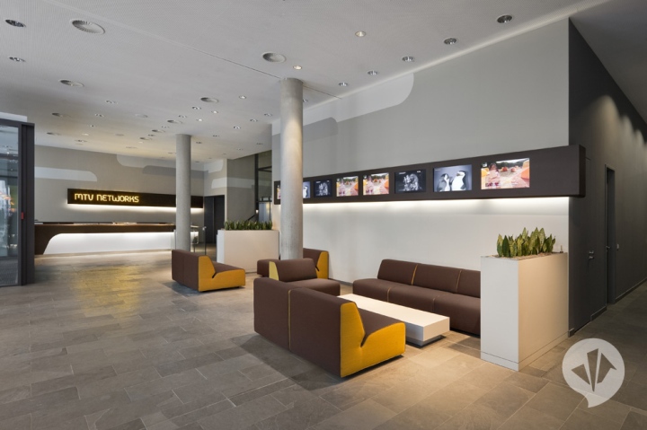
The interior design and materials relate to the identity of the MTV Networks (Germany) logo with its characteristic font and the colours dark brown, white, and yellow. They are referenced and translated creatively in the design of the reception area, the lobby, and the café as well as in the atrium and the kitchenettes.
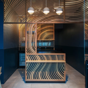
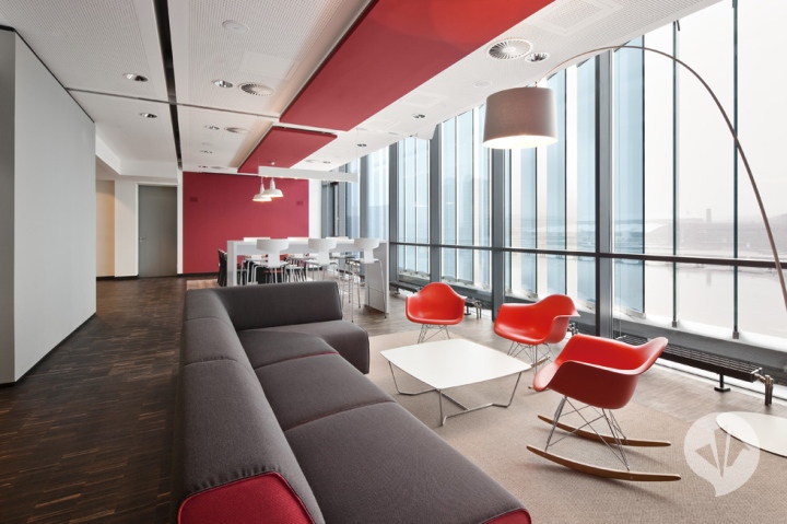
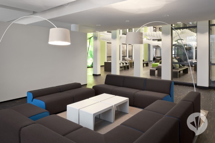
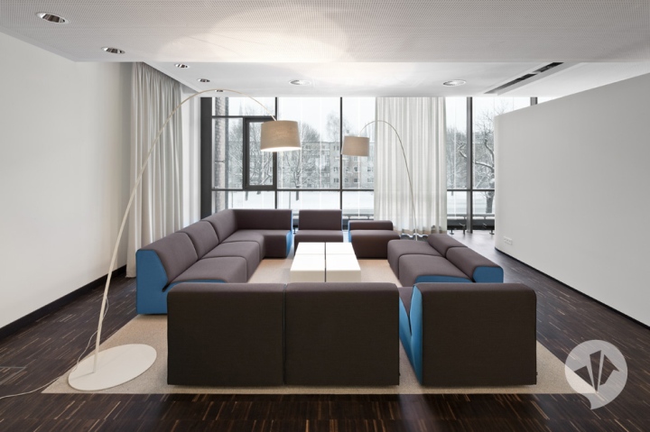
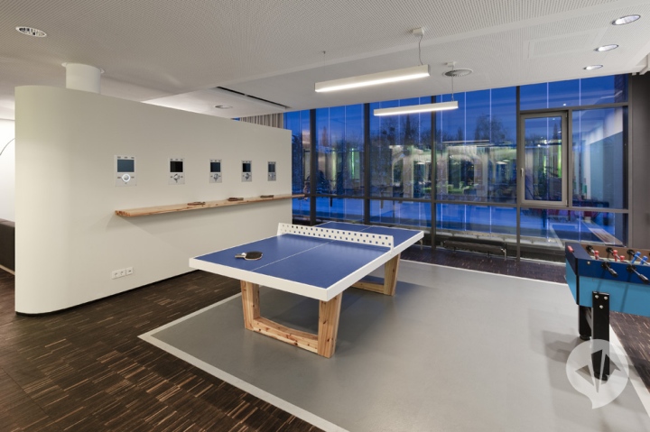
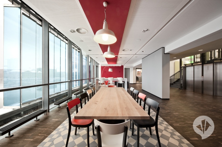
In contrast, the design of the “living rooms” relates to the dynamic and creativity of the city of Berlin. The diversity of formats and stations is reflected in the target groups’ living environments and their translation into “living rooms”. The accentuated use of colours leads to the creation of very lively, themed meeting and recreational rooms in the periphery of the atrium as the corporate core, which have an inspirational and revitalizing effect on employees.
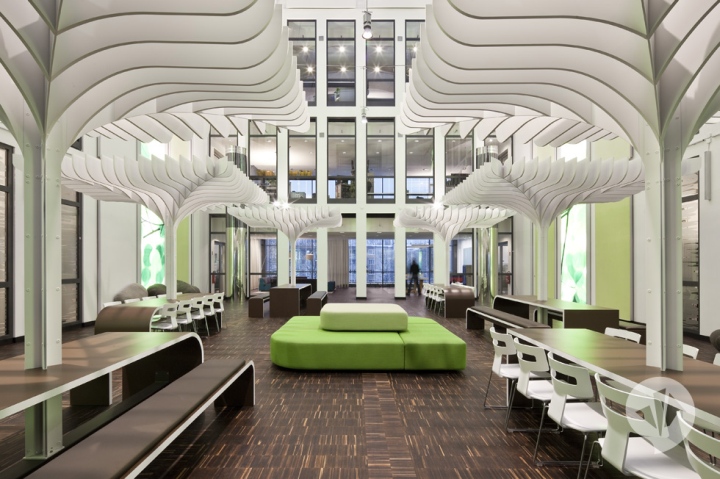
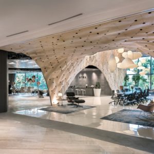
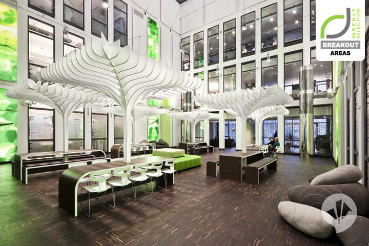
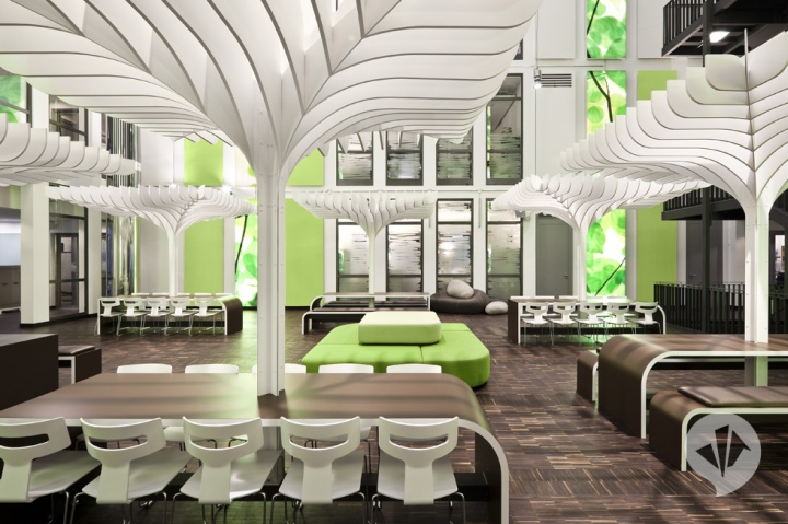
Through its new structure, organisation, and design, the atrium becomes the Network Garden. Especially by the use of wood and green, employees are provided with a lavish central area, which presents a pleasant counterpoint to the stringent and cold architecture of the building. The abstract tree parasols and several different seating isles refer to the self-contained “corporate” design and use of materials in the entrance area.
The overall picture of the “garden” is rounded up by the interaction of the large airspace-leaves installation and the “vertical green” spaces as well as small details, such as felt stones as open seating isles.
Designed by Dan Pearlman
Add to collection