KUFə coffee bags by Tina Jeler
posted by retail design blog on 2014-03-04
Add to collection
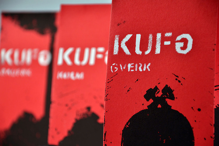

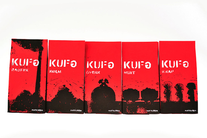
The assignment was to make a series of products. I made five coffee bags for coffee from Trbovlje city (“trboveljska kava”), which I named KUFə. Trbovlje is a coalmine city known for its biggest chimney in Europe and for alternative music (punk, hardcore), that is why I chose red, black and white color. I named the different types of coffee after items that Trbovlje is most known for and wrote them with Trbovlje – slang terms (raufnk – chimney: ground coffee for filter apparatus and kafetiera, kolm – coal: ground coffee, gverk – mine: special ground coffee, hunt – mining cart: decaffenated ground coffee, knap – miner: ground coffee roasted stronger).
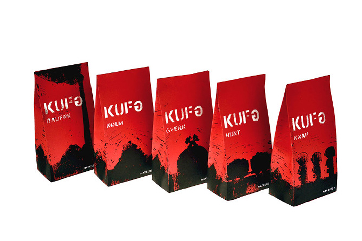
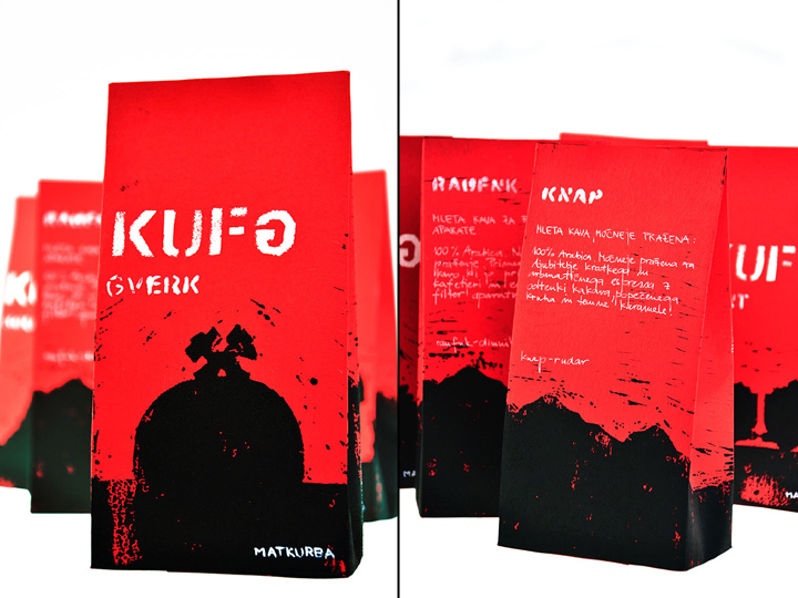
On the bottom of the coffee bag on the right side I wrote the made up coffee brand – matkurba, which is the most famous and most often used swearword in Trbovlje. On the first side of the coffee bag I displayed the name of each coffee and around the bag I portrayed hills, because all around Trbovlje there are hills. The illustration is made with a linocut technique and the typography is made with a template and in handwriting to make it look like punk graffiti.
Designed by Tina Jeler
http://cargocollective.com/tina_jeler/


Add to collection