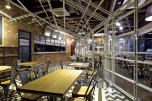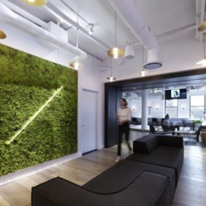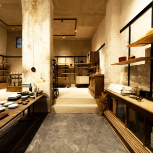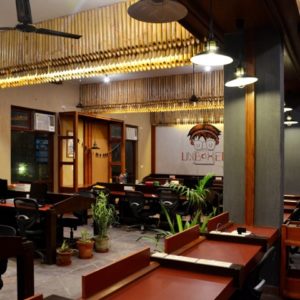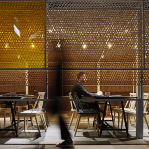

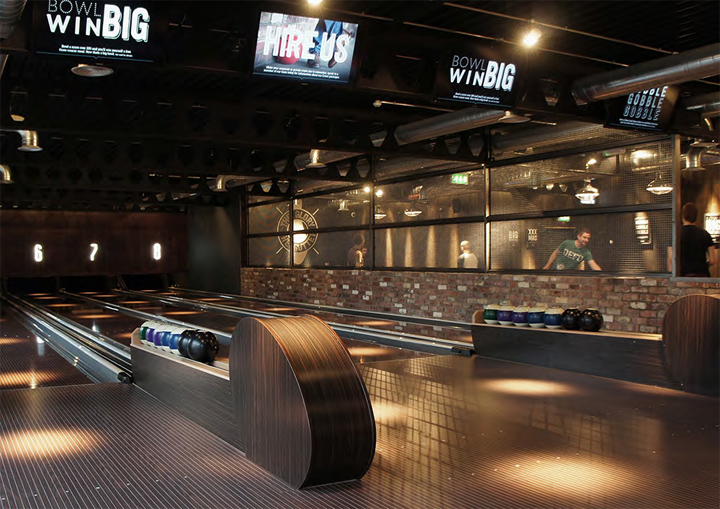
When Lane7 first approached us there was just a concept, but now, with our help, it’s a reality. Our work on the identity and brand led the way in bringing life to Newcastle’s hottest new venue. Combining restaurant quality food, a bar, eight walnut bowling lanes, two american pool tables, two ping-pong tables and a private karaoke room, Lane7 is one truly unique venue. Beginning with name generation and identity development, we were instrumental in rolling the brand out across the venue. Working alongside interior designers and various print suppliers we created everything from internal and external graphics to printed and digital collateral.

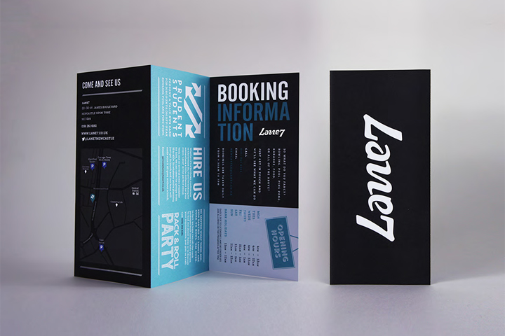
With the brief to come-up with something edgy, flexible and distinct that would marry up to the proposed interior style, we came to Lane7. ‘Lane’ gave us an obvious reference to bowling and a sense of geographical location, whilst the ‘7’ came from the 1,024 possible outcomes of a game of bowling (1+0+2+4=7) but remained non-specific. Using the joyous relationship of the ‘L’ and ‘7’ we created a bold and confident, ambigramic identity inspired by the constant movement of a bowling ball.

Stylistically, we referenced the vintage styling’s of ten-pins 1950s hey-day with a hand-drawn typographic approach, which we developed into an all-encompassing brand identity system. With the mark as our measuring stick, we designed the full-range of required print collateral; from letterheads to leaflets, business cards to badges, and mugs to menus, crafting an identifiable and characterful tone of voice for the brand in the process.
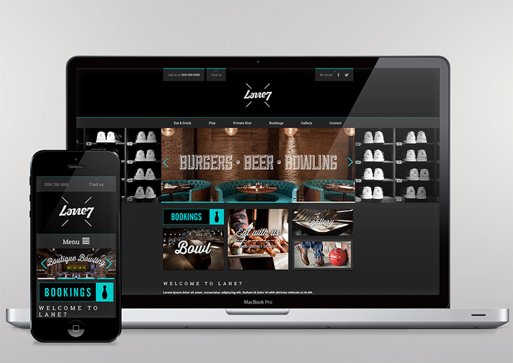
This personality became crucial as we began developing the brands digital presence. With a young and edgy target audience, social media became a focus for us early on as we sought to get the brand exposure. This rolled into the design and build of the website, and subsequent range of emailers, all of which were integral parts of the brands viral launch strategy that we coordinated.

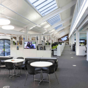
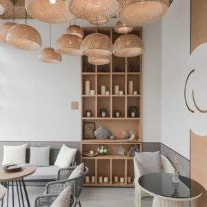
When it came to the brands physical presence we were no less involved; regular visitors to the development, we worked alongside a local interior designer to ensure brand, and not budget, dictated the build, and designed internal/external signage, printed and digital posters, and a range of graphics to fit the venue as required. We were also able to ensure that staff could live up to the brand, advising both on the staffing and uniform policy.
Designed by Wonder Stuff Studio




Add to collection
