

Liverpool English Pub branding by Reynolds and Reyner & Pure
posted by retail design blog on 2012-02-28
Add to collection


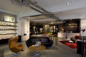
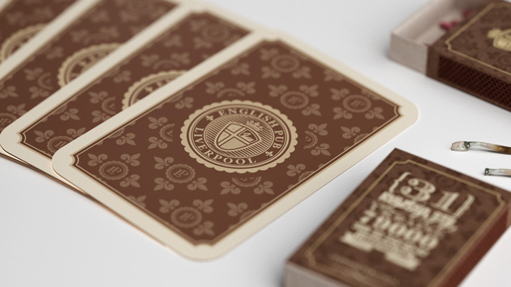
First classic English pub in Ukraine. While working on project it was very important to show the connection between our brand and traditional England. Especially with its famous town – Liverpool. That’s why we’ve started from analysis of history and key elements of town’s name and logo.

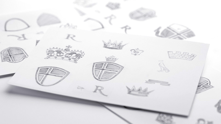
Alexander Andreyev: «The symbol of Liverpool is The Liver Bird. This bird is like legendary Phoenix and Sirin birds – there were no such a thing in real life, however, scientists still argue what kind of extinct birds could be its prototype. By itself Liver is a symbol not only of Liverpool town, it’s also main part of logo of very famous English football club. The second part of the city’s name means the water because the city is located near the sea».

Artyom Kulik: «After analysis stage we’ve found three main elements that need to be combined in a logo: The Liver Bird, location near the sea and heraldic style used in Britain during the birth of Liverpool. This has become the basis for the logo and identity of the brand at all».

Created in collaboration with marketing agency Pure:
Roman Matys, Pure «The objective of positing objects that carry roots from other cultures is to bare in mind the mentality of the audience. This is very interesting and exciting job which involves a synthesis of elements that before very unimaginable to coexist together. It is vital to maintain balance on the edge between the image in the consumer’s mind and the need to create quality and unique product. I believe, in the case of the “Liverpool” pub we have succeeded in achieving this».

Andrew Mykhashula, Pure «Each brainstorming session is a battle between two concepts: “like” “appropriate”. There were always plenty of feisty arguments from both sides of the table but in this particular case the marketing’s “appropriate” and the designer’s “like” have come to an early agreement which let to such an amazing result».


Add to collection