
Add to collection
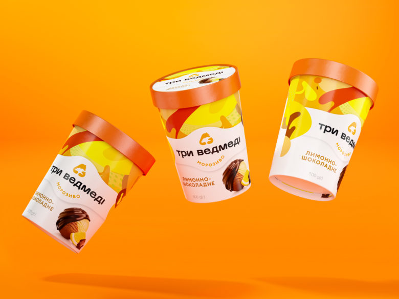
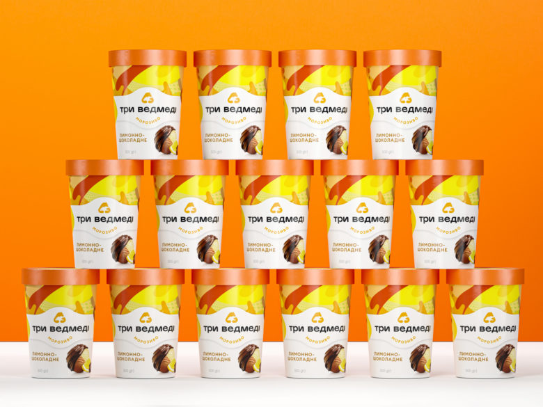
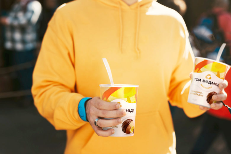
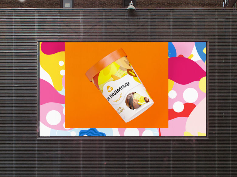
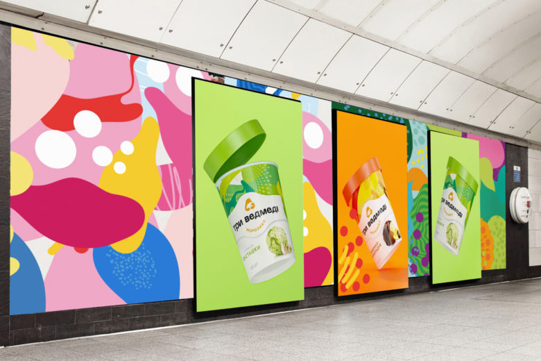
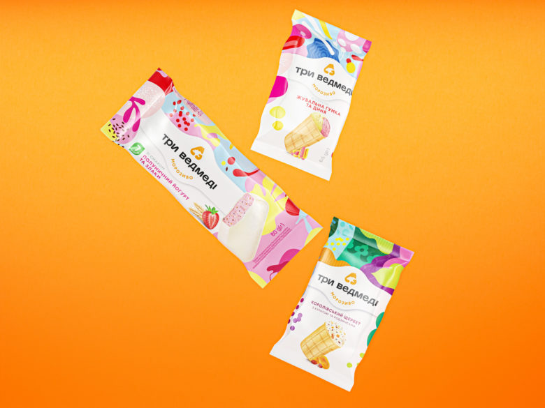
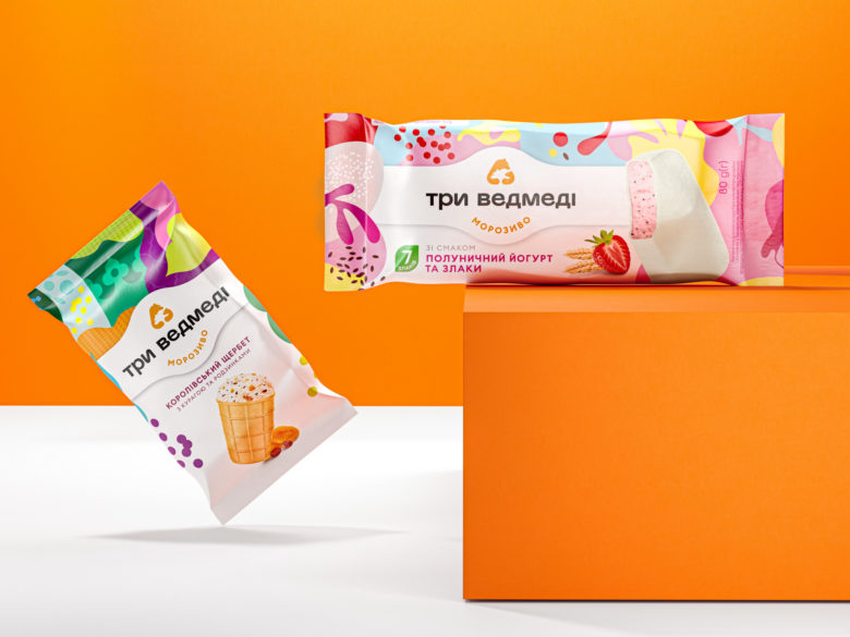
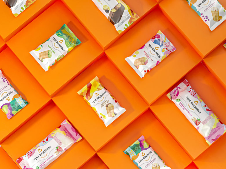
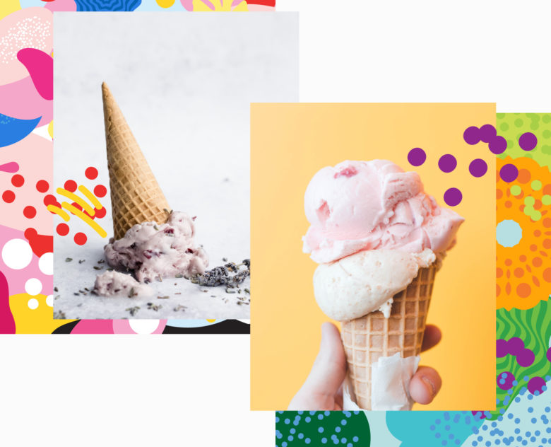
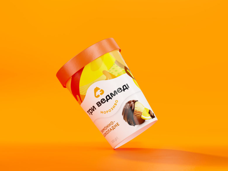
The key task of the agency was to integrate SKU designed in a diverse way and deliver the emotions that arise when eating an ice cream through the packaging. This is how the clear graphic hierarchy was born. We just gave larger space to the bright patterns, placed the updated logo on a white billet in a close-up way with the most delicious, the ice cream, being on the white background. Paired with the product image, the patterns stand for taste indicators.Special attention is paid to the tastes’ images and we reached the best fit to the packaging content. Images of the ice cream are highlighted by the graphic presentation of the ingredients.

Add to collection