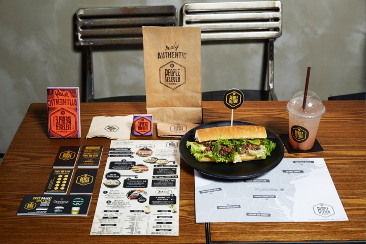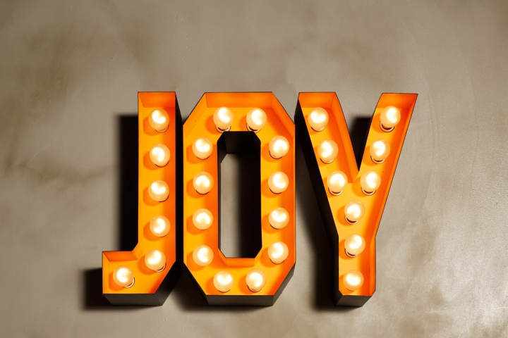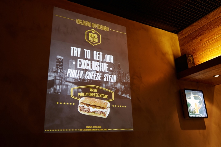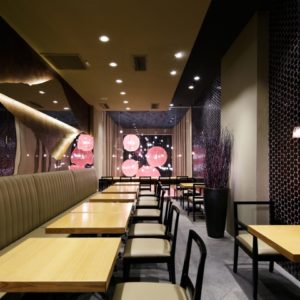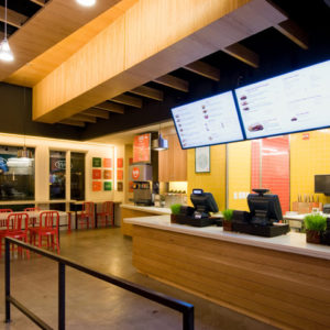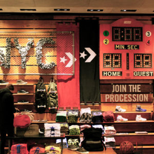
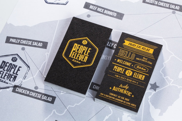

YNL design designed the brand identity of People Eleven that specializes in Philadelphia cheese steaks. The overall concept used for the design was ‘American Vintage’. This concept was applied to not just the graphic designs, but also to the restaurant’s exterior signage and interior elements such as the fence.

The logo for the restaurant was inspired by a rubber stamp, which emphasizes the natural and vintage image of the U.S. We spent many hours thinking of ways to make the rubber stamp image look good as a logo, and created many samples before arriving at the design that we liked.

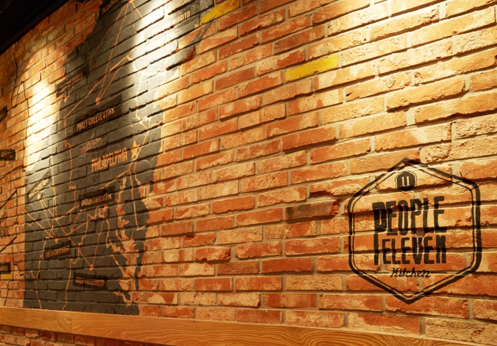
The colors used for the logo are bright yellow and black. This creates a color- clash that catches the eye and suggests vintage-like images. Broad, bold, and typography-like fonts were used for the restaurant’s menus, packaging, name cards, posters and uniforms to match the vintage and natural look and feel of the logo. On the brick walls of the restaurant, a map of Philadelphia, the home of Philly cheese, was used to highlight the space.
Designed by YNL Design
Designer: Liz Yoona Lee


