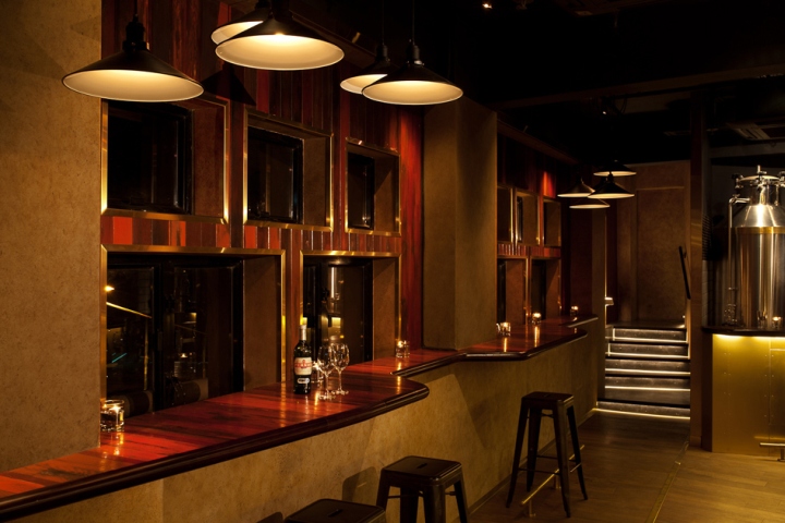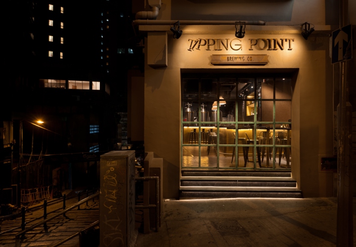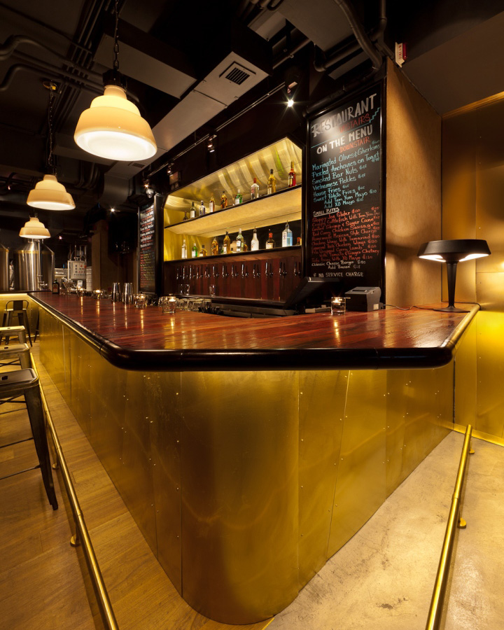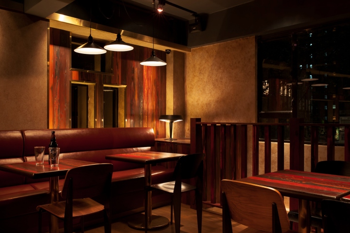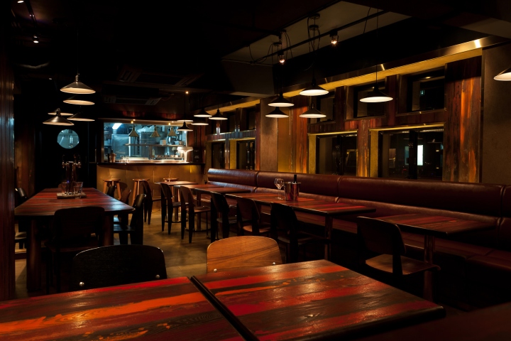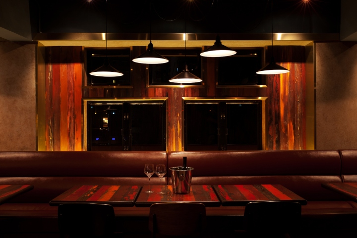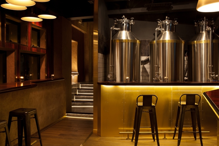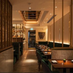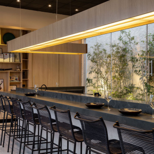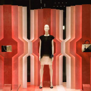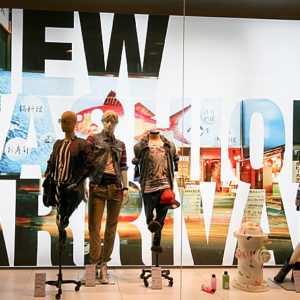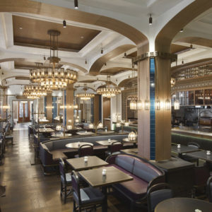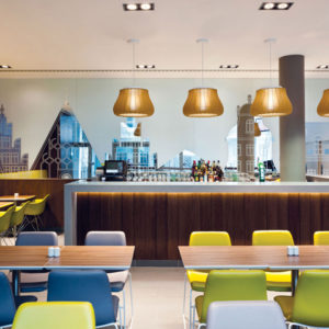
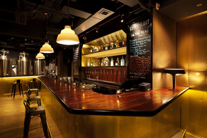

The project unfolds on two floors. At the ground floor the space is long and narrow, on the back a proper brewery is installed to produce a fine range of craft beers, on the opposite side, the entrance area opens up to the street. Tipping Point aims to establish on the market as a unique brand of craft beers and the first floor is dedicated to this program while upstairs a restaurant serves quite experimental western cuisine.

Idea of authenticity has been the driven motif in the developing design process. Real materials like painted or solid wood, copper, brass, marble, leather have been selected as opposite to typical layered materials like laminates or acrylic resins which normally used to replicate more expensive surfaces. All materials are solid to give a sense of permanence and consistency. Ageing element is actually kept in account as an added value in recognizing the beauty of the signs of times on a solid surface. Material board was made by looking at typical fisherman house where like a patchwork a variety of textures and materials are assembled together.

Rusted textured metal sheets are bolted on each other in a irregular way, wood panels are made of boards taken form boats or other houses and when assembled together they never happened to have the same color. Furniture are frequently made of the same building material of architecture like cement, tiles, painted wood and in order to resist the time they always come in heavy and thick thicknesses.

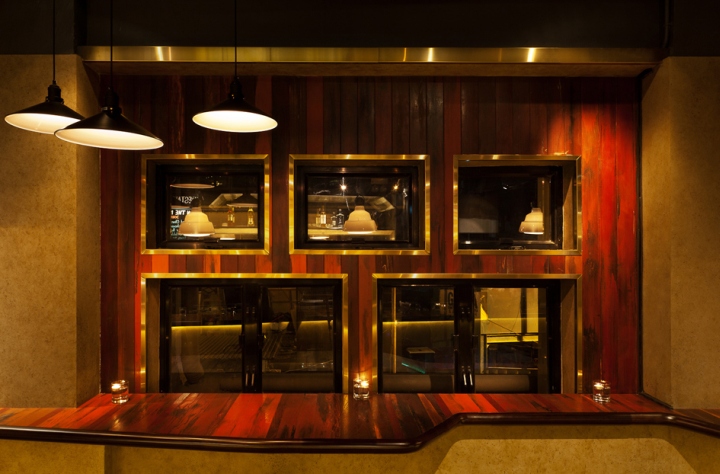
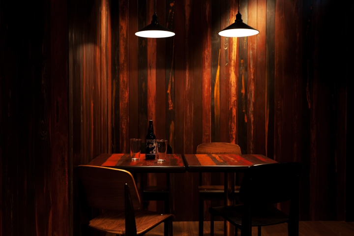
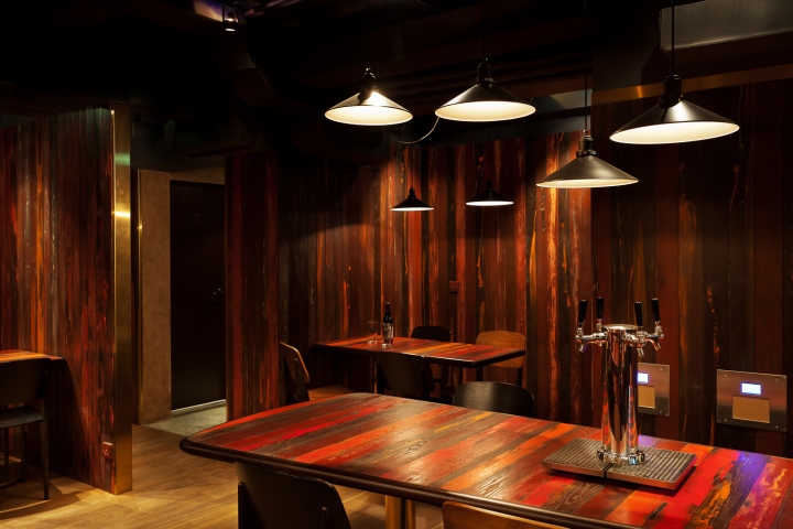
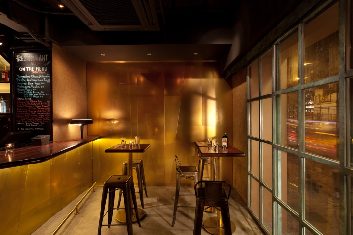
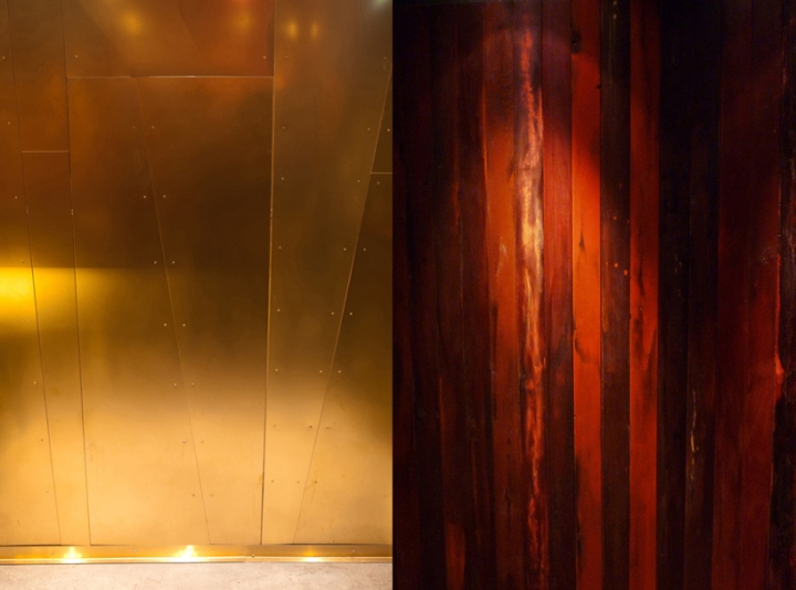
All these elements are like words of a valuable language and it has been very easy to formulate them into a design concept. Wooden surface painted in various colors is like a skin that covers both vertical and horizontal surfaces. These panels are framed on the walls by horizontal brass profiles and vertical concrete textured pillars. The same wooden texture is also used for tops of counters and tables, framed by thick solid wood edges some of these tops have angular irregular shapes as if they were cut-out pieces.

Vertical panels are decorated by brass panels cut in angular lines and fixed to the back by bolts in the old style way. These irregular graphic textures are inspired by the old fisherman house motifs but ironically meet pretty well with the ultra-modern sensibility in deconstructive lines. Cool industrial look of brass panels adds on to the presence of the brewery’s tanks which are actually producing the brand’s craft beer distributed directly through pipes from the bar wall’s taps at the ground floor and from the central table’s tap of the restaurant at the first floor.

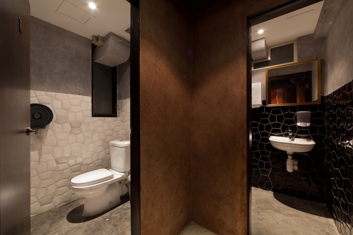
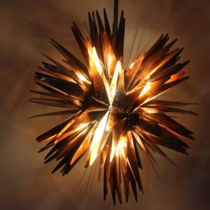
Traditional black pendant lights typical of every old school Honk Kong restaurant are alternated to ultra modern “GLAS” light by Diesel-Foscarini and Aerodrome table design by Alberto Puchetti-Arboit for Northern Lighting. Like lining fabric of a colorful tailored jacket the color palette of the toilet, in contrast with burgundy-brown dark tones of restaurant and bar has a very controlled image: gray cement paint on walls and floor combined with black and white angular tridimensional tiles.

Material and Furniture
Concrete wall paint, solid wood, painted wood, brass, floor in American walnut wood. Sofa in real leather. Furniture in painted iron.
Ceramic tiles and wall paint in the toilet
Entrance door made of copper and glass
All furniture is bespoke designed by Arboit Ltd for this project
Lights: “Aerodrome” light designed by Alberto Puchetti-Arboit Object for Northern Lighting. “Glas” pendant lights by Foscarini-Diesel
Design by Alberto Puchetti – Arboit ltd.
Construction by Hung Limited.
Graphic design for Signage, Logo and Brand ID by Dennis Lo
Pictures by Dennis Lo
