
In one of the most crowded avenues of the city with a clearly commercial calling, whe had the opportunity to design a very particular and different Mall, a Theme one, not as the other retail spaces along in it which were in better or worst scenarios places full of beauty but lack of meaning. The design call the attention of one of the most recognized Chefs of Mexico, at this time a very cherish friend, his commission: take 2 commercial spaces of 13 feet wide and 52 feet deep each one, and transform them in to point of reference, showcase and iconic place for the New Modern Yucatecan Cuisine.

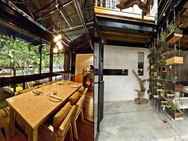
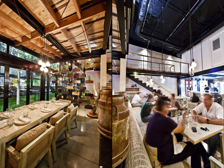
That’s how we conceive a space in where the audience merge with the Show Kitchen, the one that becomes the most important part of the project. It’s a simple understanding of the hole space, first like a preface, the green terrace, the promenade part of the Theme Mall with his two native trees called “Chaka”. A bar beside the entry works both the interior and exterior space.

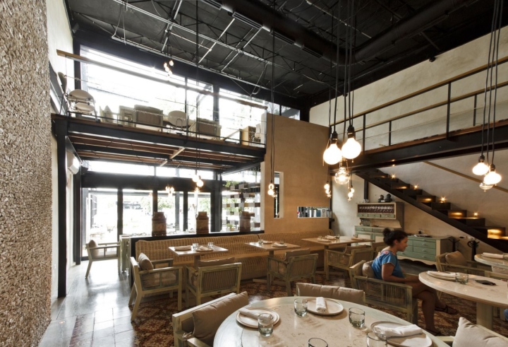
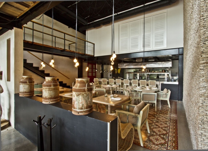
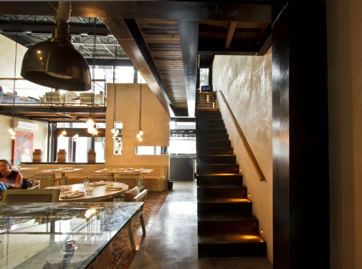
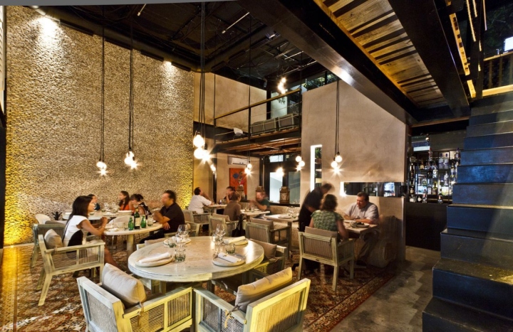
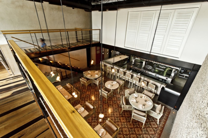
When you open the door up front you’ll find a wall covered with Chucum (concrete mix with a natural savia resin) this wall in company with the side Floating Vertical Garden confines the entry and give place for the Hostess. Then a steps forward we found ourselves in the main room which has a peculiar height and it jumps to our sight the Concrete Flooring with his “Orange Pasta Carpet” and a two stores high Stone Wall place artisanal, if you turn your view again to terrace you will find the first of the smaller party saloons which is one store high and faces the terrace.

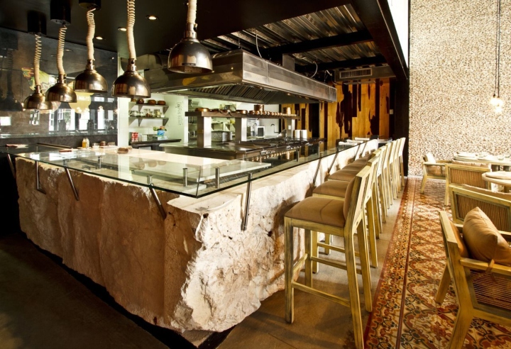
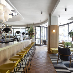
Upstairs we have another two more party saloons, one is at the back facing the main room, the other is at the front with a clear view of the terrace trees. The main attraction of the project is the Kitchen, this open, flow space its confined by a counter made of Stone Blocks who had been posted on there places with a crane, it’s a perfect contrast mixed with the transparent glass bar on top of it, that how together coexist the traditional and contemporary materials.

The Structure of the mezzanines and the roofing have an apparent look, the steel frames have been painted in black, the wood for the walls and flooring had been carefully selected ( Guayacan Wood) with his tones and layers which be far of common material, the air ventilation ducting its apparent, the lighting is indirect just like a emphasis for the space, from time to time bunch of bulbs hang from the ceiling and embellish the space. To maximize the merging of the exterior and interior space, all the windows systems ( both wood and aluminum) turn and disappear of the sight, fusing the space in just one.
Architects: R79
Architect In Charge: Roberto Ramirez Pizarro
Design Team: Daniela Álvarez, Cristina Madera, Gerardo Trejo, Eduardo Vadillo
Photographs: David Cervera


http://www.archdaily.com/436138/nectar-restaurant-r79/

