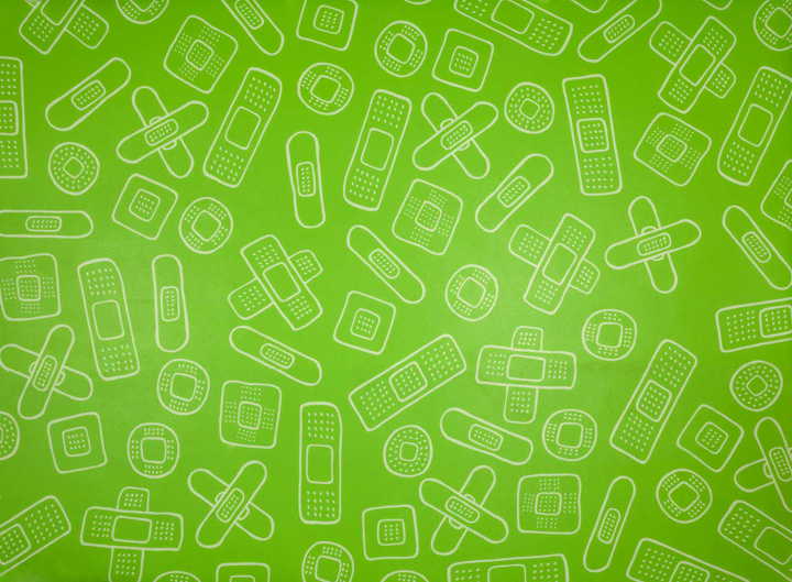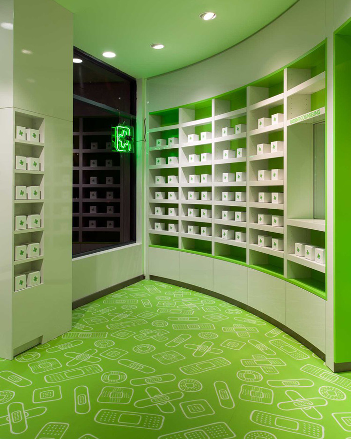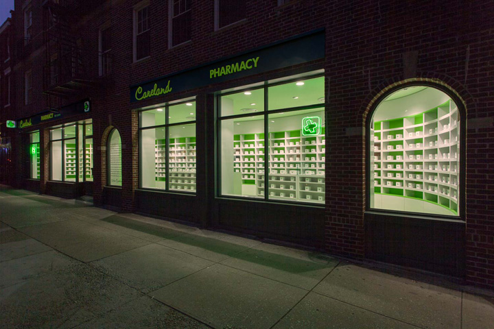
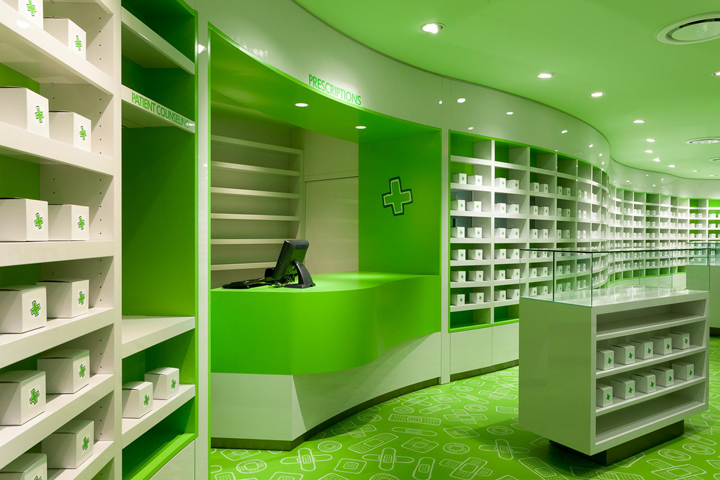

The subtext of the design approach for Careland pharmacy is the constant juxtaposition of ideas. In order to underline the clinical quality of the pharmacy, the shelves are in high gloss and sharp. The soft and sensual curve created by the 70 linear feet of the undulating shelves provide warmth and playfulness. The bright green floor, made of a pattern of band-aids hand drawn by Sergio Mannino with his typical sketching style bring warmth by introducing humor and a casual friendliness. Similar juxtapositions are found in the visual identity and the communications. Starting with the notion of “We take care seriously” the typography is a mix of a script, representing a friendly and warm approach, in contrast with an all caps sans serif font, a version of Futura, to emphasize the cleanliness, seriousness and precision of the operation.

The entire project is an example of contemporary design, yet at the same time, it is full of traditional references related to Health care. A dark shade of green is typically the color associated with pharmacies, so we pushed the color to an extreme before it became something else, before it became so distant from what is commonly perceived as a pharmacy color that people didn’t recognize it anymore. The shade we picked is also a man made color, it is not a green associated with the idea of nature. We work on the edge of the cliff and we constantly test its position in everything we do in the office.

Virtually every pharmacy around the world uses the cross as an identifier so we’ve created our own version of the cross by drawing it by hand. While it has a friendly appearance, there is clearly a strong association with pharmacies and health.
Photography: Sergio Mannino Studio and Max Bolzonella
Identity Design: Designwajskol – Jonathan Wajskol, Ying Fu, Janni Berger
Design by Sergio Mannino Studio – Sergio Mannino, Martina Guandalini, Giulia Delpiano, Giulia Bortolotti


http://www.sergiomannino.com/#careland-pharmacy-design
