Add to collection


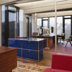
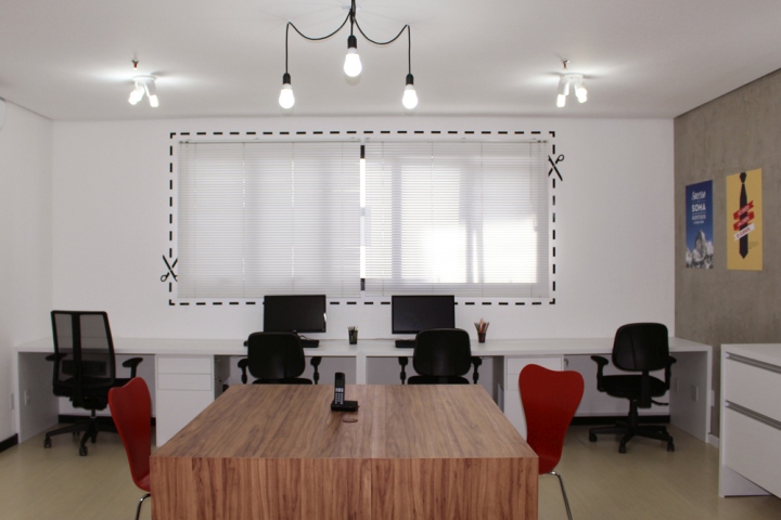
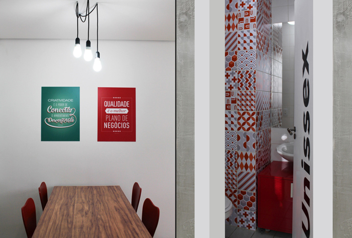
The design of this compact office passed through a full intervention. Although the space was completely modified in terms of appearance and organization, it was necessary a little investment to do so. We opted for solutions that did not cause a major impact on the existing structure, since the room is rented. Thus, the existing floor and ceiling were kept and we worked only with paint and graphical application in specific areas. In the toilet, for example, we used adhesive applied into the existing tiles, in order to upgrade the aesthetics of the space without construction work. Through the application of these adhesives, and a movable furniture fitted over the existing sink, we generated identity with a low cost.

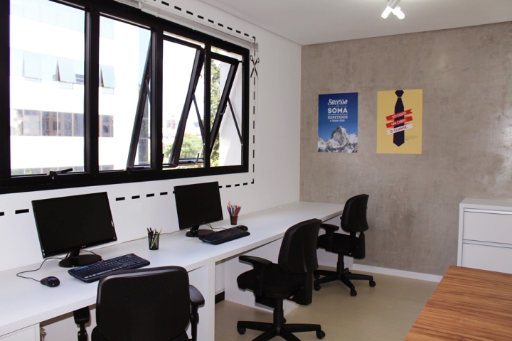
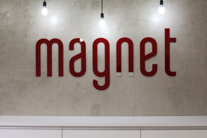
As it was a project for a headquarters of a graphic and publicity agency, we started the concept establishing these graphics as the main guide for the whole space. We proposed a base of neutral and striking shades (white + black) to highlight the central wall that receives a “concrete” painting, the company logo and storage functions and built-in furniture. Wood and color (red) brings warmth and coziness to the space, combined with a fun twisty in the phrases. The layout of the space has been designed to accommodate in the best possible way the 6 permanent employees of the company as well as area to brainstorm and independent meeting room.
Design and photography: AndryaKohlmann – design.concept


Add to collection