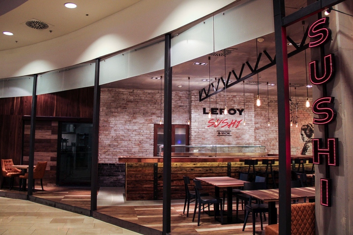


Leroy Sushi is “a space in a space”, a little microcosm in which it is possible to recognize an own and strong identity, even though it is surrounded by a rather diversified environment – as the Arena Plaza Warehouse is – from the point of view of style with the presence of different types of materials, colors, lighting systems and lettering, and in which also specific and contemporary details of a metropolitan area are found. The project of interior design by Studio Arkitekter conferred the place a strong and distinctive character; the lightweight structures together with the sliding door in smoked glass panel and the shields recall the Japanese traditional constructions, textures and interiors.

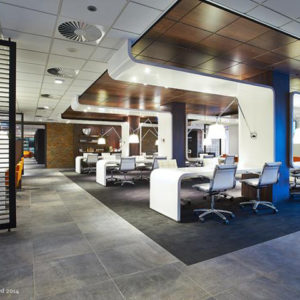
The project area is spatially well-defined and – as we admire lighty and airy places – the space is characterized by directed and diffuse lights hanging from the fair-face concrete ceiling surface and it is furnished with tables and chairs of different sizes, shapes and heights allowing endless seating solutions. The use of contradictory materials and colours gives the place fresh personality and uniqueness. The wooden surfaces of tables and floors range from yellow-tan to light and dark-brown shades.

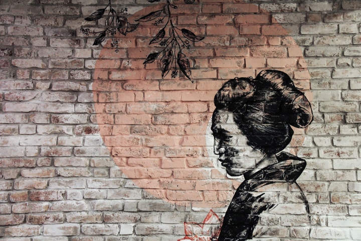
The seats are covered with brown and dove gray leather; dark grey stools are placed around the sushi counter, coated on the upper shelf by a bright copper plate and designed with squared-wooden beams, regularly stacked and overlapping. The alternation between filled and unfilled modules of the metal shields – placed on the perimeter – creates variable depth and makes the inner space communicate with the surroundings. A brick wall, decorated with Leroy Sushi logo and painted with the image of a Japanese woman, divides the kitchen from the dining room of the restaurant.
Design: Studio Arkitekter / Viktor Csap / Zsuzsanna Kertész
Ceramic letters design: Júlia Néma
Photography: Zsuzsanna Kertész


