

ANNIVERSARY MilK Pop-up Store by Kazunori Matsumura at Omotesando Hills, Tokyo – Japan

This is the design for ‘ANNIVERSARY MilK’ Pop-up store, which is a temporary select shop at Omotesando Hills, by “Milk Japon” magazine of kids fashion and lifestyle magazine.The period of this store is one year. The store concept is ‘Life With Children, Generous and Beautiful’ was the base for the store design. While expressing the world of MilK Japon aesthetics this store also offers a flexible space that can be used for various events and workshops.

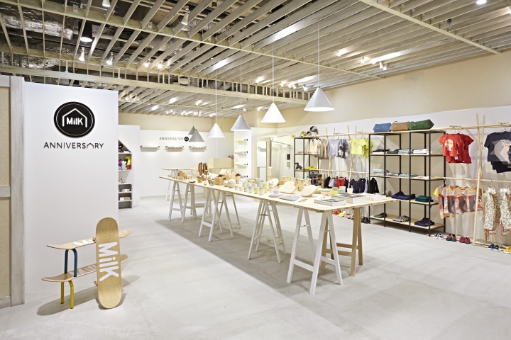
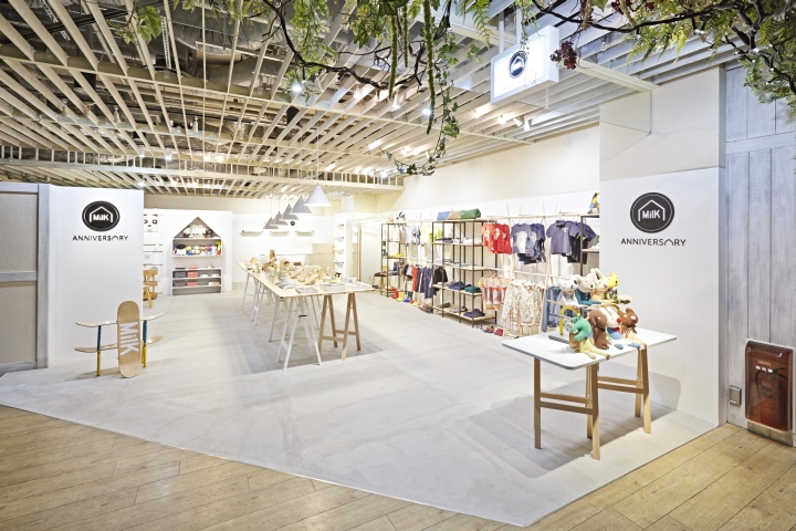
A table sized in 1.2m wide x 5m is situated in the middle of the space, and is usually used for product display as well as for gifts’ wrapping. Five pendant lights are suspended above the table, gradually lowering towards to the far end of the table. The front of the table is the focus area, the center is for product display and the furthest part is for wrapping. The five pendant lamps leniently divide each area of the table. The products on the table are removed during the events and workshops held at the pop-up store and the table is used by the events’ guests and is always a center of the space. The structure elements are wooden stands and boards combined together in a simple way, but the structure itself is created as if children left is randomly after playing, expressing the design that resembles children and childhood by spreading the wooden boards over wide radius.
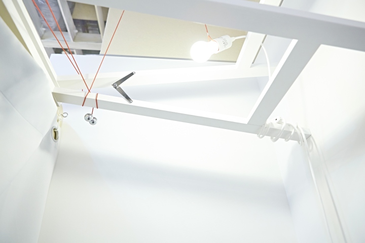
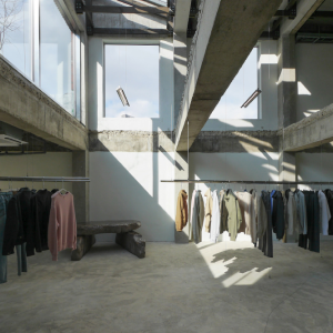
POS and fitting booth were also made in a simple structure using wooden materials similarly to the table. The fitting booth is designed by placing a table against a wall, where the back of the table serves as the inside of the fitting booth and adds a little different fell to the whole space. Beside the POS counter are placed the house-shaped shelves, which are also used for the store’s logo. With these shelves as a base, there are several grey shelves in various shapes. The display shelves by the wall are combined of dark grey frame and white wooden boards, creating a simple and understated design to highlight the products. Similarly the racks, that display clothes are created by combining white round wooden bars, so the clothes seem to be highlighted as in a frame.

The overall elements of the space are summarized in cool colors of white, grey and light wood, while the shape and structure of the furniture added some warmth, which allows to highlight the latest trendy fashion and accessory items selected by MilK Japon, while serving as a place where both children and adults can use this space as a comfortable salon.
This is an initial pop-up store of French magazine, MilK.
Design: Kazunori Matsumura
Photography: Motonori Koga
Client: MilK japon






Add to collection
