
Add to collection

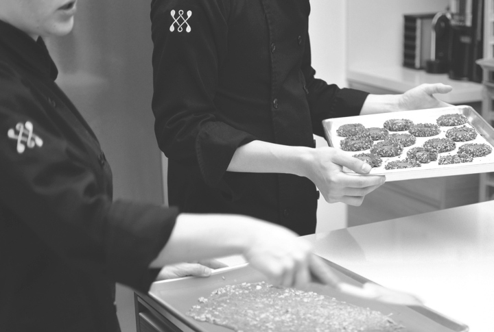
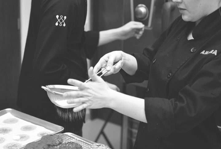
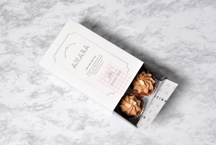
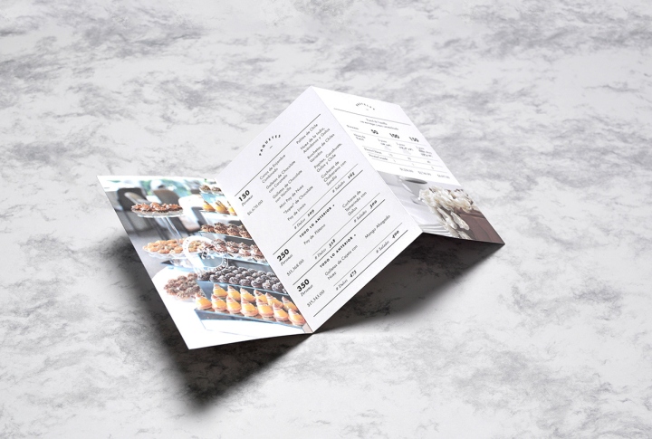
Amara is a catering atelier that provides hosts with exquisite options for their formal events. Besides baking statement cakes for weddings and showers, they specialize in finger desserts and salty treats, assembling mixed snacks tables for every occasion.
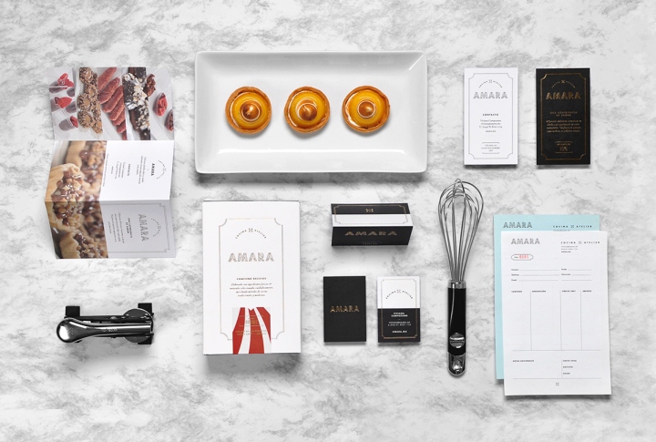
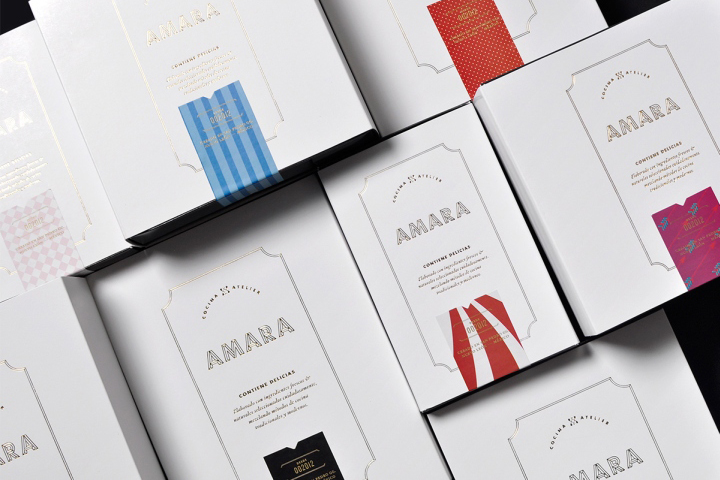
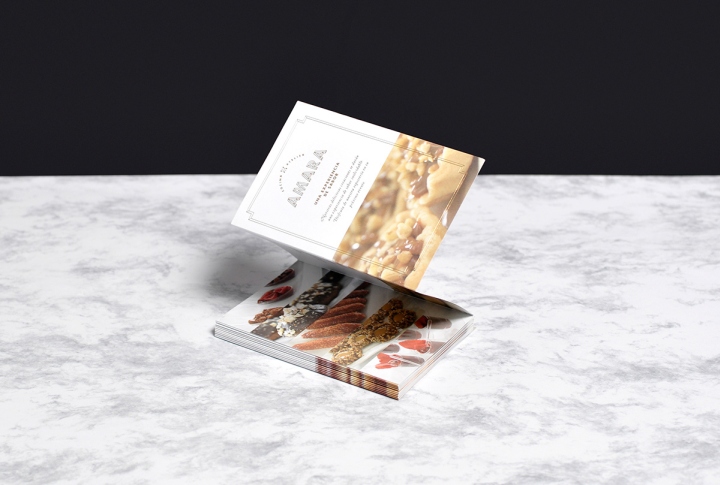
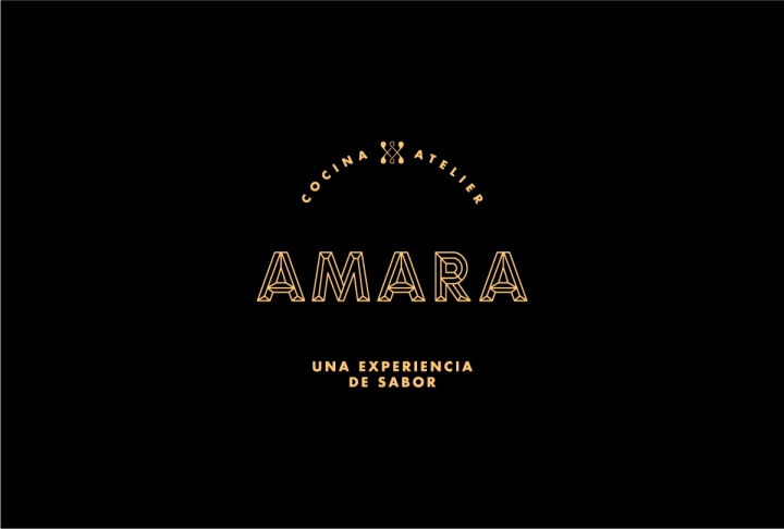
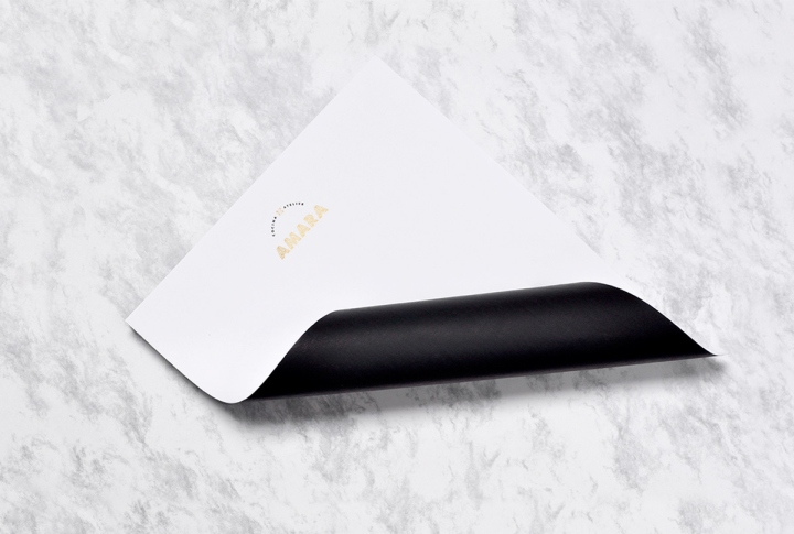
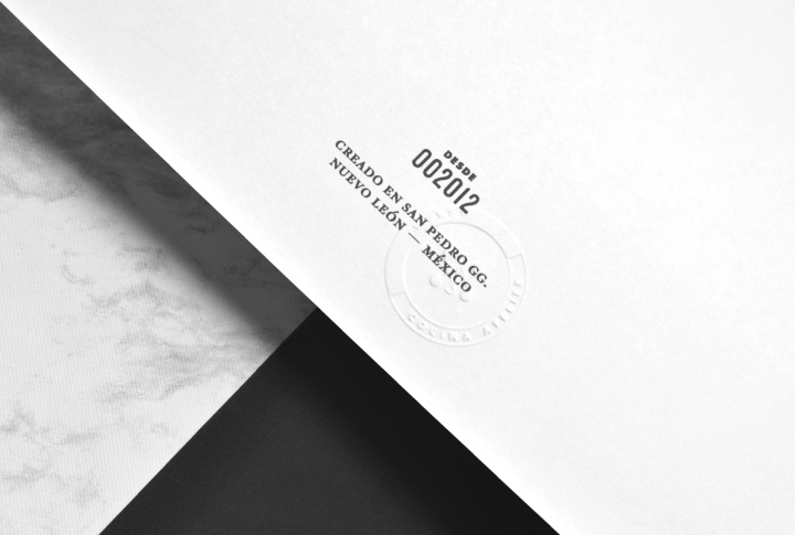
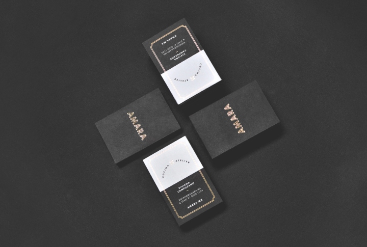
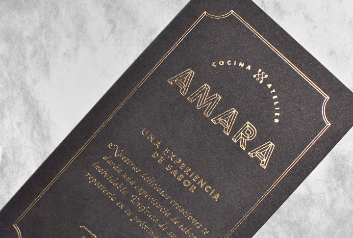
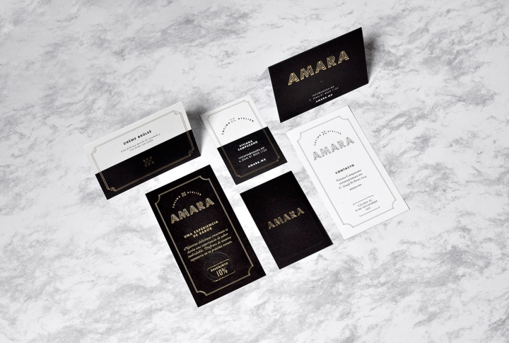
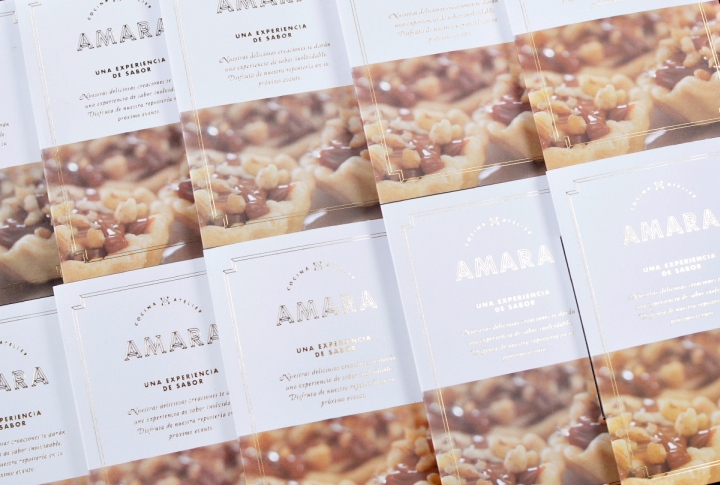
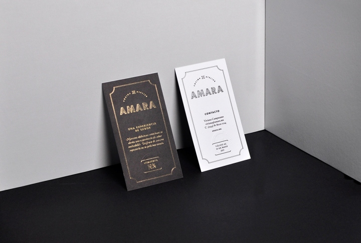
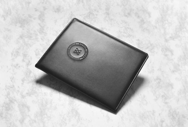
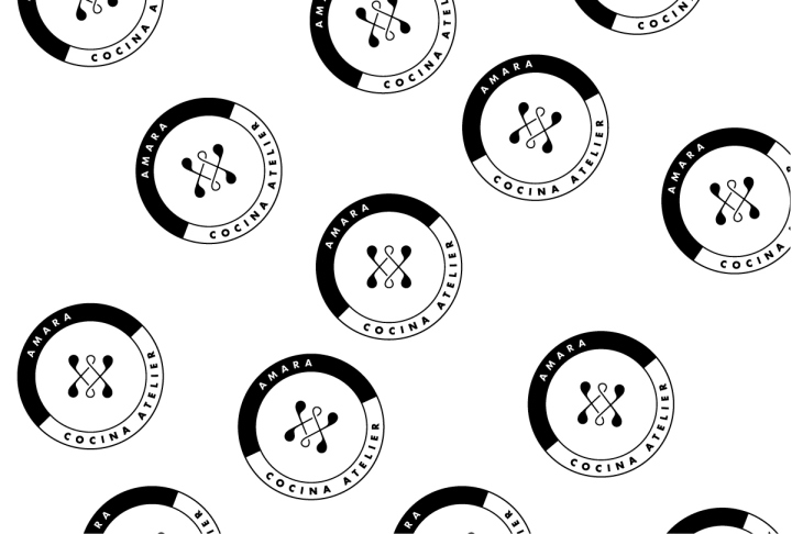
Our branding proposal was inspired by the chef’s trajectory, focusing on her residency in San Sebastian, where she learned exotic cuisine and food styling that would mark the beginning of the Amara brand. The name Amara comes from a specific region in Spain, known for its restaurants and dedicated chefs. The aesthetic chosen derives from a private event ambiance, very exclusive and elegant. Black and gold are Amara’s main color palette, upholding the luxurious sense of the brand. Colored stickers decorate the packaging to add a fresh touch. Gold bullion served as references for brand elements such as the wordmark, and the letterhead. The wordmark also takes from antique regions of San Sebastian, where heavy monograms abound. Amara’s emblem is a combination of the letter A – for Amara, and V – for the chef’s name. It’s traditional style contrasts the modern wordmark, creating an elegant yet mysterious balance.
Design: Firmalt – Naming, Branding, Packaging and Communications


Add to collection