
The design process for The Lantern Hotel project started in 2012 with long periods of time to get the building facade approval from the authorities, getting the client to confirm room numbers and room layout, going over and over the design, looking at different options and doing continuously cost-cutting exercises to maximize cost and profit for the client, achieving 49 guest rooms, all with attached bathroom, 2 dorms with each 6 beds and external bathroom, facilities for breakfast, centralized computer area, locker area and an outdoor terrace overlooking Petaling Street, Chinatown.

Sadly so, the existing shop houses at this site were demolished and were replaced with a huge building block of 5 levels, with no regards to the surrounding or the Malaysian heritage. Hong Leong Bank is operating at the first 2 levels. The 3 floors above which were empty over the last few years, was most recently used as a stationary/ bookstore as far as we know. We were faced on one hand with an ‘out-of-proportion’ existing building mass, and to satisfy client’s brief to maximize the space for as many rooms as possible for the minimum budget possible; At the same time, try to design a hotel in which guests would feel good and respond to the surrounding, partially [most already destroyed] heritage and history of Petaling Street in the most sensitive and empathic way possible.

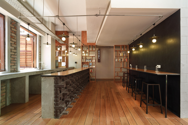
In terms of sustainability we decided from beginning on to have all the public areas natural ventilated, only the guest rooms have optional split air con unit, and to bring as much natural light into the space as possible. We ensured cross ventilation in the horizontal as well as vertical space via openings in the facade and the vertical void with a gap between skylight and roof. We only used locally available, locally manufactured building materials like dark burned clay brick, polished colored concrete and terrazzo tiles for the floor, white lime wash finish and natural plywood. We got local craftsman to build the timber shutters for the facade and use recycle solid timber for terrace and loose furniture. Solar panels for hot water showers are installed on the roof and last but not the least, the total cost of this renovation all in including furniture / furnishing up to soap holder is only 4.2mil

The construction phase alone faced a lot of constrains and hurdles. Hong Leong Bank operating in the first 2 floors, along with the hawker shops at the ground floor could not be disturbed or interrupted, which put a challenge for the contractors and the site logistic. We had to work in an unconventional way, having to deal with all the different trades and craftsman mostly not versatile with the English language, with no main contractor on board. Most decisions were made directly on site either verbally or via sketches to simplify elaborated cad drawings.

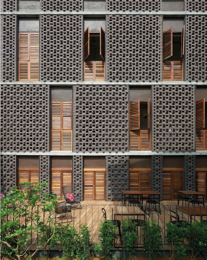
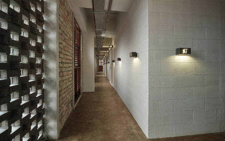
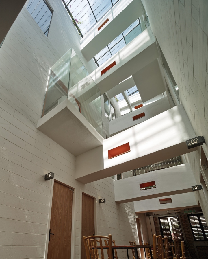
Throughout the whole design process our challenge was not to lose track of our initial idea to create a central void/ courtyard space. We also wanted to introduce natural light into all floors, face all the guest rooms internally and place the main corridor along the outer facade instead for guests to experience views out [either through the new clay brick walls with openings or through the timber shutters on their way to their rooms].

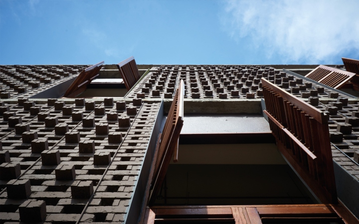
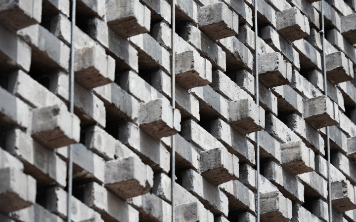
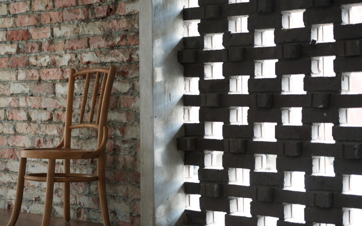
We wanted the facade to be less obtrusive and to melt harmoniously with the hustle and bustle of the surroundings. We decided on locally manufactured, dark brown clay bricks from Johor Bahru and we studied different laying methods to allow for sufficient opening and laid the bricks in a manner to give a ‘3 dimensional’ texture to the facade. We removed the existing windows and added a new facade on top of the exiting wall whereby we either added timber louver shutter windows at the existing openings or we carried the clay brick wall throughout the opening. The openings for the timber shutter/edges of the clay brick walls are ‘framed’ by 10mm thick MS steel plates in micaceous ion oxid finish and steel rod function as tie – backs are added for additional safety.

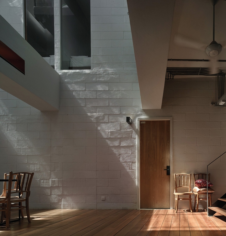
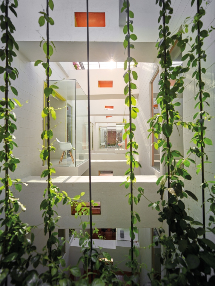
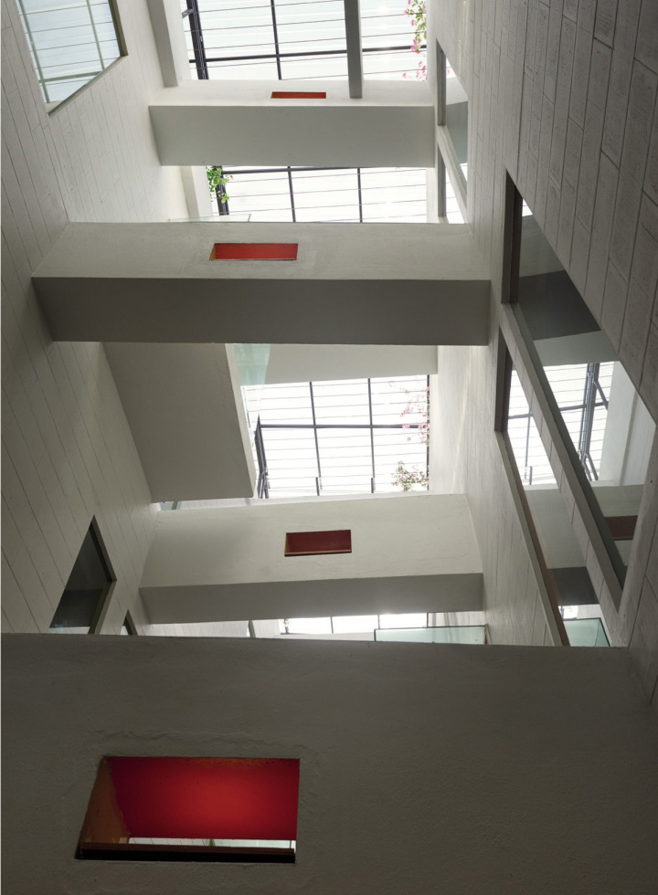
By demolishing the slabs, the existing beams are exposed and together with the cantilever glass boxes, they create an animated and dynamic play in the void- space. We emphasized these beams with their existing cored openings for the original air con ducting by adding lighting inside the openings and painting two inner sides in orange and the other 2 sides in green which gives a colored glow at night. The color scheme of green and orange is carried through the rooms whereby one side of the void has green curtains and the other side has orange. It goes the same with one wall inside the rooms, one side either has orange or green blending with the curtain or in the fabric of the chairs sitting inside the glass boxes.

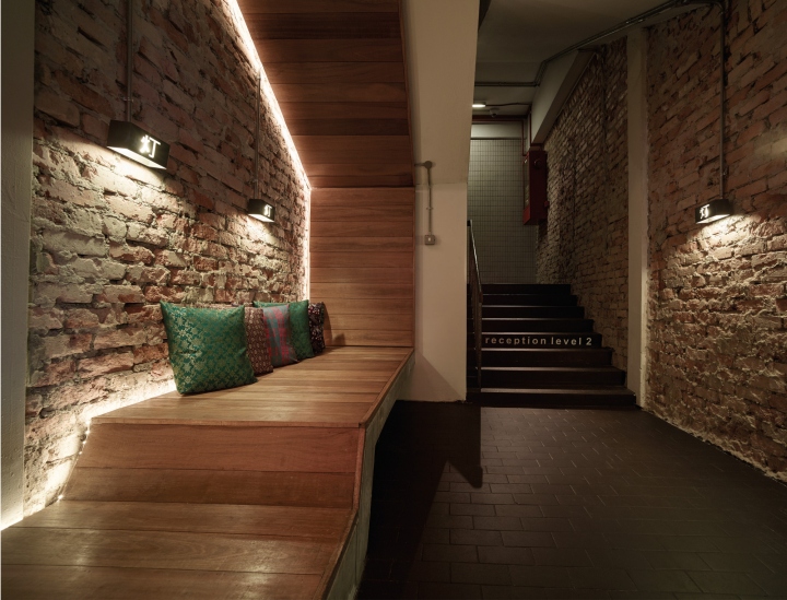
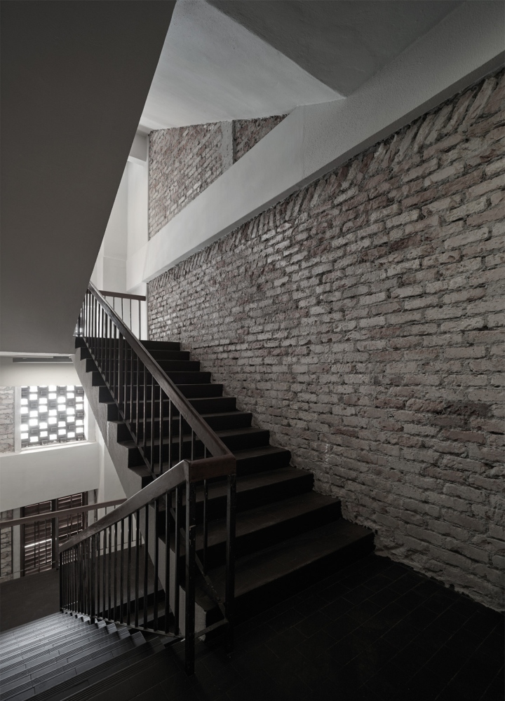
We soften the edge of the void space with plants/ creepers, placing hot dip galvanized planters with steel rods instead of railing at the corridor facing the void and we designed concrete planter boxes on the roof to allow plants to creep below the skylight along horizontal steel rods adding shading from the sun once mature. To add more texture and materiality inside the corridor and staircase, we removed some of the plaster and exposed the existing bricks. The existing concrete floor in the corridor area is just polished with some added color giving it a warm and lively patina/ texture. The void between entrance staircase and the facade was previously boxed up and enclosed and no natural light could penetrate into the staircase area. We opened it up, created a void where the natural light passing through the clay brick facade can flow into the space.

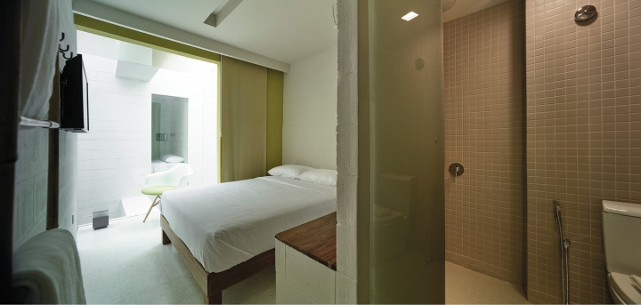
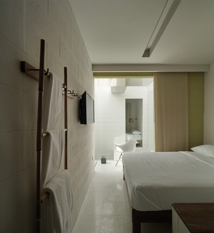
Being an open plan before, all walls for the guest rooms were added using concrete blocks, painted only. All rooms are facing the inner courtyard, with some rooms having a glass box intruding into the void, a full height window or a lanai area at the long side facade at level 2 with a view towards Petaling Street. All rooms, except the dorms, have attached bathroom in mosaic tile finish, a small niche painted in orange or green with a solid timber top, a bamboo ladder fixed to wall for towels or cloth hanger. All rooms have specially-made timber bed frame not touching the floor and the dorm has double high bed design with plywood timber wall backing. Being very small rooms ranging between 15 sqm-18 sqm, we added a centralized space for lockers in all corridors using the same timber louver design concept like the facade for the locker doors.

Having the reception on level 2, we highlighted the main entrance at ground floor with a red pendant lantern ceiling facing the main entrance door. Upon entrance, we designed a small foyer waiting area with a fixed concrete/ plywood bench before stepping up to the reception area at the 2nd floor. This floor has 15 guest rooms and all the basic public amenities like reception/ bar/ counter, charcoal pant/ magnetic wall for notes and information, a computer counter area, a simple plywood shelf and tables/ chairs inside the courtyard. These tables and chairs are to be used for morning breakfast, and meet-ups. From this level, a steel/ timber staircase leads you to the outdoor terrace overlooking Petaling Street. The next 2 floors above are typical floors with each 16 rooms + 1 dorm.

We hope this building will evoke associations, memories and a glimpse idea of what might have been at this specific site before, reminding us of the rich historical past and heritage throughout many places in Malaysia and South East Asia.
Design: ZLGdesign
Photography: Staek Photography


via Archdaily
