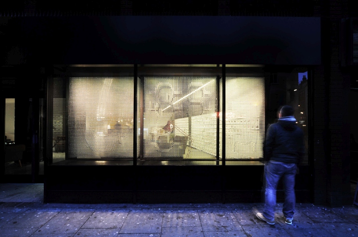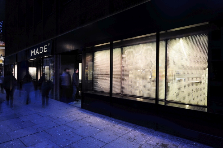

Bureau de Change was commissioned to design the window scheme for made.com’s Flagship Showroom in Soho / London. Located in one of Europe’s busiest shopping districts, the aim was to design a scheme that would stand out amongst the dominant façades of surrounding retailers and theatre buildings.

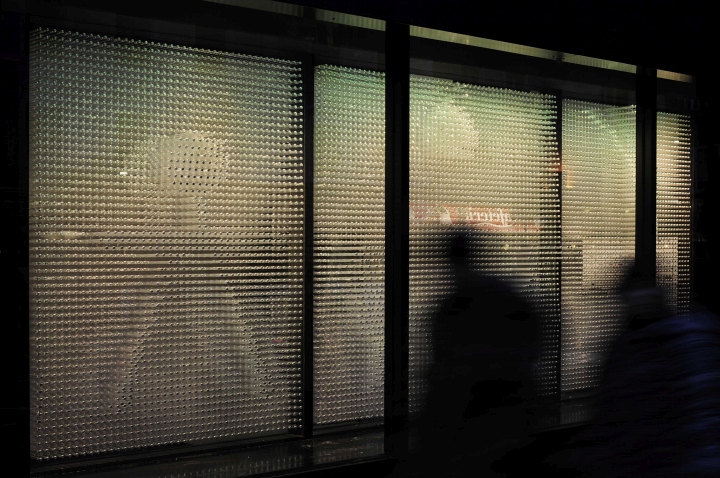
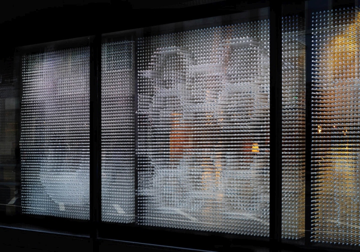
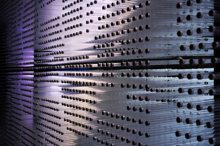
The studio concluded that continuity across the 24 metres of ground level glazing was essential, in order to create visual impact. Rather than display product behind the glass, the glazing itself becomes a full-scale representation of the product in an intricate permanent installation. Almost 40,000 clear rods puncture the 10 windows of the store to create three- dimensional ‘pinpressions’ (similar to the 1980’s executive PinArt toy) of some of MADE’s most iconic pieces of furniture.

Acting as a showroom for this online brand, as opposed to a buy ‘off the shelf’ store environment, it was important to go beyond the traditional window display format. Whilst maintaining compelling views into the interior space, the oblique views and feathered texture grabs the attention of shoppers, appearing almost animated as they pass by. Tipped with 80,000 bespoke machine turned steel caps, the scheme resembles an undulating digital display, referencing the foundations of the brand.
Design: Bureau de Change
