

The main task of the designers is to turn new generation of Yoshinoya’s image from fast food chain into a higher quality brand image, turns the store at the core of the busiest commercial district of Hong Kong into a “Top House”. It represents the brand as top fashion, luxury, avant-grande, and premium class with top quality of life, urging the busy pace of urban people to slow down, to enjoy optimized luxurious residential dining environment, spend quality time with friends, in order to deduce a new generation of “a new way of living”.

Designers Four Lau & Sam Sum emphasized on optimized “lifestyle”, using Japanese minimalist style and a lot of wood finishes, to bring out the Japanese way to pursuit slow pace and coordination, to balance the growing urbanization that destructs human, and to integrate traditional Japanese culture conceptual thinking and minimalistic modern decor taste, to become a new generation optimized dining experience new image qualities of Yoshinoya.
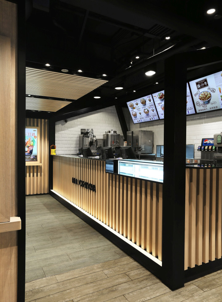
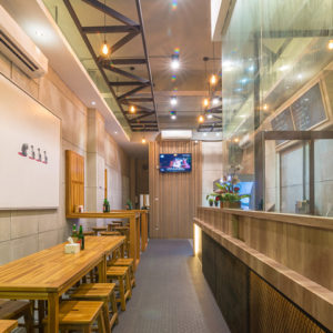
Television cabinet styled as electronic menu has become a “living area” focus, by using different house shapes successfully separate service counter and seating area as partitions with a Japanese feel. “House in house” design set upon the mood of courtyard patio space, making a small space to expand suddenly. It adds the fascination of interior architecture; produces an intimate form of a house; uses the house-shaped wooden structure at the top of the sofa seating area to hide a large number of ventilation and fire systems equipment and pipes (E & M Service). Due to the low building structures, the basic factors in considering functions and aesthetics add relative difficulties to design.
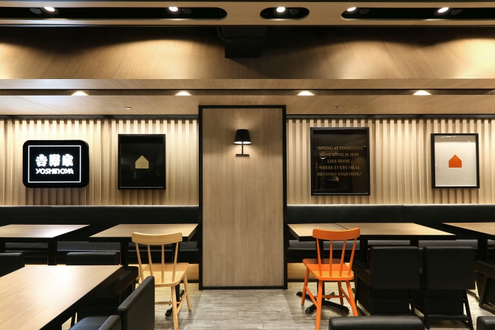
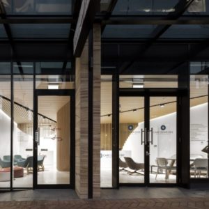
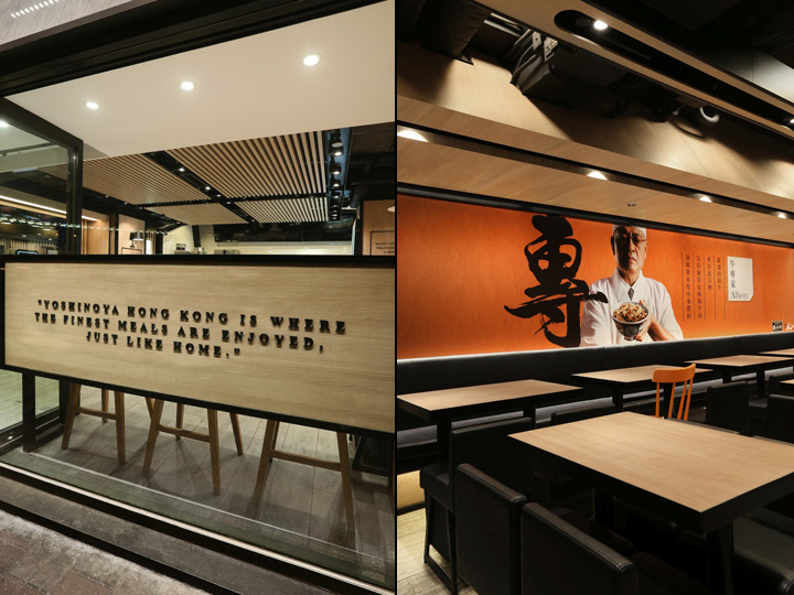
With soft lightings, modern wall lamps, flat picture frames, calligraphy that contains unique meaning and casual bar describe the luxurious residential elements, thus shaping the fashion taste and “home” as a primary core brand value. Natural stone doorway matches bright colors, simple lines outline the house, in addition with an imitation roof chimney shaped in different sizes, it successfully become the new focus and hangout spot in the heart of downtown facade.
Design: AS Design Service Limited / Four Lau (Creative Director) / Sam Sum (Art Director) / Ka Him (Assistant Interior Designer)
Photography: Sing Studio / Sum Sing
Award: 2015 Italy A’ Design Award Sliver Winner – Interior Space and Exhibition Design – Yoshinoya Fast Food Restaurant




Add to collection
