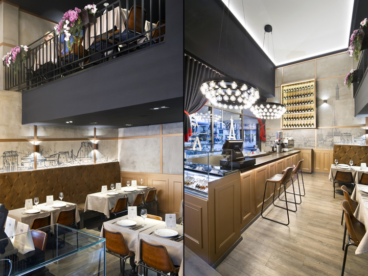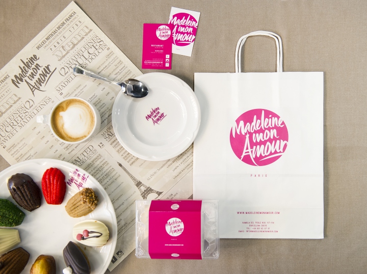

The whole concept was named after a French girl (Madeleine), a place where to offer delicious pastries hand made by “grandma” to a bunch of ladies who like to take their tea every afternoon, or a champagne cocktail at night. The challenge was to create a very intimate atmosphere with an elegant but cosy ambiance, and references given by the client went from all too girly lingerie shops to the very romantic “budoir” interior design style of the “belle époque”. In short, we were about to tackle our “most feminine” task so far, and didn’t know if we needed to start wearing high heels so to bring out all of our “pink power” or if it was better altogether to pass on the challenge to a curvy and sensitive colleague. We went for the first option and after a few months of renovation project and execution we can proudly say we can now tell the difference between fuchsia, magenta, purple red, or French violet…!

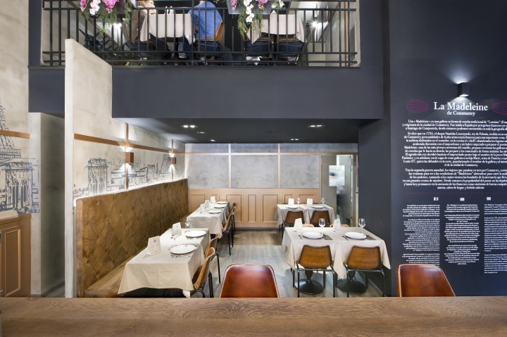
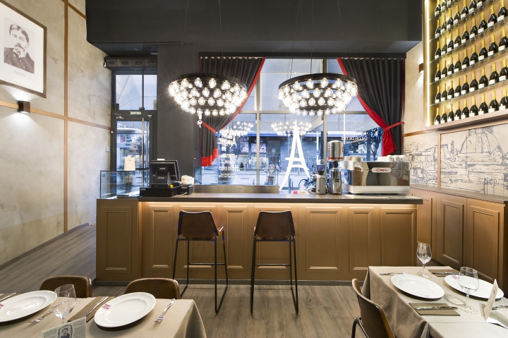
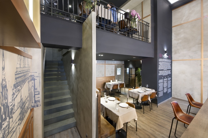
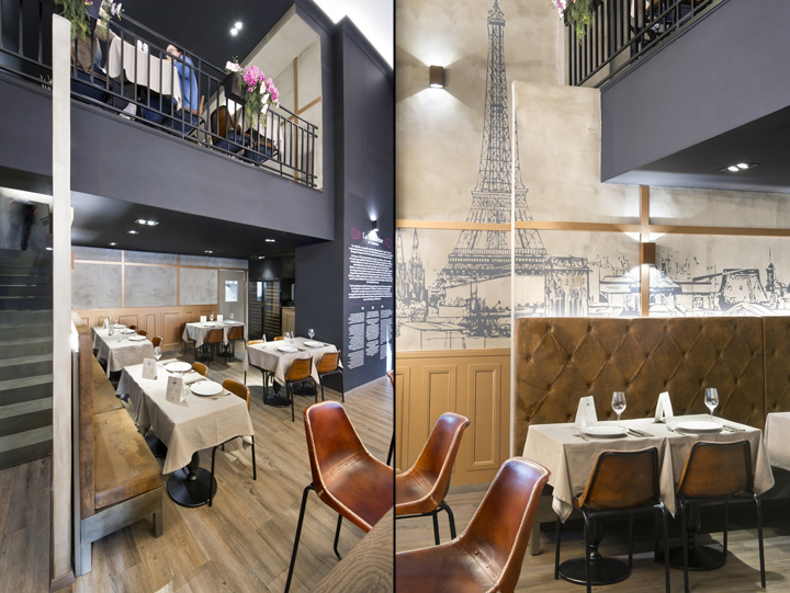
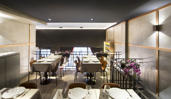
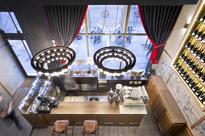
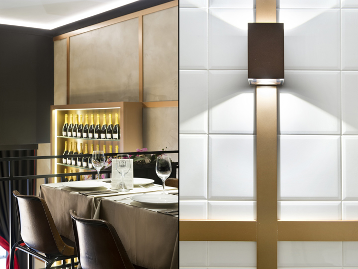
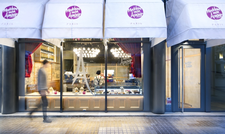
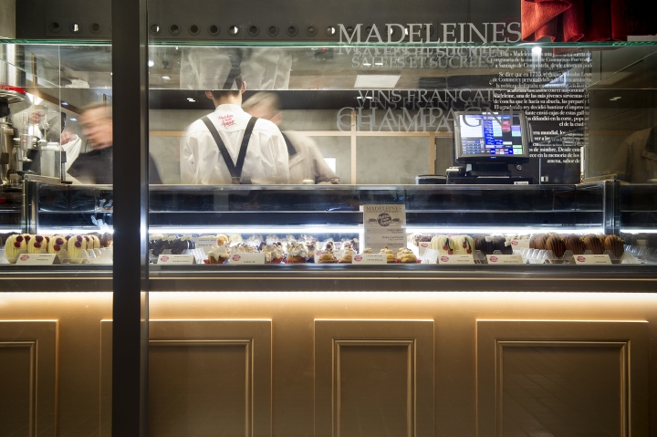
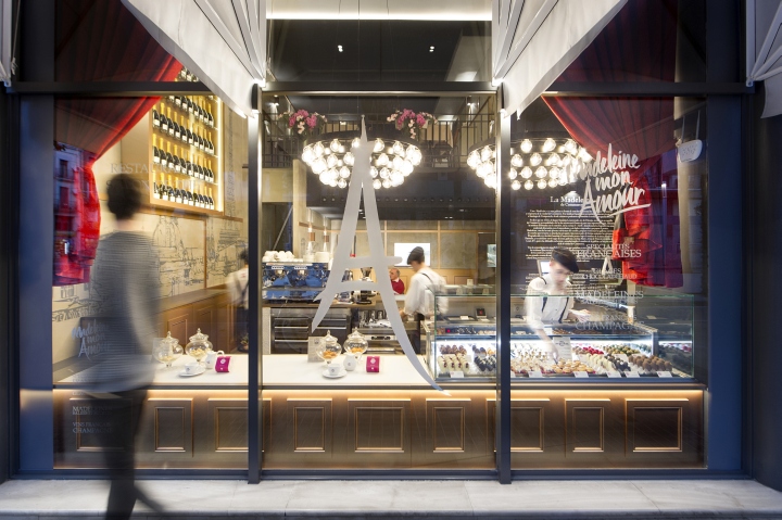
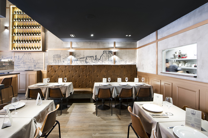
No, the outcome is not a pink cabin filled with embroidered fluffy tulle and lace. On the contrary the resulting space is actually one that combines the material honesty of concrete, worn out leather and rustic solid wood with the sparkle of copper mouldings, “capitone” upholsteries and the delicacy of magnolias. All under a sensuous and warm lighting scheme that underlines every corner of this double height interior visible all the way from the very happening Ramble del Poble Nou. A bright and cushioned envelope, like a jewel box, shining behind a huge window pane with black iron joinery, flanked by two heavy pink velvet curtains and under canopy awnings in true Haussmann´s Paris style.

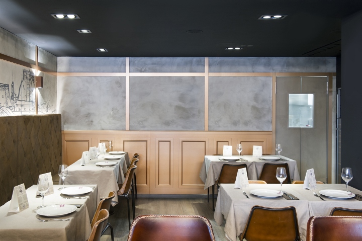
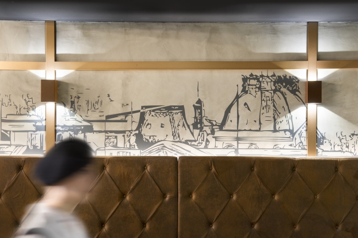
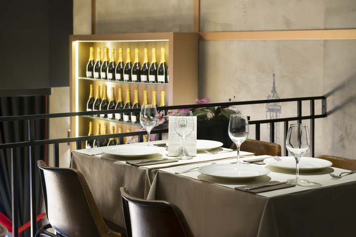
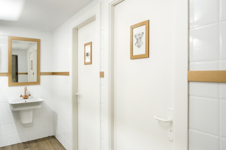
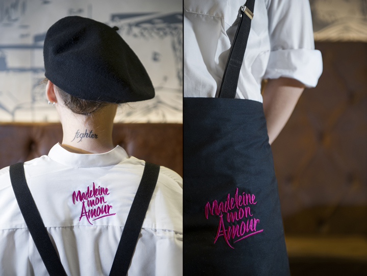
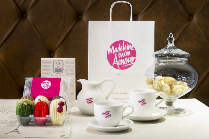
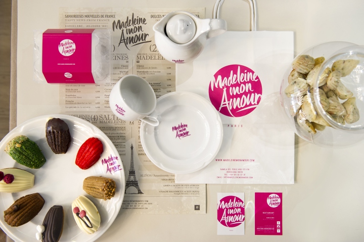
Everything in the premises stands for constant dialogue between opposites: Walls combine shine with the “grainy” opaqueness of cement over which the Parisian skyline, Eiffel Tower included, is described with sepia toned hand strokes; The rusticity of tainted solid oak is dressed up in sand coloured gabardine that serves as the perfect backdrop against which spotlessly white china teapots and plates would stand out, with all their branding tags and marks designed in the studio remaining true to the very feminine spirit conveyed by the logotype´s original designer;

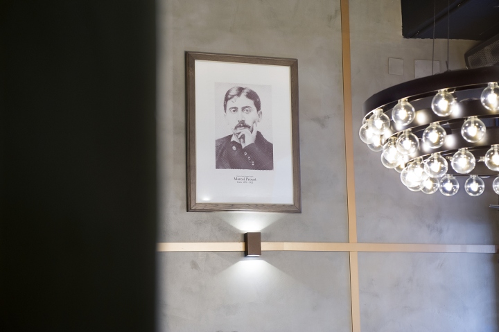
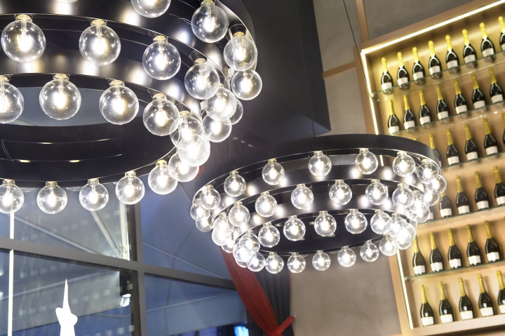
All the lavishness, the concentric shape and staggered logic of the traditional chandelier was accomplished here with the constructive economy of forged iron structures and a series of clear “balloon” bulbs of exposed incandescent filament; Lastly, the packaging, the brochures and most importantly the menu, manage to conciliate a concept and offer of tremendous novelty to the city, with a decidedly retro style: one that renders serif typefaces and stamp like logotypes over worn out yellowish backgrounds in order to convey a story and a tasting ritual that was even described by Proust back in the day. Is all these really feminine? Drop by La Madeleine and decide for yourself. If don’t happen to agree with us at least you´ll eat well: and as you may well know, everything looks better on a full stomach.
Designers: Egue y Seta
Collaborators: Daniel Pérez, Felipe Araujo, Szymon Keller and Covadonga Díaz
Photographer: VICUGO FOTO

