

Add to collection
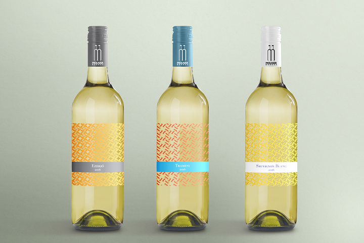

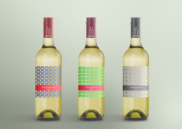
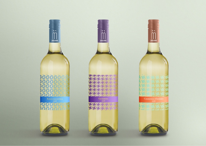
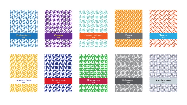
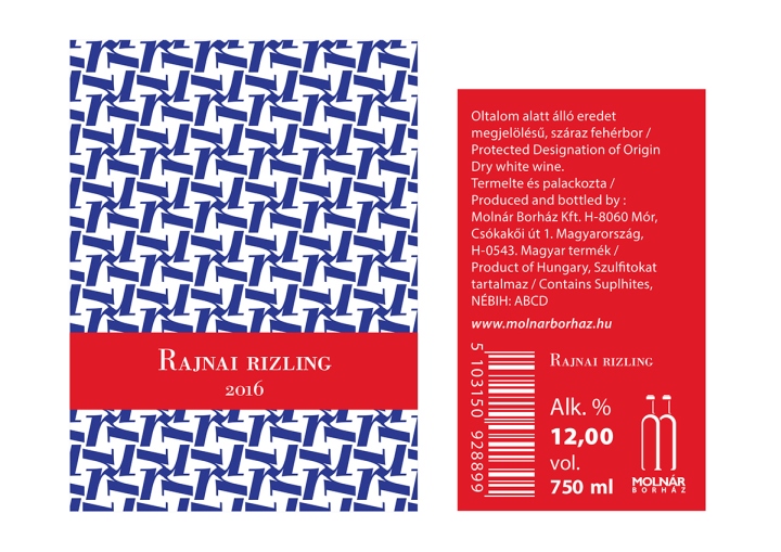
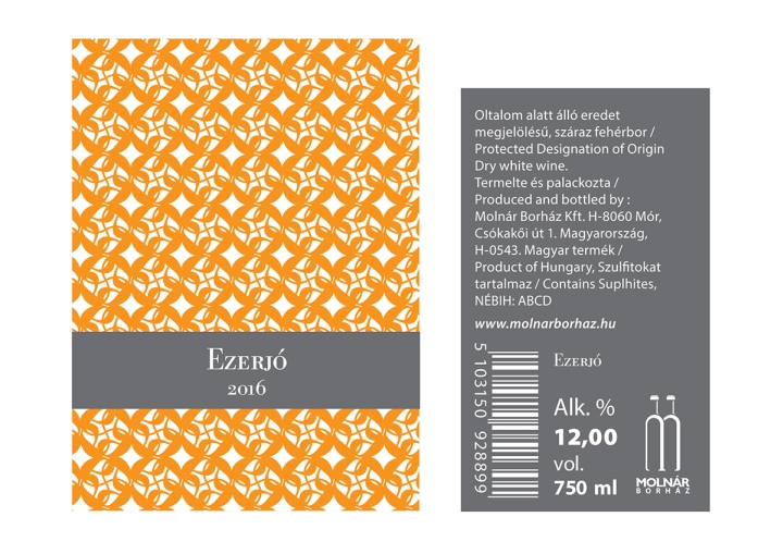
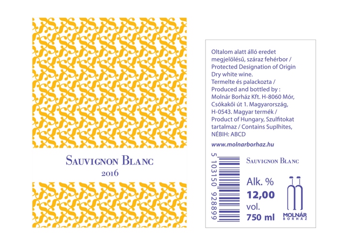
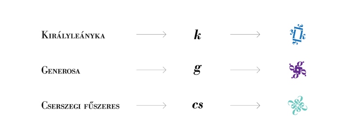
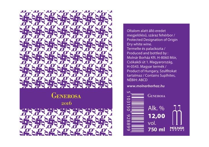
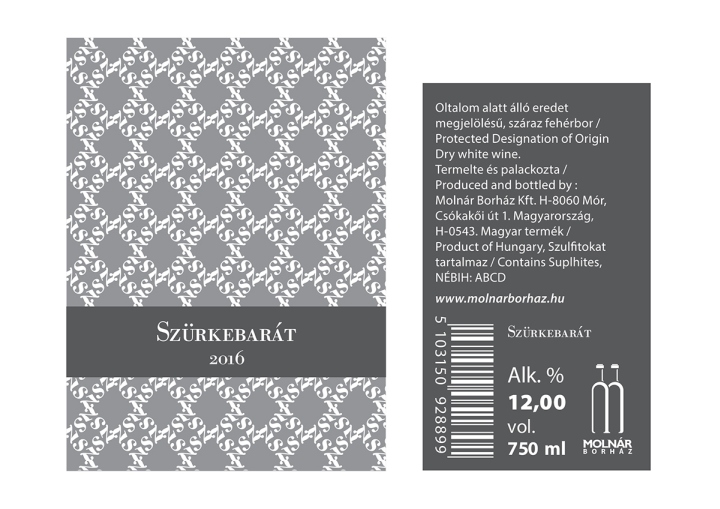
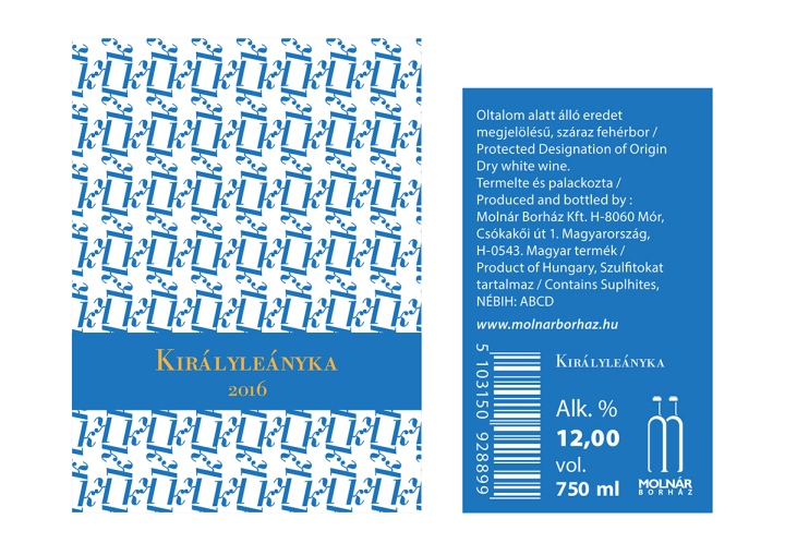
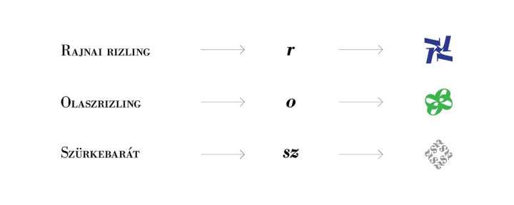
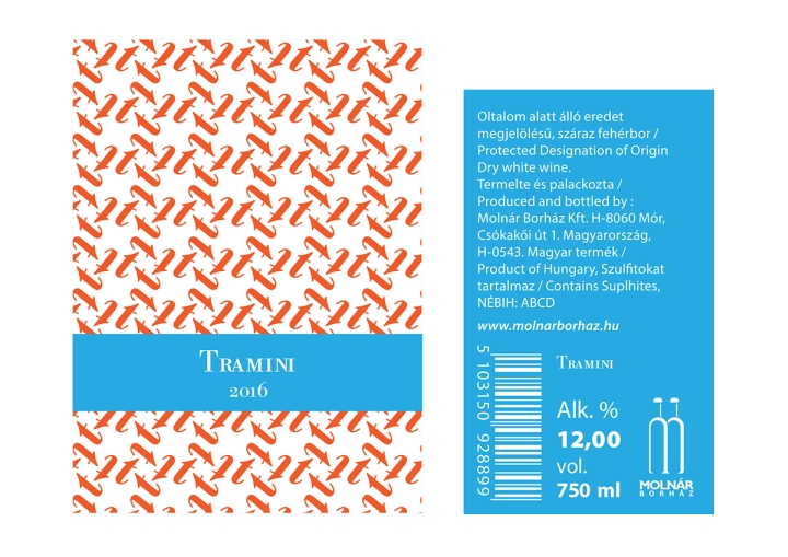
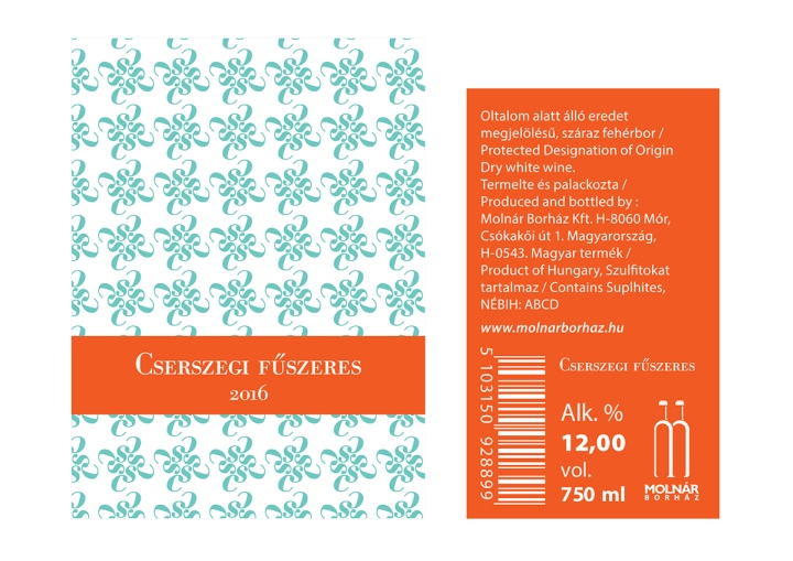
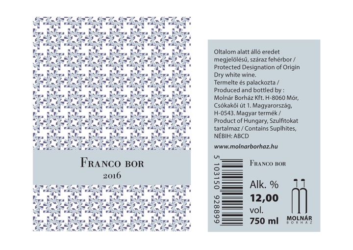
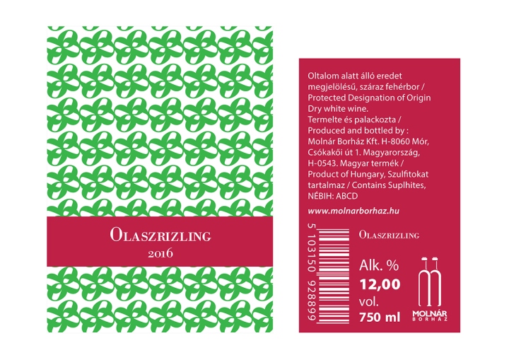
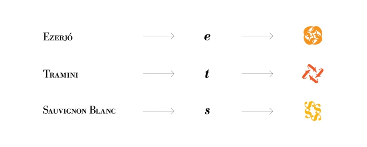
There are 9 dry white wine whose typographic labels were designed by me. There are patterns on the front side These patterns are built by small characters. The wine has a pattern that make reference to the first word of the wine’s name. Thus makes us easier to recognize, intensifies the view. For example k like Királyleányka, g like Generosa or t like Tramini. Referring to colors I preferred complementer pair of colors or those which matches to the name of the wine. e.g.: Szürkebarát (greyfriend) obviously refers to szürke (grey) While the pattern of french contains the color of the french flag the Italian wine has the italian tricolor. (The 10. wine is a fictitious one, the logo of the orderer was used as a covering pattern. This begins with my name.)
Designed by Ferenc Deak

https://www.behance.net/ferenc-deak


Add to collection