

Add to collection
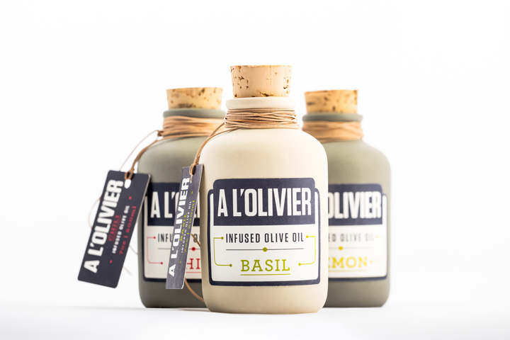

PROJECT OBJECTIVES: design a new identity and packaging structure for a collection of infused olive oils as part of an already established olive oil brand.
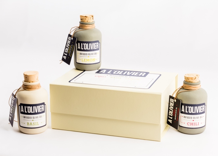
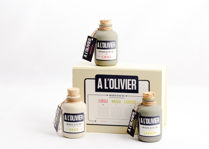
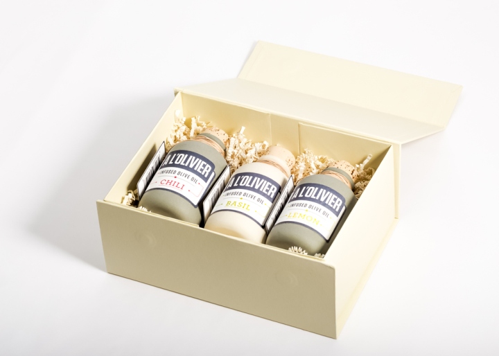
PROJECT OUTCOMES: for this project I chose A L’Olivier as the parent brand. I designed an identity and used a packaging structure that maintains the classic styling as well as the traditional feel of the brand by replacing the current tin with a package that is more recognizable to a wider audience. The package gives the consumer the feel of an established product without seeming dated.
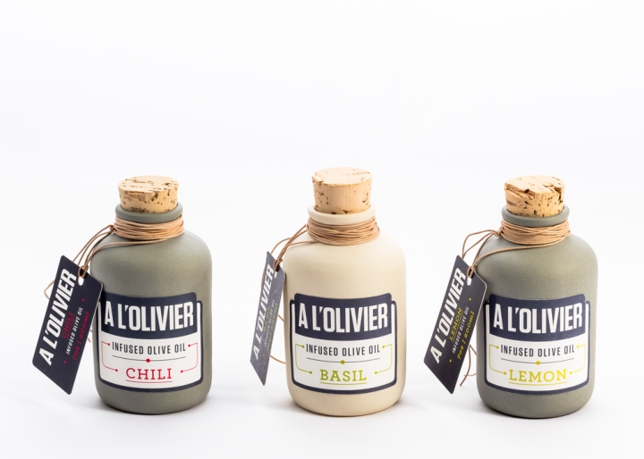
For the label, I stripped the complicated current design down to its essence to make it more appealing on the shelf without losing the authenticity of the brand. The label is more modern and streamlined allowing the consumer to easily find it on the shelf and identify what it is. The colour palette gives the consumer further clarification as to the contents of the infused oils without overpowering the brand.
(Student Project)
Designed by Ana Paulsen


Add to collection