

Links Bridge Vineyards Classic Series Wine packaging by Octavo Designs
posted by retail design blog on 2017-07-04
Add to collection
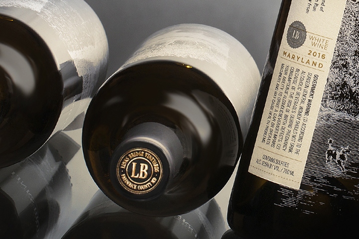

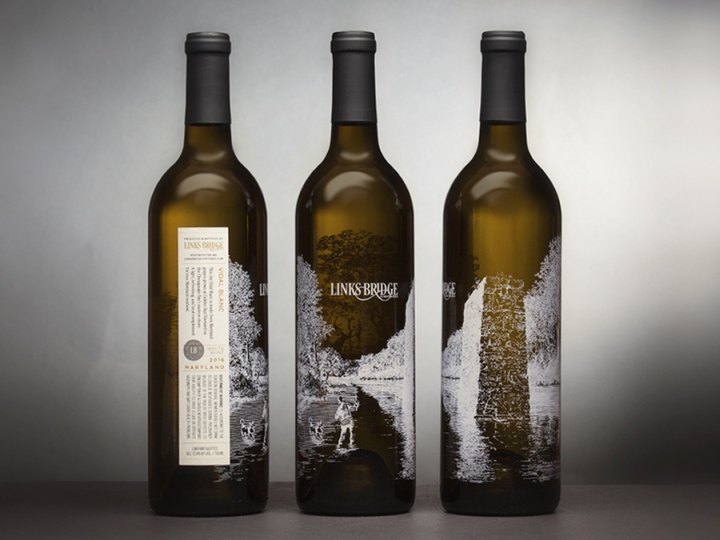
When Links Bridge Vineyards decided it was time to reinvent the look of their classic wine series, they turned to our studio to help them develop a truly special package design. We focused our attention on co-owner and talented artist, Joan Cartier’s illustrations — a series of ink etchings of Old Links Bridge on the Monocacy River, where the vineyard lies along. One etching in particular, “Fishing by Old Links Bridge” would be the visual focus for the design. This illustration showcases a local fisherman with the vineyard owner’s beloved dog, Lucy, frolicking alongside one of the bridge’s remaining stone piers. We had the artwork silk screened onto the bottle, using the bottle itself as the canvas.
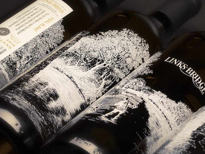
We created a label with classic and clean characteristics to compliment Joan’s illustration and the overall package design. By silk screening the illustration onto the bottle’s exterior, not only can people turn the bottle to experience the scene in its entirety, they can also see a different perspective of the illustration through the bottle and the fabulous wine inside. We topped the whole package off emblazing the vineyard logo onto the corks and foil embossed the vineyards seal onto black matte foil caps. Our goal was to capture the spirit of the vineyard and its region onto a beautiful and cleanly designed package, matching the fruits of labor inside.
Design: Octavo Designs
http://www.packagingoftheworld.com/2017/06/links-bridge-vineyards-classic-series.html


Add to collection