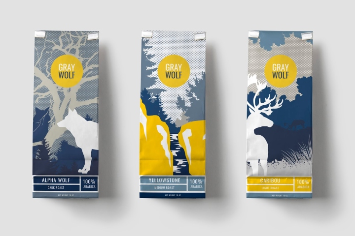

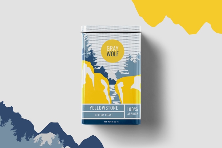
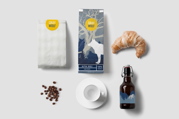
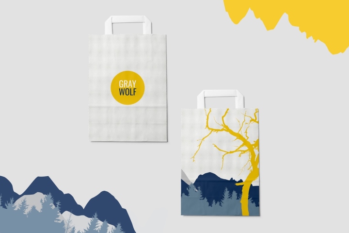
The coffee aisle of a grocery store can seem aesthetically homogenous. The imagery is drab (beans, steam, mugs of brown liquid) and the colors are dark and warm. When I think of coffee, I think of energy, purpose, and focus. I wanted to explore the notion of presenting coffee in a bright way, instead of the usual brown mug; I wanted to see coffee as something full of vitality and intention.
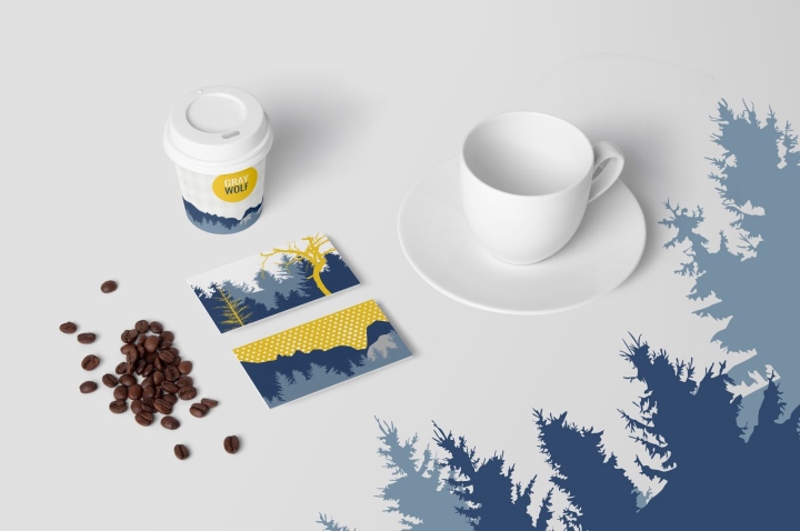
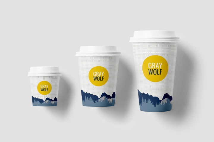
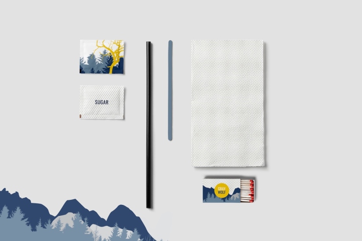
Gray Wolf is wild but disciplined. Boldness, a theme often emphasized in coffee copywriting, is built-in to the wolf imagery. The color palette (blues and grays and yellow) is vibrant and positive but forceful and strong. The wolf itself is poised. The idea of presenting coffee in a bold and bright way.
Designer: Merril “Moyl” Cledera
http://www.packagingoftheworld.com/2016/09/gray-wolf-coffee-concept.html


Add to collection
