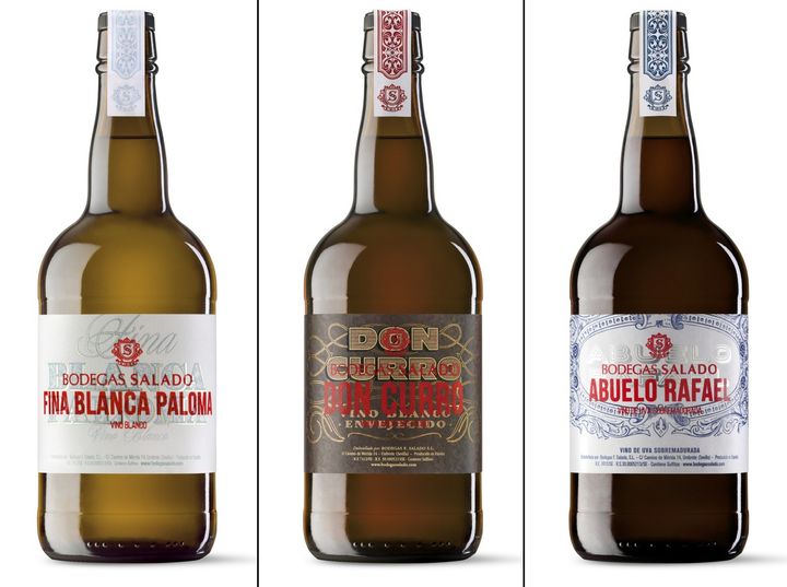
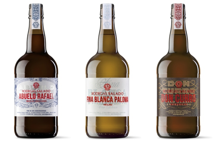

The show must go on, we renovate the image of the Generous Wines of Bodegas Salado. The value of its production processes – still the same since 1810 – inspired our proposal: a premium design, modernized and rich in details, faithful to the Andalusian origins of Bodegas Salado. We get closer to younger audiences, placing the product as upmarket, but true to its essence by applying a groundbreaking concept.
Preliminary Notes: Bodegas Salado develops its wine activity in the Andalusian region of Aljarafe for more than two hundred years. Its range of Generous Wines preserves the value of the traditional production processes of its wines of overripe grapes and aged white wines. We place the new image of the range in up-market generous wines with a transgressor concept, always faithful to the Andalusian origins of Bodegas Salado.

Strategy: we develop a renewed graphic code which reunites tradition with modernity. We keep faithful to the Andalusian values, story and essence of Bodegas Salado. We create a design related to the elaboration process of the product. We give a premium look to the packaging, due to a meaningful design, the use of special materials and enlightening printing techniques.
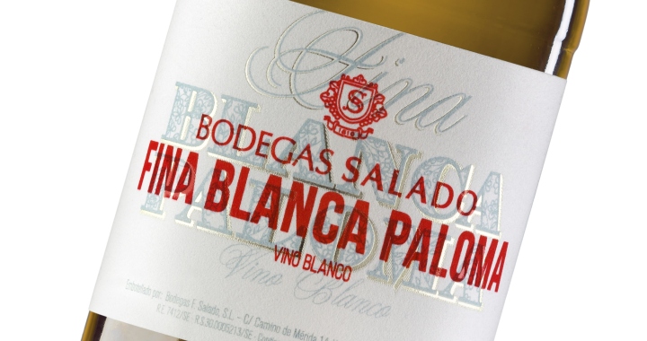
Storytelling: good traditions are a treasure to be preserved carefully. Generation after generation, Salado’s family has preserved with passion the traditional processes of its generous wines: The bicentennial barrels are still shaping the new vintage, moulding new flavors following years of quality and winemaking savoir-faire.The three varieties, generous fino white wine, dry oloroso made by white aged wine and sweet oloroso made with overripe grapes, conform the range of Generous wines in its typical Andalusian Style. The grandad Rafael (el Abuelo Rafael) and its son Don Curro give name to the sweet and dry olorosos of the range, in honor to Salado’s lineage; while the undeniable Andalusian icon of the Virgen de la Paloma names the fino white wine. Graphic solution: the barrels of Bodegas Salado keep shaping new Generous Wines since 1810. Using the system of ‘criaderas y soleras’, the old shapes the flavors of the new vintages. For this reason, our graphic proposal is based in the concepts of modernity and tradition and it superimpose two labels:

At the base we recall the aesthetic of the labels from the late 18th and the early 19 th century, popular during the beginnings of Bodegas Salado. In the form of labels cutouts, we create the drawings and illustrations by hand with the family emblem. The lines of the Plaza España in Seville inspire us to reflect the always present Andalusian tradition of Bodegas Salado. Over the old-fashioned composition, a modern typography and a rejuvenated family shield in red forms the new label, balancing the ensemble making it remarkable and original. For Fina Blanca Paloma, the most unique of the Generous wines range, we include printing and stamping details in silver blue over an exclusive Fasson Velvet White paper. The result is elegant, attractive and full of uniqueness premium quality.
Design: TSMGO
Photography: DclickEstudio!
