

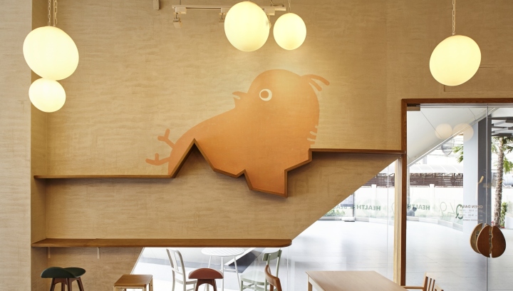
The first idea in this design come from the sound when people eat restaurant’s signature waffle. The word refers to a sound when a knife cut through their crunchy waffle – C-R-A-C-K. From above idea, P/S/D expand idea of “Crack-Sound” to “Crack-the-Egg”. The idea was interpreting to an image of a small chicken try to break egg shell to see the world.
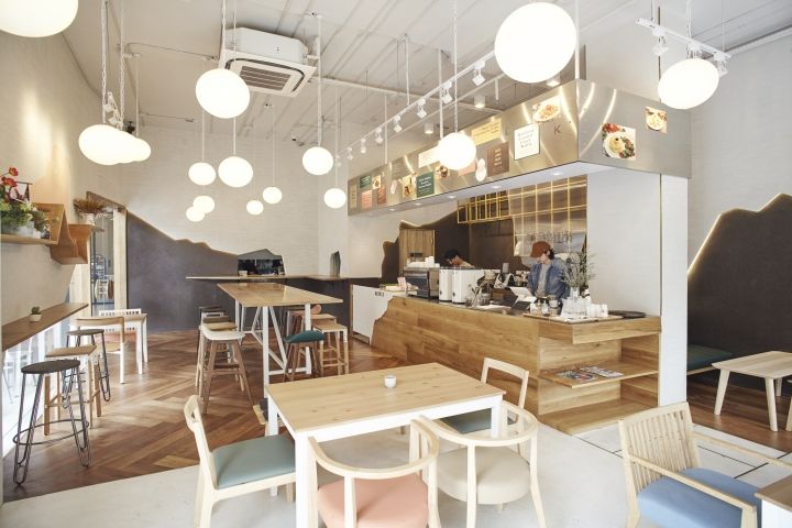
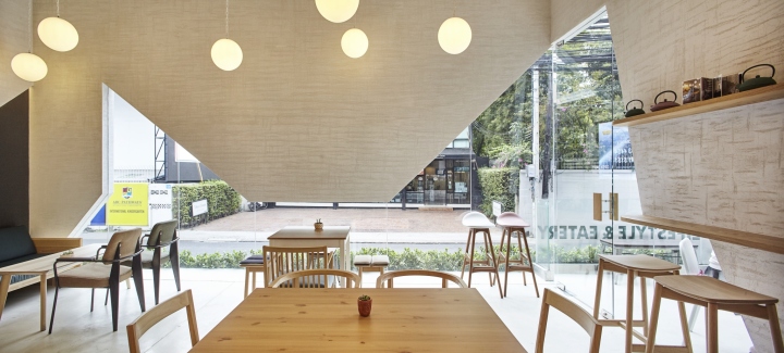
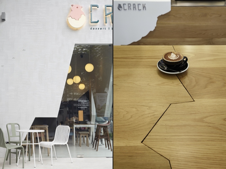
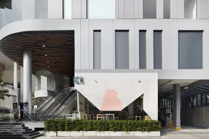
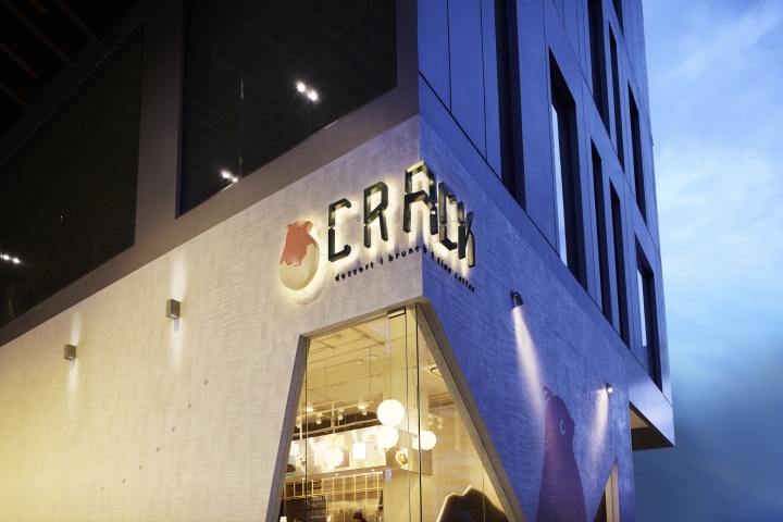
Also, the idea of crack-the egg be an action of people when breaking egg before cook. Thus, Crack-the-Egg become the main concept in design this restaurant. The restaurant design would be a big egg that the little chicken try to break out. The façade of a restaurant design to be as smooth as egg’s shell.
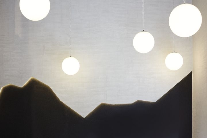
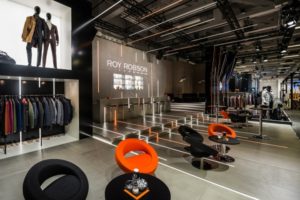
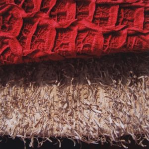
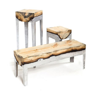
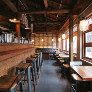
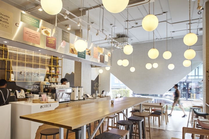
The texture of the wall is raw and have a crack line bigger and bigger starting from the floor through ceiling until see the inside space. A decoration inside is in warm tone. The restaurant wants the customer feel like when they eat at their friends’ house. The material and the arrangement of furniture and lighting are placed in variety position with difference material. This randomness makes the space more excited.
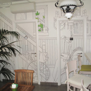
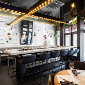
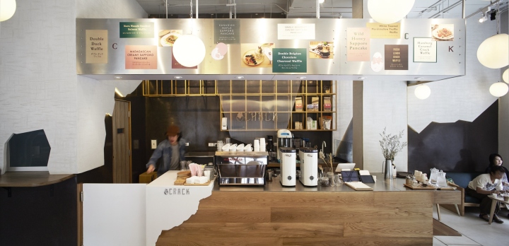
Another important selection of this space is the lamp. P/S/D choose to use round lamp similar to the roundness of an egg. This lamp also gives a home feeling from their warm light ray. Customer can sneak peak inside the kitchen from a small crack in the room. A barista counter is a simple wood top with a premium stainless outline.
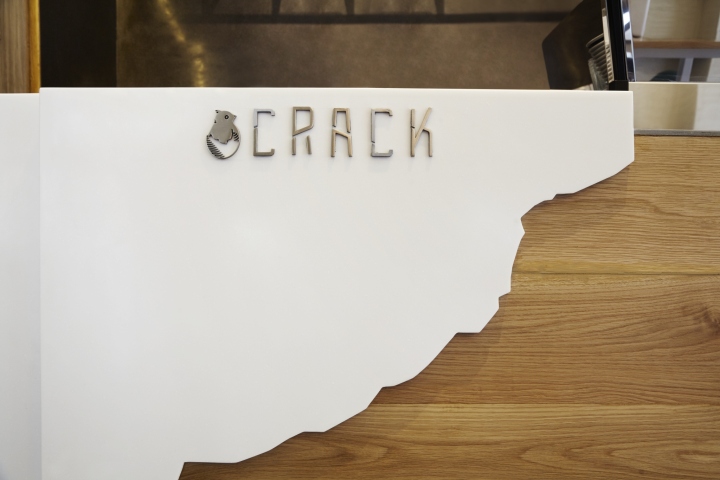
Menu board made of a magnetic plate which come from an idea of a magnet wall at the refrigerator in every house. Another highlight of the restaurant is the idea of merge all crack lines that we refer from the crack of egg shell since the building façade, fuse to inside room and link from start position of the crack.
Design: Party Space design
Photography: F.SECTIONS


Add to collection
