

Amphora Olympia Olive oil packaging by Sophia Georgopoulou | Design
posted by retail design blog on 2017-03-15
Add to collection
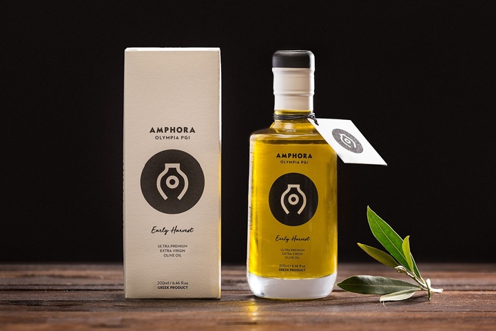

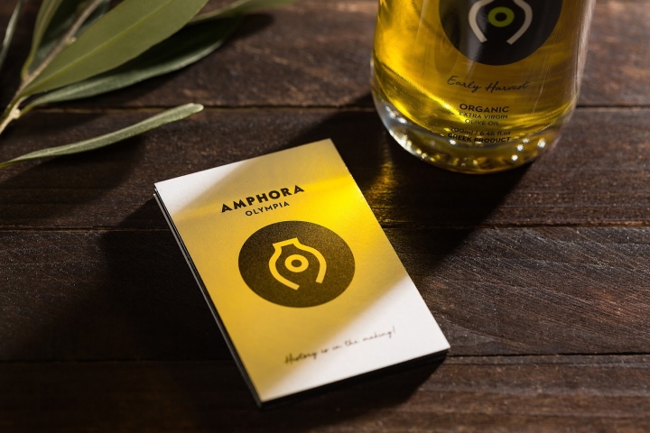
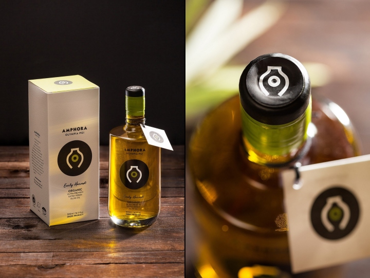
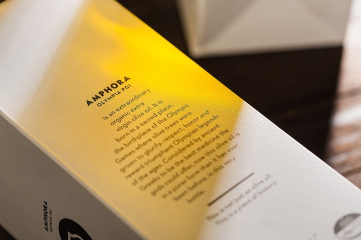
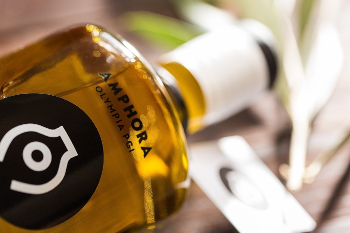
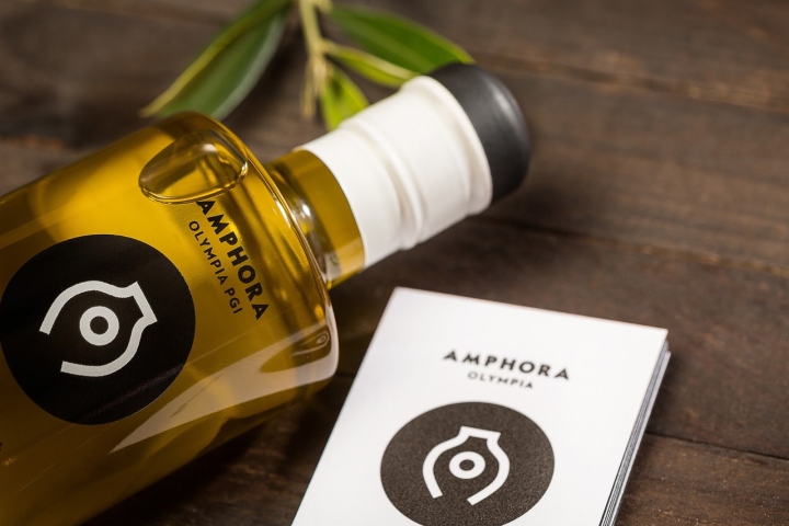
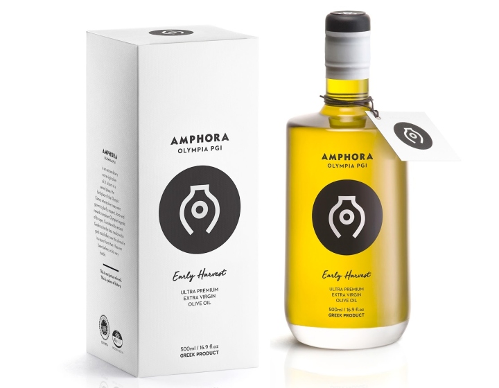
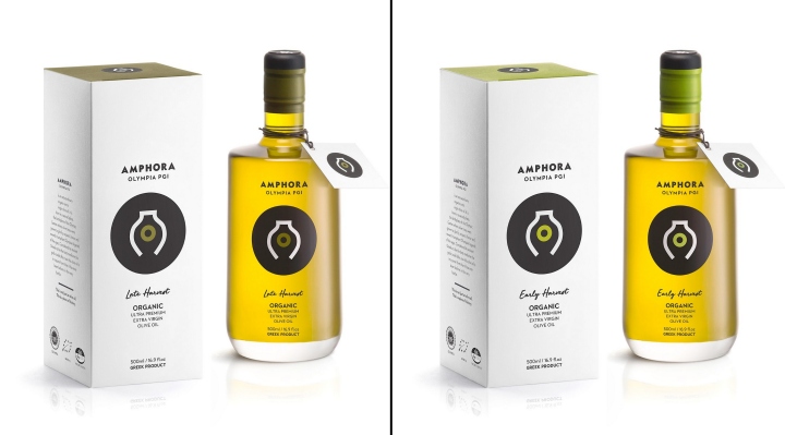
To create the brand identity of Amphora Olympia, a brand new series of premium quality Organic and Extra Virgin Olive Oil from Greece that is targeted for the foreign market. The brand pays tribute to the history of the birthplace of the Olympic Games, ancient Olympia where olive trees were grown not only for their fruits but also to honor the triumphant athletes. The Design Concept & Design Given the brand name we focused our design strategy in depicting the ancient practice of preserving olive oil in amphorae that led us to a very clear cut logotype.

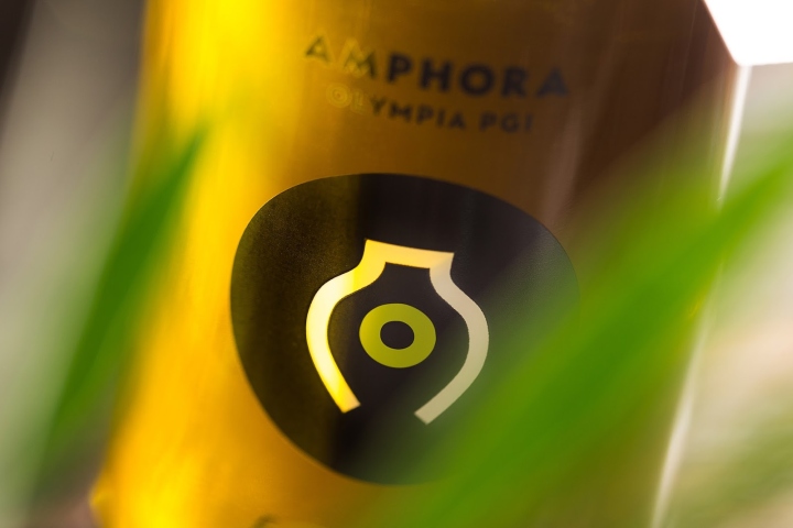
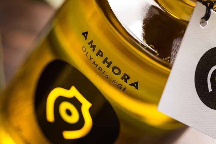
The circle in the middle of the logo symbolizes the olive oil and ancient Olympia (letter O) and is placed at the center of an amphora shape which is inspired by the letter A of the word Amphora, and all together are concealed in a black circle. This idea helps the eyes of the beholder focus on the essential message: this is an olive oil of Greek origin and carries all the qualities of this heritage. The different colors –depicted here on the “O”- showcase the varieties of the product.
Design: Sophia Georgopoulou | Design


http://www.packagingoftheworld.com/2017/03/amphora-olympia.html


Add to collection